Criteria
Criteria elements are window components which can get input from the user and send it to the application server (business logic).
How does it work
Internally, a criterion has 2 basic attributes to manage the information to send to the server and the information to show to the user:
- selected: The selected values of the criterion. These values will be sent to the server.
- values: The available values of the criterion. These values will not be sent to the server. It's a list of values and labels that will be shown to the user to choose from.
Priorities
The selected values can be fulfilled in several ways. Here is a priority list with those ways:
- variable - These are the values sent from another screen
- screen target - The values returned by the screen target are the most priority of the list
initial-load="value"- The query-retrieved values follow the screen target values- session - Session-stored values
- property - Property-stored values
- value - Static values defined on value attribute
XML skeleton
<criteria id="[identifier]" component="[component]" label="[label]" placeholder="[placeholder]" style="[classes]"
          initial-load="[initial-load]" server-action="[server-action]" target-action="[target-action]"
          variable="[variable]" value="[value]" session="[session]" property="[property]"
          validation="[validation]" readonly="[read-only]" size="[size]" unit="[unit]" icon="[icon]"
          printable="[printable]" help="[help]" help-image="[help-image]"
          optional="[optional]" area-rows="[area-rows]" number-format="[number-format]" capitalize="[capitalize]"
          strict="[strict]" checked="[checked]" group="[group]" show-slider="[slider]" destination="[destination]">
  <dependency... />
</criteria>
Criteria structure
| Element | Use | Multiples instances | Description |
|---|---|---|---|
| criteria | Required | No | Global node of criteria. Defines the criterion attributes |
| dependency | Optional | Yes | List of dependencies attached to the criterion |
General attributes
| Attribute | Use | Type | Description | Values |
|---|---|---|---|---|
| id | Required | String | Criterion identifier. For reference purposes | |
| component | Required | String | Criterion type | See components |
| label | Optional | String | Criterion text (outside the criterion) | Note: You can use i18n files (locales) |
| placeholder | Optional | String | Criterion text (inside the criterion) | Note: You can use i18n files (locales) |
| style | Optional | String | Criterion CSS classes | See Bootstrap positioning for criteria sizing |
| initial-load | Optional | String | Server action call to load the criterion data (launched at window generation) | enum (for enumerated), query (for query call loading the values part of the criterion) or value (for query call loading the selected part of the criterion) |
| server-action | Optional | String | Server action call | See server action list |
| target-action | Optional | String | Target to call on the server | |
| max | Optional | Integer | Max number of values | Note: Default value is set in property var.def.rpp in file base.properties |
| autoload | Optional | Boolean | Launch target-action when the screen has been initialized | Note: Default value is false |
| autorefresh | Optional | Integer | Launch the target-action every X seconds | Note: The value is in seconds |
| variable | Optional | String | Parameter to fill the criterion value | Identifier of a criterion in the previous screen |
| value | Optional | String | Criterion default value | |
| session | Optional | String | Session variable to load the criterion | Session variable identifier |
| property | Optional | String | Property variable to load the criterion | Property variable identifier |
| validation | Optional | String | Validation rules | See validation |
| readonly | Optional | Boolean | Set criterion as readonly | Default value is false |
| size | Optional | String | Criterion size | sm (default), md or lg. |
| unit | Optional | String | Criterion unit text | Note: You can use i18n files (locales) |
| icon | Optional | String | Icon identifier | Note: You can check all iconset at FontAwesome |
| printable | Optional | String | Check if criterion is printable | true, false, excel, all, tab |
| help | Optional | String | Help text for the criterion | Note: You can use i18n files (locales) |
| help-image | Optional | String | Help image for the criterion | This must be a image path |
| left-label | Optional | Integer | Put the label on the left and give it a size in chars | Default value is empty (label is on top instead of left). If defined, the value must be a number of chars for the label |
Specific attributes
| Attribute | Criterion | Type | Description | Values |
|---|---|---|---|---|
| optional | Select | Boolean | Allow selecting a empty value | Default value is false |
| area-rows | Textarea | Integer | Number of rows of the textarea | Default value is 3 |
| number-format | Numeric | String | Format of the number | See autonumeric plugin |
| capitalize | Select, Suggest | Boolean | Put the first letter of the options in uppercase and the others in lowercase | Default value is false |
| strict | Suggest | Boolean | Allow the user only to select the list values | Default value is true |
| check-target | Suggest | String | Target action to be launched if label is not defined at suggest initialization | Default value is the defined at target-action |
| checked | Checkbox, Radio | Boolean | Mark the criterion as checked initially | Default value is false |
| group | Checkbox, Radio | String | Group of the criterion (for validation and management purposes) | |
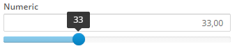
| show-slider | Numeric | Boolean | Used to show the graphic component slider | Note: Only apply in numeric criteria |
| destination | Uploader | String | Destination relative folder to upload the file | |
| show-weekends | Date | Boolean | For enable or disable the weekend days | Default value is true |
| show-future-dates | Date | Boolean | For enable or disable the future days after date value selected | Default value is true |
| date-format | Date | String | To set the format of the date you want to show | Default value is dd/MM/yyyy. Note: See the format in the following link |
| date-show-today-button | Date | Boolean | To show or not the button to select today date | Default value is true |
| date-view-mode | Date | String | Select 'days', 'months' or 'years' to set the minimum magnitude to be shown | Default value is days |
Components
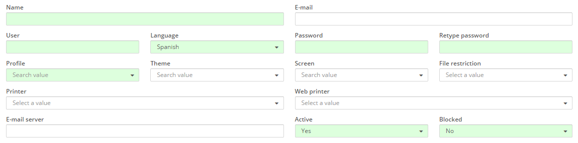
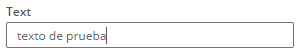
Text criterion
Basic text input.
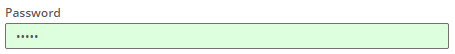
Password criterion
Basic text input, but the written characters are not shown to the user.
Textarea criterion
Criterion which allows the user to insert a large text and newlines.

Hidden criterion
Hidden criterion. It is useful to send static values to a query or as a formula element.
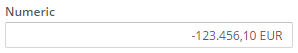
Numeric criterion
Criterion which allows to insert formatted numbers.
Numeric criterion with slider enabled
Number format attribute
This attribute is used to format the numeric criterion and the slider. It is specified in json object format.
| Attribute | Use | Type | Description | Values |
|---|---|---|---|---|
| min | Optional | Number | The minimum possible value | Ex: {min: 5} |
| max | Optional | Number | The maximum possible value | Ex: {max: 5} |
| aSign | Optional | String | Desired currency symbol | Ex: {aSign: ' €'} |
| pSign | Optional | String | Controls the placement of the currency symbol | pSign: 'p' to prefix or pSign: 's' to suffix (default) |
| aPad | Optional | Boolean | Controls padding of the decimal places | true always pads the decimal with zeros or false (default) to no padding |
| precision | Optional | Number | Number of decimals | Note: The thousand & decimal separators can not be the same |
| step | Optional | Number | Slider increment step | Ex: {step: 5} |
| ticks | Optional | Array | Used to define the values of ticks in slider. Tick marks are indicators to denote special values in the range. This option overwrites min and max options | Ex: {ticks: [-1000, -500, 0, 500, 1000]} |
| ticks_labels | Optional | Array | Defines the labels below the tick marks. Accepts HTML input | Ex: {ticks_labels: ['-$1000', '-$500', '$0', '$500', '$1000']} |
Note: You can view all autonumeric attributes here and the slider attributes here
Number format examples
number-format="{min: 0, max: 100, step: 0.01, precision: 2, aSign:' £', pSign:'s', aPad:true}"
---
number-format="{min: -1000, max: 1000, step: 10, precision: 2, aSign:' $', pSign:'s', aPad:true,
ticks: [-1000, -500, 0, 500, 1000], ticks_labels: ['-$1000', '-$500', '$0', '$500', '$1000']}"
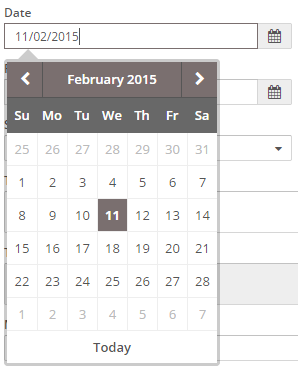
Date criterion
Allows to select a date with a calendar.
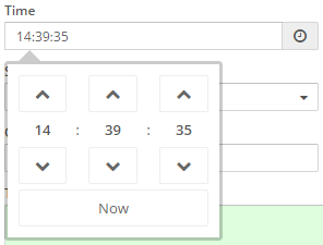
Time criterion
Allows to select a time with a time picker.
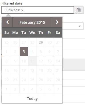
Filtered date criterion
Allows to select a date with a calendar from a list of filtered dates.
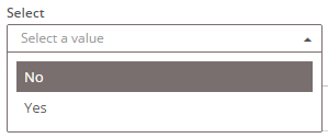
Select criterion
Shows a list and allows the user to select one element.
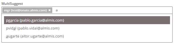
Suggest criterion
Allows the user to search a value by typing some characters of the seek value.
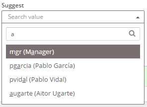
Note: The typed text is sent to the server as
suggestparameter, but only when the query is used to fill in the options. Otherwise, suggest's id should be used as usual.
Select VS Suggest
| Select | Suggest |
|---|---|
| The list of values is "fixed" | The list can change every time you interact with the component |
| The list is loaded when you enter into the window | The list is loaded when you interact with the component |
| Filtered in the client | Can be filtered in client and server |
| You have to use it when the list of values is small and with fixed number of values. | It can be used with both small and large lists |
| Use attribute "max"=0 | Use attribute "max" to limit the data returned by the server. |
| You must use the variable "suggest" to filter. | |
| Not used when there are interrelationships between criteria | Mandatory use when there are interrelationships with other criteria. |
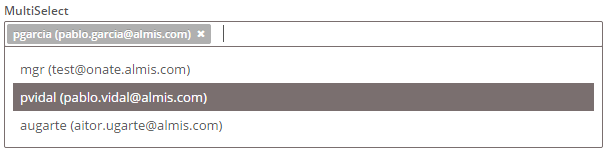
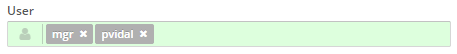
Multiple select criterion
Shows a list and allows the user to select some elements.
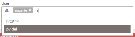
Multiple suggest criterion
Allows the user to search some values by typing some characters of the seek values.
Note: The typed text is sent to the server as
suggestparameter.
Checkbox criterion
Shows a checkbox. It sends a 1 (or the value defined in the value attribute) if it's checked or 0 if it is unchecked.

Radio button criterion
Shows a radio button. It is mono-selection. It sends the value attribute of the selected element between all the radio buttons with the same group attribute.

Note: If we want a radio button group to be required, all the radio buttons that are inside the group must have validation="required"
Button checkbox criterion (line)
Similar to a checkbox but it has a button appearance. It sends a 1 (or the value defined in the value attribute) if it's checked or 0 if it is unchecked.

Radio button criterion (line)
Similar to a radio button but it has a button appearance. It is mono-selection. It sends the value attribute of the selected element between all the radio buttons with the same group attribute.

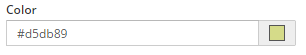
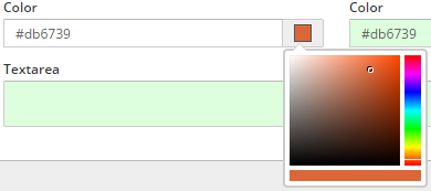
Color criterion
Color criterion. It is useful to get color hexadecimal value with a color picker widget.
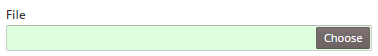
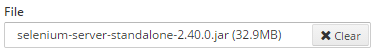
Uploader criterion
Criterion useful to send files to the server. Once uploaded, the files can be managed by the server processes
Text view criterion
This criterion simply shows a text, which can be retrieved from a variable, a parameter, a query or even loaded with dependencies.
Examples
Multiple suggest with icon
<criteria label="PARAMETER_USER" component="suggest-multiple" id="..." icon="user" initial-load="query" target-action="..."
          style="col-xs-12 col-sm-6 col-lg-3"/>
Radio button group
<criteria component="radio" label="PARAMETER_RADIO_1" id="RadBox1" group="RadBox" variable="RadBox"
          value="Radio1" style="col-xs-6 col-sm-2 col-lg-1 no-label" validation="required" checked="true"/>
<criteria component="radio" label="PARAMETER_RADIO_2" id="RadBox2" group="RadBox" variable="RadBox"
          value="Radio2" style="col-xs-6 col-sm-2 col-lg-1 no-label" readonly="true"/>
<criteria component="radio" label="PARAMETER_RADIO_3" id="RadBox3" group="RadBox" variable="RadBox"
          value="Radio3" style="col-xs-6 col-sm-2 col-lg-1 no-label"/>
Required text without label, with placeholder and with icon
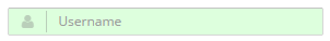
<criteria placeholder="SCREEN_TEXT_USER" component="text" icon="user" id="user" validation="required"
          style="col-xs-6 col-sm-4 col-md-2"/>
Select multiple with two preselected values
<criteria component="select-multiple" id="user" label="PARAMETER_USER" icon="user" initial-load="query"
          target-action="..." style="col-xs-12 col-sm-6 col-lg-3" value="1, 2" validation="required"/>
Color criterion sample
<criteria label="PARAMETER_COLOR" id="Col" variable="Col" component="color"
          style="col-xs-6 col-sm-3 col-lg-2" value="#d5db89" />
Uploader criterion sample
<criteria label="PARAMETER_UPLOADER" id="Upl" component="uploader" validation="required"
          style="col-xs-12 col-sm-6 col-lg-4" destination="testModule">