Dependencies
Each component (criterion, grid, chart, etc) can have some dependencies inside affecting its behaviour and contents. A dependency can be launched depending on component conditions or events.
The element must have the component attribute to make it work. If the element does not have the component attribute, the dependency system won´t work properly.
XML skeleton
<dependency initial="[initial]" source-type="[source-type]" target-type="[target-type]"
            server-action="[server-action]" target-action="[target-action]"
            label="[label-to-update]" value="[value]" formule="[formule]"
            type="[type]" invert="[invert]" async="[async]" silent="[silent]">
  <dependency-element ... />
  ...
  <dependency-action .../>
  ...
</dependency>
Dependency structure
| Element | Use | Multiples instances | Description |
|---|---|---|---|
| dependency | Required | No | Global node of the dependency. Defines the dependency attributes |
| dependency-element | Required | Yes | Condition to launch the dependency |
| dependency-action | Optional | Yes | Action which will be launched if dependency conditions are valid |
Dependency attributes
| Attribute | Use | Type | Description | Values |
|---|---|---|---|---|
| initial | Optional | Boolean | Dependency will be launched on page load | Default value is false |
| source-type | Optional | String | Dependency source (Where the data will be taken) | See source types. Default value is none |
| target-type | Optional | String | Dependency target (Where the dependency will be applied) | See target types. Default value is none |
| server-action | Optional | String | Server action call (when source-type is query) | See server action list |
| target-action | Optional | String | Target to call on the server / Name of the criterion, to get its value, when source-type is launcher | |
| label | Optional | String | Label to apply to the target | Note: You can use i18n files (locales) |
| value | Optional | String | Value to apply to the target | |
| formule | Optional | String | Formule to get the value that will be applied to the target | |
| type | Optional | String | How to evaluate the conditions | Possible values are and (default) and or. |
| invert | Optional | Boolean | Invert the condition evaluation | Default value is false |
| async | Optional | Boolean | Run the server action asynchronously | Default value is false |
| silent | Optional | Boolean | Run the server action without showing the loading bar | Default value is false |
Source type
The source-type attribute refers to the place from we are retrieving the data to apply to the component.
| Value | Description |
|---|---|
| none | Do nothing (nowhere to retrieve values from) |
| query | Launch a query to retrieve values |
| launcher | Get the values from the stored alias defined in target-action |
| value | Get the values from the value attribute defined on the dependency |
| label | Get the values from the label attribute defined on the dependency (can be a i18n local) |
| formule | Get the values from a evaluated formule on the formule attribute defined on the dependency |
| reset | Clear the target value |
Note:
source-type="action"is no more needed. Simply add some dependency-actions to your dependency and they will be launched when conditions are valid.
Target type
The target-type attribute refers to the place where we are applying the data retrieved from the source-type or whatever we want to do with the component where the dependency is.
| Action | Needs data | Inverse action | Description |
|---|---|---|---|
| none | No | none | Applies to nothing (default value) |
| label | Yes | none | Applies the source-type retrieved value to the component label |
| unit | Yes | none | Applies the source-type retrieved value to the component unit label |
| icon | Yes | none | Applies the source-type retrieved value to the component icon |
| input | Yes | none | Applies the source-type retrieved value to the component value |
| format-number | Yes | restore number format | Applies the source-type retrieved value to the criterion number format (for numeric criteria only) |
| validate | Yes | none | Applies the source-type retrieved value to the criterion validation |
| attribute | Yes | none | Set an attribute defined on target-action with the source-type retrieved value |
| show | No | hide | Show the component |
| hide | No | show | Hide the component |
| show-column | No | hide-column | Show the column (applicable only on columns) |
| hide-column | No | show-column | Hide the column (applicable only on columns) |
| enable | No | disable | Enable the component |
| disable | No | enable | Disable the component |
| set-required | No | set-optional | Set the criterion as required |
| set-optional | No | set-required | Remove the required criterion validation |
| set-readonly | No | set-editable | Set the criterion as read-only |
| set-editable | No | set-readonly | Allow editing the criterion |
| set-visible | No | set-invisible | Set the component as visible |
| set-invisible | No | set-visible | Set the component as invisible (similar to hide but keeping the hidden criterion place) |
| enable-autorefresh | Yes | disable-autorefresh | Enable autorefresh and set the autorefresh timer with the source-type retrieved value |
| disable-autorefresh | Yes | enable-autorefresh | Disable autorefresh and set the autorefresh timer with the source-type retrieved value |
Note: Some
target-typeactions have an inverse action, which is executed when dependency conditions are not accomplished. In this case, it's NOT necessary to add another dependency with the inverse action.
Dependency element
The dependency elements are the definition of the conditions required to launch a dependency.
Dependency element skeleton
<dependency-element id="[id]" column="[column]" attribute="[attribute]" condition="[condition]" row="[row]"
                    id2="[id2]" column2="[column2]" attribute2="[attribute2]" event="[event]" value="[value]"
                    optional="[optional]" cancel="[cancel]" alias="[alias]"/>
Dependency element attributes
| Attribute | Use | Type | Description | Values |
|---|---|---|---|---|
| id | Required | String | Component identifier | |
| column | Optional | String | Column identifier of the component (applicable on grids) | |
| attribute | Optional | String | Attribute to check. | See attributes below. Default value is selected |
| condition | Optional | String | Compare condition | See dependency element conditions. Default value is is not empty |
| row | Optional | String | Row number from the grid to check the attribute | |
| id2 | Optional | String | Component identifier to compare | |
| column2 | Optional | String | Column identifier of the component (appliable on grids) | |
| attribute2 | Optional | String | Attribute to check. | |
| event | Optional | String | Event to check | See events below. |
| value | Optional | String | Value to check | |
| optional | Optional | Boolean | Mark the element as optional. It is useful to use its values even if they are empty | Default value is false |
| cancel | Optional | Boolean | Cancel the dependency if this element has not been checked (useful for mandatory events) | Default value is false |
| alias | Optional | String | Name to apply to the dependency element. Useful for launcher dependency targets | |
| check-value | Optional | Boolean | Check this element values (launch the dependency if this element changes) | Default value is true |
Dependency element conditions
eqValues are equalneValues are not equalcontainsValue1 contains value2not containsValue1 doesn't contain value2geValue1 is greater than or equal than value2leValue1 is less than or equal than value2gtValue1 is greater than value2ltValue1 is less than value2inValue1 is in value2 listnot inValue1 is not in value2 listis emptyValue1 is emptyis not emptyValue1 is not empty
Attributes
The attributes are all the data you can retrieve from an AWE component. Depending on the component, you can retrieve distinct information of each one:
| Action | Apply to | Description |
|---|---|---|
| visible | All components | true if component is visible |
| value | Criteria | Gets criterion value. This is the default attribute |
| text | Criteria | Gets component visible value |
| label | Criteria | Gets component label |
| unit | Criteria | Gets component edit label |
| editable | Criteria | true if component is editable |
| required | Criteria | true if component is required |
| selectedValues | Select and Suggest Multiple | Gets select criterion selected values number |
| totalValues | Select | Gets select criterion total values number |
| currentRow | Grid | Gets current row identifier |
| currentRowValue | Grid | Gets column value of the current row (not the selected one). This is useful to update row values without a selection |
| prevCurrentRow | Grid | Gets previous row to the current row |
| prevCurrentRowValue | Grid | Gets column value of the previous row to the current row |
| nextCurrentRow | Grid | Gets next row to the current row |
| nextCurrentRowValue | Grid | Gets column value of the next row to the current row |
| selectedRow | Grid | Gets selected row identifier |
| selectedRowValue | Grid | Gets column value of the selected row. |
| prevRow | Grid | Gets previous row to the selected one identifier |
| prevRowValue | Grid | Gets column value of the previous row to the selected one |
| nextRow | Grid | Gets next row to the selected one identifier |
| nextRowValue | Grid | Gets column value of the next row to the selected one |
| selected | Grid | Number of selected rows of the grid |
| selectedRows | Grid | Number of selected rows of the grid |
| modifiedRows | Grid | Number of modified rows of the grid (on multioperation grids) |
| totalRows | Grid | Number of total rows of the grid (records) |
| hasDataColumn | Grid | true if the column defined has any data |
| emptyDataColumn | Grid | true if the column defined is empty |
| fullDataColumn | Grid | true if the column defined is full of data |
Note: If you want to retrieve a
selectedRowValuefrom a grid column which isn't editable, you must add an event launcher to make sure the dependency is being launched when selecting a row (i.e.event="select-row")
Events
Some components launch events in some cases. You can capture those events with a dependency element to make them launch the dependency:
| Event | Apply to | Description |
|---|---|---|
| click | Button, Context option and Charts | Launched on element click |
| select-row | Grid | Launched when a row has been selected |
| before-save-row | Grid | Launched before saving a row |
| save-row | Grid | Launched when saving a row |
| after-save-row | Grid | Launched after saving a row |
| before-cancel-row | Grid | Launched before cancel saving a row |
| cancel-row | Grid | Launched when cancel saving a row |
| after-cancel-row | Grid | Launched after cancel saving a row |
| delete-row | Grid | Launched when deleting a row |
| after-delete-row | Grid | Launched after deleting a row |
| add-row | Grid | Launched when adding a row |
| after-add-row | Grid | Launched after adding a row |
| check-records-saved | Grid | Launched when checking if records have been saved |
| check-records-generated | Grid | Launched when checking if any records have been generated |
| check-one-selected | Grid | Launched when checking if there is one row selected |
| check-some-selected | Grid | Launched when checking if there is at least one row selected |
| double-click | Charts | Launched when clicking twice on a chart point |
| context-menu | Charts | Launched when right clicking on a chart point |
| zoom | Charts | Launched when selecting a range (zooming) in a chart |
Dependency action
Dependency actions are actions launched when a dependency has been activated and the dependency source-type is action. See actions for more information.
Examples
When a button is clicked, update a criterion with a formule
<dependency initial="true" source-type="formule" target-type="input"
            formule="'Valor' + (parseInt('[ButSetVa1]'.substr(5,1),10) + parseInt('[ButSetVa2]'.substr(5,1),10))">
  <dependency-element id="ButSetVa3" event="click" />
  <dependency-element id="ButSetVa2" />
  <dependency-element id="ButSetVa1" />
</dependency>
Validate if a column value is already at the database
<dependency source-type="query" server-action="unique" target-action="AweKeyUni">
  <dependency-element id="GrdKeyLst" column="KeyNam" attribute="currentRowValue" />
</dependency>
Enable a button when there is one row selected on a grid
<dependency target-type="enable" initial="true">
  <dependency-element id="GrdKeyLst" attribute="selectedRows" condition="eq" value="1" />
</dependency>
Change the numeric format when a criterion value is 4decimales
<dependency source-type="formule" target-type="format-number" initial="true"
            formule="{vMin: '-999999', mDec: [NumHid], aSign:' JPY', pSign:'s', aPad:true}">
  <dependency-element id="Txt" condition="eq" value="4decimales" />
</dependency>
Change the validation of a time criterion
<dependency source-type="value" target-type="validate" value="{textLE:['TimReq']}">
  <dependency-element id="CalReq" condition="eq" name="Cal" />
  <dependency-element id="Cal" condition="eq" name="CalReq" />
</dependency>
Launch two actions when a criterion value changes
<dependency initial="true">
  <dependency-element id="CalReq" />
  <dependency-action type="server" server-action="data" target-action="ProAllLst" target="SelReq" />
  <dependency-action type="server" server-action="data" target-action="ProAllLst" target="SelMulReq" />
</dependency>
Make a criterion not visible (but keeping the place) when a criterion value is oculta
<dependency target-type="set-invisible" initial="true">
  <dependency-element id="Txt" condition="eq" value="oculta" />
</dependency>
Make a criterion editable (not readonly) when a criterion value is edita
<dependency target-type="set-editable" initial="true">
  <dependency-element id="Txt" condition="eq" value="edita" />
</dependency>
Fill a criterion unit label with the result of a query when a checkbox gets checked
<dependency source-type="query" target-type="unit" server-action="data" target-action="ModSel">
  <dependency-element id="ChkBoxVa2" condition="eq" value="1" />
</dependency>
Show a component when the column value of the selected row of a grid is not equal to awemadora02
<dependency target-type="show" initial="true">
  <dependency-element id="GrdSta" column="Als" attribute="selectedRowValue" condition="ne" value="awemadora02"/>
  <dependency-element id="GrdSta" event="select-row"/>
</dependency>
Use a dependency just in the selected row
<dependency initial="true" target-type="enable">
  <dependency-element id="GridName" attribute="selectedRow" condition="eq" id2="GridName" attribute2="currentRow"/>
</dependency>
Note: If you want to retrieve a selected row value from a grid column which isn't editable, you must add an event launcher to make sure the dependency is being launched when selecting a row (i.e.
event="select-row")
Validate a criterion using a Java method
Dependency
<criteria label="PARAMETER_TEXT" id="TxtVal" variable="TxtVal" component="text">
  <dependency source-type="query" server-action="validate" target-action="ValidateBankAccount">
    <dependency-element id="TxtVal"/>
  </dependency>
</criteria>
Query
<query id="ValidateBankAccount" service="ValidateBankAccount">
  <variable id="BankAccount" type="STRING" name="TxtVal" />
</query>
Service
<service id="ValidateBankAccount">
  <java classname="com.almis.awe.test.Validation" method="validateBankAccount">
    <service-parameter type="STRING" name="BankAccount" />
  </java>
</service>
Java method
public class Validation {

  // PATTERNS
  private static final String BANK_ACOUNT = "^[0-9]{4}\\-[0-9]{4}\\-[0-9]{2}\\-[0-9]{10}$";
  private static final Pattern BANK_ACCOUNT_PATTERN = Pattern.compile(BANK_ACOUNT, 0);

  public ServiceData validateBankAccount(String bankAccount) throws AWException {
    ServiceData check = new ServiceData();
    Matcher matchAccount = BANK_ACCOUNT_PATTERN.matcher(bankAccount);
    if (!matchAccount.matches()) {
      check.setType(AnswerType.WARNING);
      check.setMessage(LocalSingleton.getInstance().getLocal("ERROR_MESSAGE_WRONG_BANK_ACCOUNT", bankAccount));
    }
    return check;
  }
}
Add a class to a HTML element when an event occurs
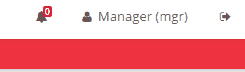
Sometimes we need to show an advice in the screen to notice users that something has happened in the back-end such as a new entry in the database or similar. We are going to explain how to add two class names ("animated" and "faa-slow" to set the animated speed) to an HTML element to animate a bell icon and show a number over the icon that represents a number of errors in the application. By pressing this button the bell stops the animation and shows a dialog with a grid showing the error details.
Definition of the screen elements
First we must define the HTML element in the screen xml, in this case an "info-button" element with an attribute "icon" with a "bell" value and a "unit" attribute. This last attribute will represent the number of errors in the application.
  <info-button style="nav-icon-btn-danger" title="BUTTON_NOTIFICATIONS" icon="bell" id="Warnings" unit="">
    ...
  </info-button>
The following step is to add the action to stop the bell animation (removing the class name) and show the dialog.
  <info-button style="nav-icon-btn-danger" title="BUTTON_NOTIFICATIONS" icon="bell" id="Warnings" unit="">
    <button-action type="remove-class" target-action="animated faa-slow" target="#Warnings .fa-bell" />
    <button-action type="dialog" target="MessageWarnings" />
  </info-button>
The first button-action removes the "animated" and "faa-slow" class names from the HTML element pointed in the "target" attribute, in this case the element with class name "fa-bell" inside the element with "Warnings" id.
The second button-action opens the dialog with the "MessageWarnings" id.
This actions are triggered when the user click in the button.
Now we must add the required dependencies to show the numbers of errors and add the "animated" and "faa-slow" class names. This actions must run when the users enter in the screen or log in to the application so we are going to add an aditional action.
<info-button style="nav-icon-btn-danger" title="BUTTON_NOTIFICATIONS" icon="bell" id="Warnings" unit="">
  <button-action type="remove-class" target-action="animated faa-slow" target="#Warnings .fa-bell" />
  <button-action type="dialog" target="MessageWarnings" />
  <dependency source-type="launcher" target-type="unit" target-action="notification" initial="true">
    <dependency-element id="NotificationNumber" alias="notification"/>
  </dependency>
  <dependency>
   <dependency-element id="NotificationNumber" attribute="value" condition="ne" value="0" />
   <dependency-action type="add-class" target-action="animated faa-slow" target="#Warnings .fa-bell" />
  </dependency>
</info-button>
The first dependency is a "launcher" type that runs when the user enters in the screen where this element is defined thanks to the "initial" attribute set to "true". The dependency, points to the "unit" attribute of the info-button and depends on an element with a "NotificationNumber" id represented in the "dependency-element" tag. This new element will be created in following steps.
The second dependency is an "action" type. This action will be triggered when the value of the "dependency-element" (the element with a "NotificationNumber" id) is not equal (ne) to zero. This is represented with the following attributes: attribute="value" condition="ne" value="0". The action for this dependency is an "add-class" type so when this action runs, a class name will be added to an element. This action points to the element with class name "fa-bell" inside the element with "Warnings" id ("target" attribute in the dependecy-action tag) so this element will receive the class name described in the "target-action" attribute ("animated faa-slow").
Now we are going to define the dependency element "NotificationNumber". This element will be a hidden criteria and has an "initial-load" attribute defined to "value" and a "target-action" that points to a query that must be defined in the "Queries.xml" in AWE.
<criteria id="NotificationNumber" component="hidden" initial-load="value" target-action="getNotificationErrors" />
And last but not least the dialog definition.
<dialog id="MessageWarnings" modal="true" style="modal-lg" label="SCREEN_TEXT_WARNINGS" icon="exclamation-triangle" help="HELP_SCREEN_TEXT_PRINT_EMAIL">
  <tag type="div" style="modal-body row">
    <window label="BUTTON_NOTIFICATIONS" icon="bell" expandible="vertical">
      <grid id="GridMessageWarning" style="height-lg" max="50" server-action="data-silent" target-action="getErrorMessageInfo" autoload="true" autorefresh="30">
        ...
        columns definition
        ...
      </grid>
    </window>
  </tag>
</dialog>
At this point we created all the necesary elements in the screen. The following step is to define the queries that fetch the data from the database.
Queries
In the "Queries.xml" file we must define the following tags:
<query id="getErrorMessageInfo" service="getErrorMessageInfo"/>
<query id="getNotificationErrors" service="getErrorMessageInfo">
  <field id="errors" alias="value" />
  <field id="errors" alias="label" />
</query>
The first query points to a service called "getErrorMessageInfo" defined in the "Services.xml" file in AWE. This query will be launched by the grid created in the dialog.
The second query points to the same service and expects two values one for a "value" field and other for a "label" field. This query will be launched by the hidden criteria.
Service
Once the queries are defined and points to a service we must create this service. In the "Services.xml" file we must define the following tags:
<service id="getErrorMessageInfo">
  <java classname="com.isban.smgmi.web.controller.ErrorMessageController" method="getErrorMessageInfo">
  </java>
</service>
This service launch the "getErrorMessageInfo" method in the "com.isban.smgmi.web.controller.ErrorMessageController" class.
Java
In the Controller we must create the "getErrorMessageInfo" method and must return a ServiceData object. This controller must call to a Manager class.
public class ErrorMessageController extends AWEController {
  public ServiceData getErrorMessageInfo() throws AWException {

    // Get event manager
    ErrorMessageManager errorMessageManager = new ErrorMessageManager();

    return errorMessageManager.getErrorMessageInfo();
  }
}
In the Manager definition we must create a fill client action to load data in the dialog grid and a select client action to load data in hidden criteria.
public class ErrorMessageManager extends AWEManager {

  /**
   * Get error info
   *
   * @return
   * @throws AWException
   */
  public ServiceData getErrorMessageInfo() throws AWException {
    ...
          ClientAction fillErrorGrdAction = new ClientAction("fill");
          fillErrorGrdAction.setSilent("true");
          fillErrorGrdAction.setTarget("GridMessageWarning");

          DataList errorGrdParametersDatalist = new DataList();
          Integer rowIndex = 0;
          for (ErrorBean error : errorList) {
            HashMap<String, CellData> parametersRow = new HashMap<String, CellData>();
            parametersRow.put("id", new CellData(rowIndex));

            ...
            // add columns data
            ...

            errorGrdParametersDatalist.getRows().add(parametersRow);
            rowIndex++;
          }
          // Set records
          errorGrdParametersDatalist.setRecords(rowIndex);

          fillErrorGrdAction.addParameter("datalist", errorGrdParametersDatalist);

          // Notification Number
          ClientAction selectCrtNotificationNumberAction = new ClientAction("select");
          selectCrtNotificationNumberAction.setTarget("NotificationNumber");
          selectCrtNotificationNumberAction.setSilent("true");

          errorListSize = errorList.size();
          ArrayNode notifNumberArrayNode = JsonNodeFactory.instance.arrayNode();
          notifNumberArrayNode.add(String.valueOf(errorListSize));
          selectCrtNotificationNumberAction.addParameter("values", new CellData(notifNumberArrayNode));

          // Adds clients actions
          serviceData.addClientAction(selectCrtNotificationNumberAction);
          serviceData.addClientAction(fillErrorGrdAction);
    ...
  }