Accordion
An accordion is a layout component that allows to organize the content in different sections that can be collapsed or expanded. Inside its panels, it allows to have the same content as a window or a tag element, even nested accordions.
XML skeleton
<accordion id="[accordion-identifier]" ...>
  <accordion-item... />
  <dependency... />
</accordion>
Accordion structure
<accordion id="[accordion-identifier]" selected="[id-selected]" autocollapse="[accordion-autocollapse]" style="[accordion-style]">
...
</accordion>
Accordion attributes
| Attribute | Use | Type | Description | Values |
|---|---|---|---|---|
| id | Required | String | Accordion identifier. For reference purposes | |
| autocollapse | Optional | String | If set to "true" only one accordion item can stay opened at a time | true or false (default is true) |
| selected | Optional | String | If we want an accordion item to be opened at the beginning, set its ID here | |
| style | Optional | String | Grid CSS classes | We can use panel-group-[type] and panel-group-dark classes to style (type can be the usual danger, success, etc. values) |
Accordion Item structure
<accordion-item id="[accordion-item-identifier]" label="[accordion-item-label]"
style="[accordion-item-style]">
...
</accordion-item>
Accordion Item attributes
| Attribute | Use | Type | Description | Values |
|---|---|---|---|---|
| id | Required | String | Accordion item identifier. For reference purposes | |
| label | Required | String | Text to be placed inside of the header | Note: You can use i18n files (locales) |
| style | Optional | String | Grid CSS classes |
Dependencies
If we want to collapse or expand an accordion item using a dependency, we must use one that modifies the attribute selected setting the ID of the item (if it's expanded it will collapse and viceversa)
<dependency target-type="attribute" target-action="selected" value="[child-id]">
...
</dependency>
Examples
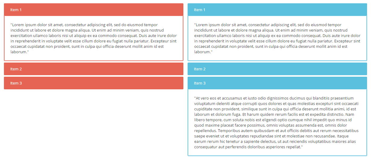
Below we can see the difference between having the autocollapse attribute as true (left) or false (right)
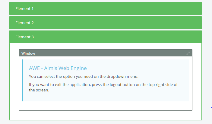
Below an accordion item holding a window with an include
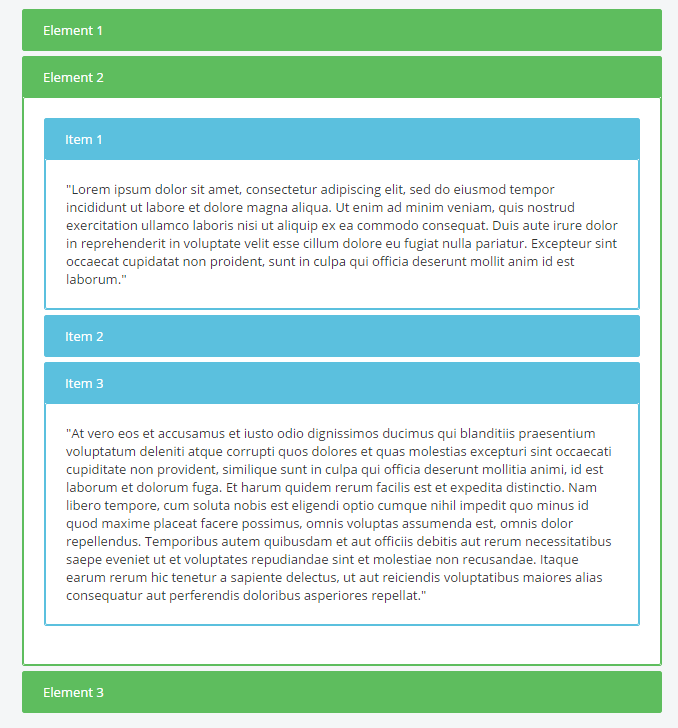
And this would be a full accordion structure example
<accordion id="acc2" autocollapse="false" style="panel-group-info">
    <accordion-item id="acc2-1" label="Item 1">
        <tag>
            <text>
                "Lorem ipsum ...  laborum."
            </text>
        </tag>
    </accordion-item>
    <accordion-item id="acc2-2" label="Item 2">
        <tag>
            <text>
                "Sed ut ... pariatur?"
            </text>
        </tag>
    </accordion-item>
    <accordion-item id="acc2-3" label="Item 3">
        <tag>
            <text>
                "At vero ... repellat."
            </text>
        </tag>
    </accordion-item>
</accordion>