awe-102 Windows design
In this tutorial we will learn how to create screens with AWE and to layout the components needed for the screen as we wish.
Generating a screen
Once the development has begun, the easiest way to design a new screen is copying a similar one and changing what we are interested in. For an initial development, we can copy already developed AWE screens.
Another option is to create an empty XML file and add the tags as we need them.
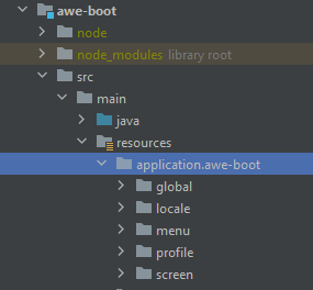
The folder where we will include the screen will be screen, inside of our project's folder:
application # root directory of your application
├── src
│   └── main
|       └── java
|       └── resources
|       |   └── application.[App ID] # xml directory
|       |       ├── global
|       |       ├── locale
|       |       ├── menu
|       |       ├── profile
|       |       └── screen
|       ├── ...
├── pom.xml
├── ...
Screen file creation
The structure of an initial window is as follows:
<screen xmlns:xsi="http://www.w3.org/2001/XMLSchema-instance" xsi:noNamespaceSchemaLocation="https://aweframework.gitlab.io/awe/docs/schemas/screen.xsd" template="window" label="SCREEN_TITLE_USR" help="HELP_SCREEN_TITLE_USR" keep-criteria="true">
  <tag source="buttons">
    ...
  </tag>
  <tag source="center">
    ...
  </tag>
  <tag source="hidden">
    ...
  </tag>
</screen>
In this example you can find several items:
screentag: Is the tag that defines a screen. It has several mandatory attributes likexmlns:xsiandxsi:noNamespaceSchemaLocationthat define the validation schema to be used with the screen, along with other attributes that will be defined later.tagtags withsourceattribute: Each AWE window uses a template (defined in attributetemplate) and every template has som entrypoints defined (source). Everything defined inside atagtag with asourceattribute defined is included in the corresponding entrypoint of the template.
Other attributes of screen tag are:
template(mandatory): is the template que are going to use. The template decides the initial format that we are going to work with. At this moment there are only two templates: full and window (check Screen areas).label(mandatory) is a locale that dictates the title of the screen (it will appear in the upper part of the browser).help(optional) is a locale that will hold an explanation of what the screen does (afterwards, this information will be available for visiting in screen's help context).
There are many more attributes available for the tags (check links of screen and tag)
Locales
Inside of locale folder of our AWE project, we will find a file with format Locale-[LANGUAGE].xml with all text translated for each language that should be used within the application. Each text has an identifier, that will be called locale from now on.
Locale files have the following format:
<locales xmlns:xsi="http://www.w3.org/2001/XMLSchema-instance" xsi:noNamespaceSchemaLocation="https://aweframework.gitlab.io/awe/docs/schemas/locale.xsd">
  ...
  <locale name="LOCALE_IDENTIFIER" value="Locale text"/>
  ...
</locales>
Every time we add a new locale, is necessary to insert it manually alphabetically ordered by identifier, and in every language defined in the application.
To improve the addition of new locales, a developer module has been developed, we will talk about it later and it helps a lot with this task.
Adding file to menu
Inside of menu folder, there are two files: public.xml and private.xml.
public.xml file contains the list of options that can be accessed without authentication within the application. private.xml file contains those options that do need authentication.
File format is as follows:
<menu screen="home_horizontal" xmlns:xsi="http://www.w3.org/2001/XMLSchema-instance"
  xsi:noNamespaceSchemaLocation="https://aweframework.gitlab.io/awe/docs/schemas/menu.xsd" context="screen/private/home" default-action="screen">
  <option name="information" screen="info" invisible="true" />
  <option name="tools" label="MENU_TOOLS" icon="wrench">
    <option name="sites" label="MENU_TOOLS_SITES" screen="Sit" icon="sitemap">
      <option name="new_site" screen="SitNew" invisible="true"/>
      <option name="update_site" screen="SitUpd" invisible="true"/>
      <option name="view_site" screen="SitViw" invisible="true"/>
    </option>
    <option name="modules" label="MENU_TOOLS_MODULES" screen="Mod" icon="puzzle-piece">
      <option name="new_module" screen="ModNew" invisible="true" />
      <option name="update_module" screen="ModUpd" invisible="true" />
      <option name="view_module" screen="ModViw" invisible="true" />
    </option>
  </option>
</menu>
Options included inside other options are considered to be in a lower level, so options at top level can be found in the main toolbar and their children are hosted in submenus.
To add a new option, we find the spot where we want it to be shown and we add a line with the name of the option (name should be unique), filename that holds the screen without the .xml suffix (screen). Also, we can add a locale (label) and an icon (icon).
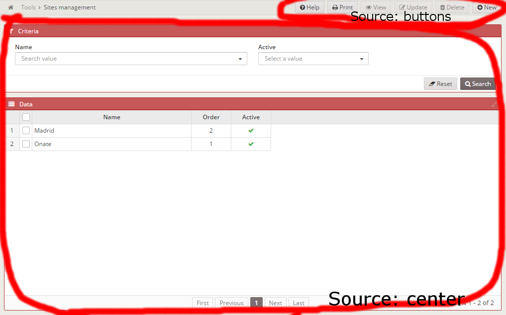
Screen areas
Given the template selected, several areas (sources) can be used in a screen:
- full template only has 2 sources: center and hidden. It does not have a defined structure. Source center defines the complete sctructure of the template. Everything included in source hidden will not be visible.
- window template has 4 sources: center, buttons, modal and hidden. Source buttons is useful to include the main buttons of the screen (those that affect the whole content). Source center will hold window's content. Source modal is used for defining modal dialogs in the screen. Finally, source inside hidden we will define those components that should not be shown.
Adding HTML tags
tag tag can be translated into any HTML tag simply by specifying it in type attribute:
<tag type="div" style="my-class" id="test"></tag>
This will result into:
<div class="my-class" id="test"></div>
For more info about tags click here 🔗.
Adding a window component
One of most basic components in AWE is the window:
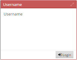
It is useful for defining different logic areas of the screen and group components. Also, it has a button area interesting for executing actions over other windows (or even the same).
It also has a button for maximizing/restoring it, allowing the user to access to more data in a single sight.
AWE window's structure is as follows:
<window label="SCREEN_TEXT_CRITERIA" icon="filter">
  <tag type="div" style="panel-body">...</tag>
  <tag type="div" style="panel-footer">
    <tag type="div" style="pull-right">...</tag>
  </tag>
</window>
Inside of tag with style panel-body we would include the componets (criteria) that we would like to show. tag with style panel-footer allows to create an area where buttons could be added (to align to the right, inside of tag with style pull-right).
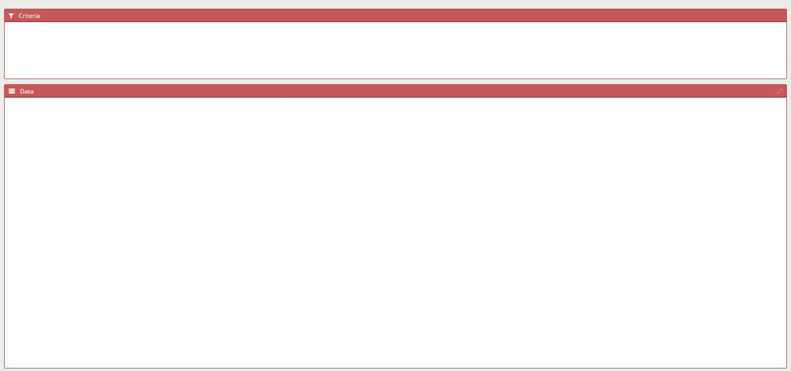
If we want to include a grid or a chart, is not necessary to include the tags with panel-body and panel-footer, we can add those components directly:
<window label="SCREEN_TEXT_DATA" icon="list" maximize="true">
  <grid id="miGrid" ...>
    ...
  </grid>
</window>
For more info about windows, go check here.
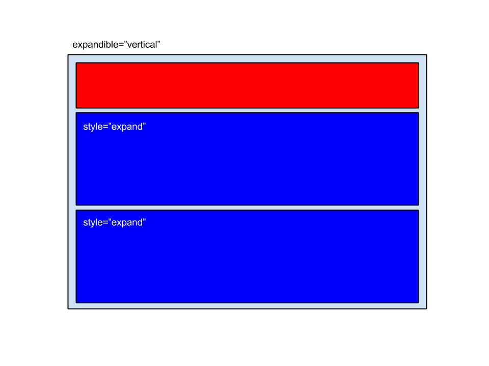
Expandible and static
AWE is able to fill all the space offered by a screen by expanding certain components. For this, is necessary to denote in father's tag how we want the children to be expanded and in each child.
This way, if we have a screen with two windows:
<tag source="center" type="div" expandible="vertical">
    <window label="SCREEN_TEXT_CRITERIA">
       ...
    </window>
    <window label="SCREEN_TEXT_DATA" style="expand">
      ...
    </window>
</tag>
In the father
<tag source="center" type="div" expandible="vertical">
we say that we want the children to expand vertically and in one child
<window label="SCREEN_TEXT_DATA" style="expand">
we say we want it to be expanded. It would be something like this:
Note: The children without expand style will keep their size, given the components they hold.
If there is more than one child expanding, the available space will be divided among all children expanding in the following way:
 Layouts can also be combined to form different structures:
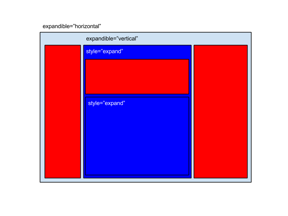
For more info about layouts check here 🔗.
Buttons
Buttons are one of the basic components in AWE. Button's definition es very simple muy powerful at the same time. Inside each button we can invoke one or several actions that affect the behaviour of the defined screen.
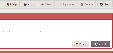
To include a button, we will use the button tag:
<button label="BUTTON_NEW" icon="plus" id="ButNew">
  <button-action type="screen" target="newWindow" />
</button>
In this example, when you click the button the application will navigate to the window whose option has as name newWindow.
<button button-type="submit" label="BUTTON_SEARCH" icon="search" id="ButSch" help="HELP_SEARCH_BUTTON">
  <button-action type="validate" />
  <button-action type="filter" target="idGrid" />
</button>
This other button will validate the criteria defined first, and if there is no error, it will launch an action of type filter over the component idGrid, what will force a reload of the component's data.
For more info about buttons click here 🔗.
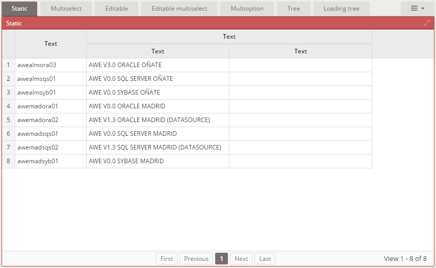
Tabs
Inside of a screen we may want to have the information distributed accross tabs. In AWE there is the tab component (not to be mistaken with tag) and tabcontainers inside tabs to hold the content.
<tab id="tabId" initial-load="[initial-load]" target-action="[enumerated-query-identifier]">
  <tabcontainer id="idTabcontainer1">
  ...
  </tabcontainer>
  ...
  <tabcontainer id="idTabcontainerN">
  ...
  </tabcontainer>
</tab>
Withing the tab component we say where would we like to take the data from, wether from an enumerated (initial-load="enum") or from a query (initial-load="query"). In both cases, the field label corresponds to the text shown in the tab and the field value to the identifier of the tabcontainer associated to the tab.
Note: Tabs work as criteria, they are a list of values with a selected value. For more info on tabs click here 🔗.
Wizard
Wizards in AWE work in a similar way to tabs. wizard component contains one or more components of type wizard-pane, that will hold the content that belongs to each step of the wizard.
<wizard id="idWizard" initial-load="[initial-load]" target-action="[enumerated-query-identifier]" label="LOCALE">
  <wizard-panel id="idPanel1">
     ...
  </wizard-panel>
  <wizard-panel id="idPanel2">
     ...
  </wizard-panel>
</wizard>
In the wizard component we specify where we want to obtain the data from, wether an enumerated (initial-load="enum") or from a query (initial-load="query"). In both cases, the field label corresponds to the text shown as the step description and the field value to the identifier of the wizard-panel associated to the step.
The attribute label will hold a locale with the text shown as a title in every step, followed by the step number.
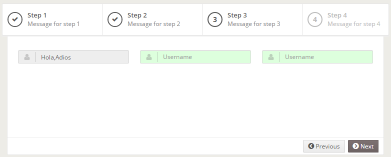
Also, the wizard defines a series of actions that can be invoked from a button to move forward or backwards.
<button label="BUTTON_PREVIOUS" icon="chevron-circle-left" id="BkStep1">
  <button-action type="prev-step" target="idWizard"/>
</button>
<button label="BUTTON_NEXT" icon="chevron-circle-right" id="FwStep3" style="btn-primary">
  <button-action type="validate" target="idPanel2"/>
  <button-action type="next-step" target="idWizard"/>
</button>
Note: Wizards, as tabs, work as a criteria, they are a list of values with a selected one. For more info on wizards, check here 🔗.
Dialogs
A dialog in AWE is a window shown over the existing content, useful for completing additional information, consulting extra data or to perform a complementary action to the existing in the screen.
To define a dialog, we use the dialog tag:
<dialog id="idDialog" modal="true" style="normal" label="TITLE_DIALOG" icon="print" help="HELP_DIALOG">
  <tag type="div" style="modal-body row">
    ...
  </tag>
  <tag type="div" style="modal-footer">
    ...
  </tag>
</dialog>
dialogs, like windows, have specific styles to define its content: modal-body will hold the content of the dialog and modal-footer its buttons.
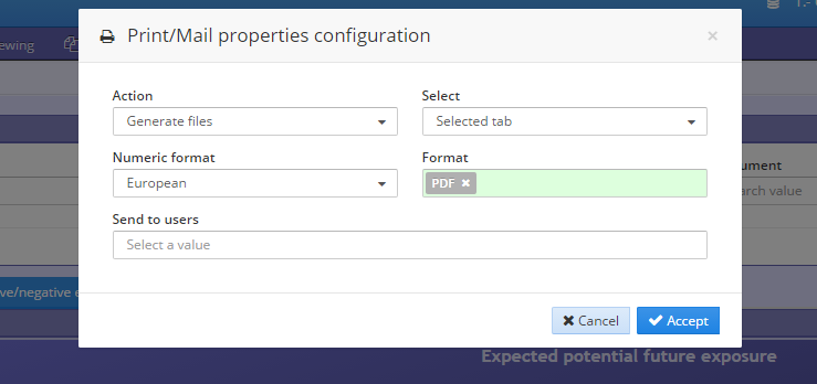
The right way to add a dialog to a screen with the window template is using the source modal.
To open a dialog, it is necessary to invoke a dialog action as shown:
<button id="openDialog" label="BUTTON_OPEN_DIALOG" icon="floppy-o">
   <button-action type="dialog" target="idDialog" />
</button>
And inside of the dialod, we can include buttons as follows to accept and cancel:
<button label="BUTTON_CANCEL" icon="close" id="ButDiaCan">
  <button-action type="close" target="idDialog" />
</button>
<button label="BUTTON_ACCEPT" icon="check" id="ButDiaVal" button-type="submit">
  <button-action type="server" server-action="maintain" target-action="storeData" />
  <button-action type="close" target="idDialog" />
</button>
For further information about dialogs click here 🔗.
Including parts of other screens
In some ocasions, we will have the need to reuse a group of components in several screens (like a dialog, for instance). To achieve this, AWE provides a tag called include that allows to include all the content of a screen inside of another:
<include target-screen="screenName" target-source="sourceName" />
In this case, we would include the content of sourceName from the screen screenName.xml inside of our screen.
It is important to know that when using an include, there should be no identifier of the content included equivalent to any identifier of our current screen, because it may crash.
For more information about includes click here🔗.