awe-102 Windows design
This tutorial continues from awe-101 and shows the first practical path for building a screen in AWE: create the screen XML, add the labels it needs, place it in the menu, and shape the layout with the main container components.
Quick path
- Create a screen XML file in
application/<your-acronym>/screen/. - Define the basic
<screen>structure and choose a template. - Add the locales used by the screen title and labels.
- Register the screen in
public.xmlorprivate.xml. - Use windows, layout tags, buttons, and dialogs to organize the page.
Before you start
You should already be comfortable with the generated application structure from awe-101.
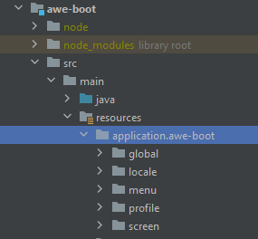
Keep these folders in mind:
src/main/resources/application/<your-acronym>/
├── global/
├── locale/
├── menu/
├── profile/
└── screen/
The screen itself lives in screen/, but it usually depends on locale/ for text and menu/ so users can reach it.
Step 1: Create the screen file
The fastest safe path is usually to copy a similar screen and simplify it. If you are starting from scratch, create a new XML file under screen/ and begin with the smallest valid skeleton.
<screen xmlns:xsi="http://www.w3.org/2001/XMLSchema-instance"
        xsi:noNamespaceSchemaLocation="https://aweframework.gitlab.io/awe/docs/schemas/screen.xsd"
        template="window"
        label="SCREEN_TITLE_USR"
        help="HELP_SCREEN_TITLE_USR"
        keep-criteria="true">
  <tag source="buttons">
    ...
  </tag>
  <tag source="center">
    ...
  </tag>
  <tag source="hidden">
    ...
  </tag>
</screen>
What matters first:
templatechooses the overall screen structure.labelpoints to the locale used as the screen title.helpoptionally points to help text for the screen.tag source="..."inserts content into the template entry points.
Use the API reference when you need the full attribute list instead of memorizing it:
Step 2: Add the screen text in locale files
Every visible label should come from the locale files in locale/Locale-<LANG>.xml.
<locales xmlns:xsi="http://www.w3.org/2001/XMLSchema-instance"
         xsi:noNamespaceSchemaLocation="https://aweframework.gitlab.io/awe/docs/schemas/locale.xsd">
  ...
  <locale name="LOCALE_IDENTIFIER" value="Locale text"/>
  ...
</locales>
Typical additions for a new screen:
- one locale for the screen title
- one locale for the help text, if you use it
- one locale for each button or visible section label you introduce
If your project workflow still expects locales to stay alphabetically ordered, keep that convention consistent across languages.
If you want tooling help for locale maintenance later, see awe-105.
Step 3: Add the screen to the menu
Users will not reach the screen until it appears in menu/public.xml or menu/private.xml.
<menu screen="home_horizontal"
      xmlns:xsi="http://www.w3.org/2001/XMLSchema-instance"
      xsi:noNamespaceSchemaLocation="https://aweframework.gitlab.io/awe/docs/schemas/menu.xsd"
      context="screen/private/home"
      default-action="screen">
  <option name="tools" label="MENU_TOOLS" icon="wrench">
    <option name="my-screen" label="MENU_MY_SCREEN" screen="my-screen" icon="desktop" />
  </option>
</menu>
Keep this mapping straight:
name: unique menu option identifierlabel: locale shown to the userscreen: screen file name without.xml
Top-level options appear in the main toolbar. Nested options appear in submenus.
Step 4: Choose the right screen areas
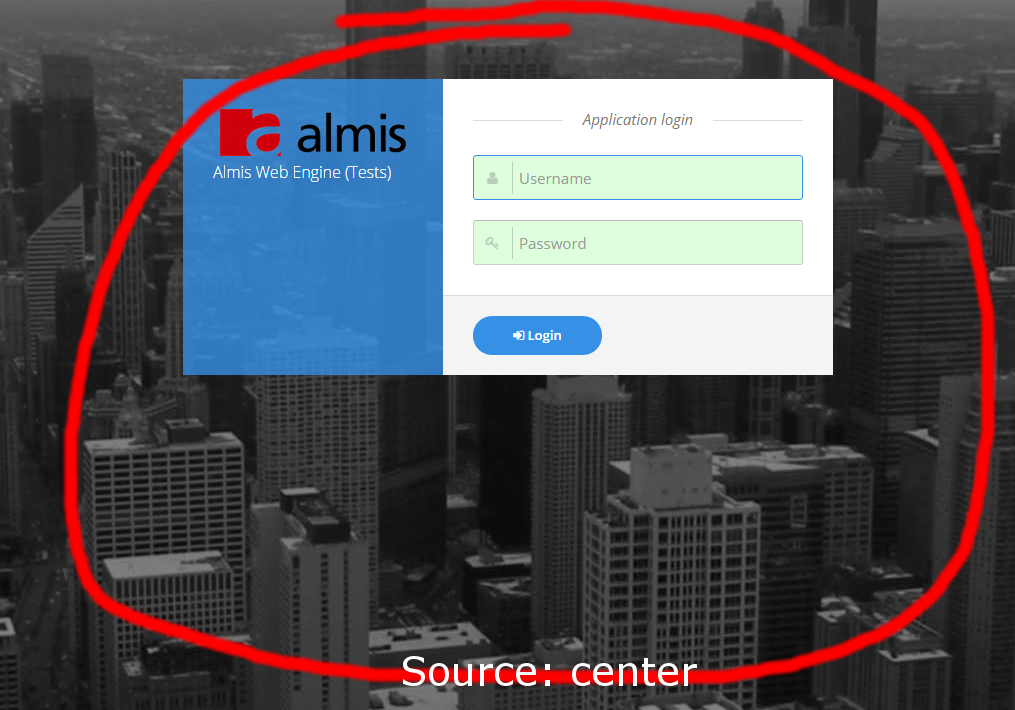
The template determines which source areas are available.
| Template | Main use | Available sources |
|---|---|---|
full | Free-form layouts | center, hidden |
window | Most standard application screens | center, buttons, modal, hidden |
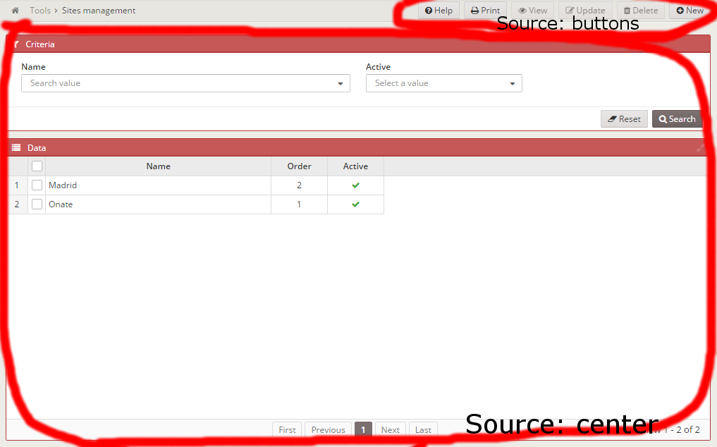
Practical rule:
- Start with
windowunless you clearly need a custom page composition. - Use
buttonsfor screen-wide actions. - Use
centerfor the main content. - Use
modalfor dialogs. - Use
hiddenfor messages and internal helper components.
Step 5: Build the layout with the core components
Add plain HTML structure with tag
tag can render standard HTML elements by setting its type attribute.
<tag type="div" style="my-class" id="test"></tag>
This becomes:
<div class="my-class" id="test"></div>
See the tags API when you need the exhaustive options.
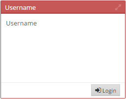
Group related content with window
window is the most common visual container in AWE screens.
<window label="SCREEN_TEXT_CRITERIA" icon="filter">
  <tag type="div" style="panel-body">...</tag>
  <tag type="div" style="panel-footer">
    <tag type="div" style="pull-right">...</tag>
  </tag>
</window>
Use it to separate logical areas such as filters, data, or summary panels.
If the window contains a grid or chart, you can usually place that component directly inside the window:
<window label="SCREEN_TEXT_DATA" icon="list" maximize="true">
  <grid id="myGrid" ...>
    ...
  </grid>
</window>
Control expansion and static areas
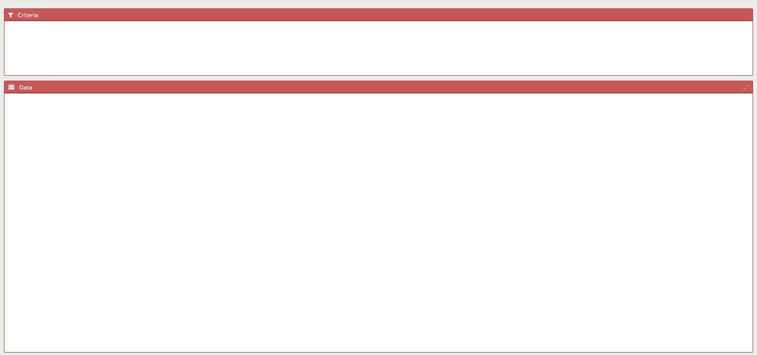
To make a child fill the available space, mark the parent as expandable and the child as expand.
<tag source="center" type="div" expandible="vertical">
  <window label="SCREEN_TEXT_CRITERIA">
    ...
  </window>
  <window label="SCREEN_TEXT_DATA" style="expand">
    ...
  </window>
</tag>
This pattern is common when you want a fixed filter area above a data area that grows with the screen.
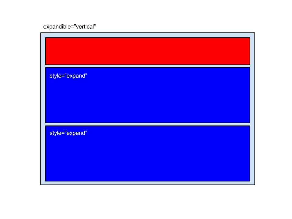
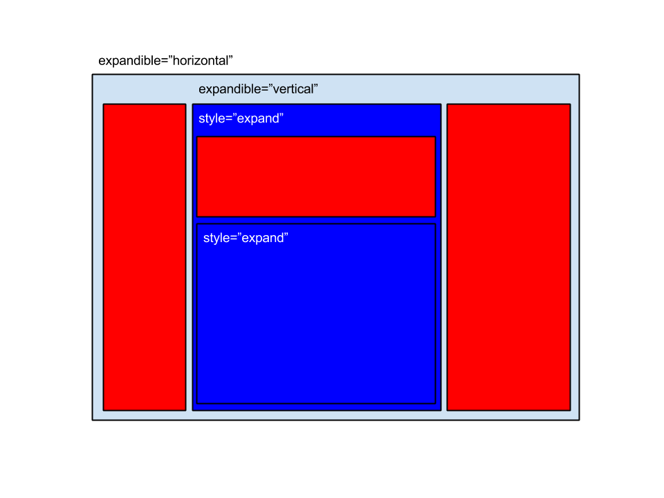
See the layout API for the full set of layout combinations.
Step 6: Add the main interactive containers
Buttons
Buttons are the usual entry point for screen actions.
<button label="BUTTON_NEW" icon="plus" id="ButNew">
  <button-action type="screen" target="newWindow" />
</button>
<button button-type="submit" label="BUTTON_SEARCH" icon="search" id="ButSch" help="HELP_SEARCH_BUTTON">
  <button-action type="validate" />
  <button-action type="filter" target="idGrid" />
</button>
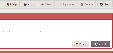
The second pattern is the common search flow: validate criteria, then reload the target grid.
More in the button API.
Tabs
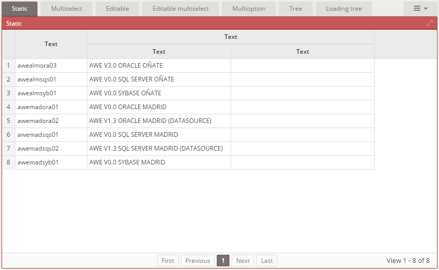
Use tabs when one screen contains clearly separated sections.
<tab id="tabId" initial-load="[initial-load]" target-action="[enumerated-query-identifier]">
  <tabcontainer id="idTabcontainer1">
    ...
  </tabcontainer>
  <tabcontainer id="idTabcontainerN">
    ...
  </tabcontainer>
</tab>
Tabs usually load their labels and values from an enumerated or a query. For exhaustive variants, use the tab and tabcontainer API.
Wizards
Use wizards when the user should progress through a sequence of steps.
<wizard id="idWizard" initial-load="[initial-load]" target-action="[enumerated-query-identifier]" label="LOCALE">
  <wizard-panel id="idPanel1">
    ...
  </wizard-panel>
  <wizard-panel id="idPanel2">
    ...
  </wizard-panel>
</wizard>
Navigation is usually driven by buttons such as:
<button label="BUTTON_PREVIOUS" icon="chevron-circle-left" id="BkStep1">
  <button-action type="prev-step" target="idWizard"/>
</button>
<button label="BUTTON_NEXT" icon="chevron-circle-right" id="FwStep3" style="btn-primary">
  <button-action type="validate" target="idPanel2"/>
  <button-action type="next-step" target="idWizard"/>
</button>
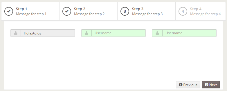
More in the wizard API.
Dialogs
Dialogs are useful for focused secondary actions or extra information.
<dialog id="idDialog" modal="true" style="normal" label="TITLE_DIALOG" icon="print" help="HELP_DIALOG">
  <tag type="div" style="modal-body row">
    ...
  </tag>
  <tag type="div" style="modal-footer">
    ...
  </tag>
</dialog>
In window templates, place dialogs under source="modal" and open them with a button action:
<button id="openDialog" label="BUTTON_OPEN_DIALOG" icon="floppy-o">
  <button-action type="dialog" target="idDialog" />
</button>
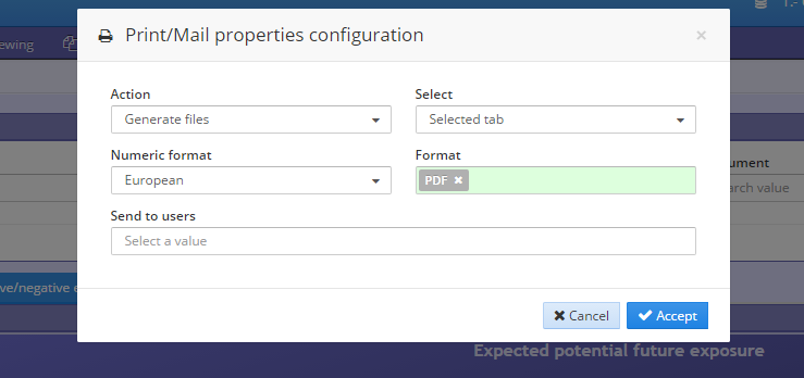
See the dialog API.
Includes
Use include when you want to reuse a source from another screen instead of duplicating the same fragment.
<include target-screen="screenName" target-source="sourceName" />
This is helpful for shared dialogs or repeated UI fragments.
Avoid identifier collisions between the included fragment and the current screen. Reused content with duplicate ids can break the screen.
See the include API.
What to do next
Once the screen shell exists, the next typical step is adding input and data components: