awe-103 Criteria, grids and charts
This tutorial focuses on the most common data-facing screen elements in AWE: criteria for input, grids for tabular results, and charts for visual summaries. Treat this page as the practical path. When you need every variant or every attribute, jump to the API reference instead of treating the tutorial like a component catalog.
Quick path
- Start with a small set of criteria.
- Bind those criteria to a query-backed grid.
- Add validation and selection components only where they improve the flow.
- Introduce charts after the data path is already clear.
Before you start
You should already know how to create a screen shell from awe-102.
The common path looks like this:
criteria -> query or enumerated -> grid or chart -> actions/dependencies
If you are unsure about data sources, keep awe-104 open while reading this page.
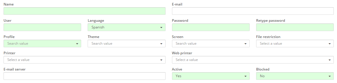
Step 1: Start with criteria
Criteria collect input, filter data, and hold values that later actions send to the server.
Use the smallest useful criterion set first. A screen with three well-chosen criteria is usually easier to understand than one with every possible field type.
Criteria XML shape
<criteria ... />
Full example shape:
<screen xmlns:xsi="http://www.w3.org/2001/XMLSchema-instance"
        xsi:noNamespaceSchemaLocation="https://aweframework.gitlab.io/awe/docs/schemas/screen.xsd"
        template="window"
        label="SCREEN_TITLE_USR"
        help="HELP_SCREEN_TITLE_USR"
        keep-criteria="true">
  <tag>
    <criteria id="[identifier]" component="[component]" label="[label]" placeholder="[placeholder]" style="[classes]"
              initial-load="[initial-load]" server-action="[server-action]" target-action="[target-action]"
              variable="[variable]" value="[value]" session="[session]" property="[property]"
              validation="[validation]" readonly="[read-only]" size="[size]" unit="[unit]" icon="[icon]"
              printable="[printable]" help="[help]" help-image="[help-image]"
              optional="[optional]" area-rows="[area-rows]" number-format="[number-format]" capitalize="[capitalize]"
              strict="[strict]" checked="[checked]" group="[group]" show-slider="[slider]" destination="[destination]">
      <dependency/>
    </criteria>
  </tag>
</screen>
Only two attributes are always fundamental:
id: internal referencecomponent: criterion type
For the full attribute reference, use:
The base pattern: text criteria
Text criteria are the simplest way to learn the model.
<criteria id="TextCrt" component="text" label="Text" style="col-xs-12 col-sm-6 col-md-3 col-lg-2" />
This gives you a text field whose submitted value is available under the criterion id unless you remap it with variable.
Useful first refinements:
Default value
<criteria id="TextCrt" component="text" label="Text" value="Test text" style="col-xs-12 col-sm-6 col-md-3 col-lg-2" />

Placeholder
<criteria id="TextCrt" component="text" label="Text" placeholder="Introduce a text" style="col-xs-12 col-sm-6 col-md-3 col-lg-2" />

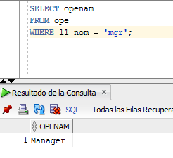
Initial value from a query
Use this only when the initial screen load really depends on server data.
Screen
<criteria id="TextCrt" component="text" label="Text" initial-load="value" target-action="GetOpe" style="col-xs-12 col-sm-6 col-md-3 col-lg-2" />
Query
<query id="GetOpe">
  <table id="ope" alias="ope" />
  <field id="openam" alias="label" />
  <field id="openam" alias="value" />
  <where>
    <and>
      <filter left-field="l1_nom" condition="eq" right-variable="Usr" ignorecase="true" />
    </and>
  </where>
  <variable id="Usr" type="STRING" value="mgr" />
</query>

Value from a previous screen
When navigating between screens, use variable to recover a value already present in the previous context.
Validation
Use validation to protect the happy path instead of pushing obvious errors to the server.
Required example:
<criteria id="TextCrt" component="text" label="Text" validation="required" style="col-xs-12 col-sm-6 col-md-3 col-lg-2" />
<button button-type="submit" label="BUTTON_SEARCH" icon="search" id="ButSch" help="HELP_SEARCH_BUTTON">
  <button-action type="validate" />
</button>

Minimum length example:
<criteria id="TextCrt" component="text" label="Text" validation="{minlength:10}" style="col-xs-12 col-sm-6 col-md-3 col-lg-2" />

For the full validation set, use the criteria API.
Read-only, size, unit, and icon
<criteria id="TextCrt" component="text" label="Text" readonly="true" style="col-xs-12 col-sm-6 col-md-3 col-lg-2" />

<criteria id="TextCrtSM" component="text" label="Text" size="sm" value="size sm" style="col-xs-12 col-sm-6 col-md-3 col-lg-2" />
<criteria id="TextCrtMD" component="text" label="Text" size="md" value="size md" style="col-xs-12 col-sm-6 col-md-3 col-lg-2" />
<criteria id="TextCrtLG" component="text" label="Text" size="lg" value="size lg" style="col-xs-12 col-sm-6 col-md-3 col-lg-2" />

<criteria id="TextCrt" component="text" label="Text" unit="EUR" value="10.000" style="col-xs-12 col-sm-6 col-md-3 col-lg-2" />

<criteria id="TextCrtSM" component="text" label="Text" icon="hand-o-right" value="Test text" style="col-xs-12 col-sm-6 col-md-3 col-lg-2" />

Other common criteria families
Use the families below as a decision guide. Reach for the API docs when you need edge-case attributes.
Text input family
Password:
<criteria id="Identifier" label="Password" component="password" variable="password" style="col-xs-12 col-sm-6 col-md-3 col-lg-2" />
Textarea:
<criteria id="Identifier" label="Textarea" component="textarea" variable="Textarea" style="col-xs-12 col-sm-6 col-lg-6" />
Hidden value:
<criteria id="Identifier" variable="NumberHidden" component="hidden" value="4" />
Read-only display text:
<criteria label="Text" id="TxtViw" variable="ButVal" component="text-view" style="col-xs-6 col-sm-3 col-lg-2" icon="download" />
Relevant references:
Numeric and date inputs
Numeric:
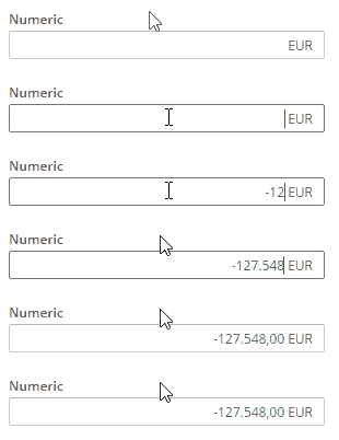
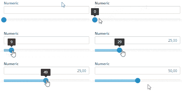
<criteria id="Identifier" label="Numeric" component="numeric" show-slider="true" number-format="{min: 0, max: 100, step: 1, precision: 2, pSign:'s', aPad:true}" style="col-xs-12 col-sm-6 col-md-3 col-lg-2" />
Date:
<criteria label="Date" id="Cal" variable="Cal" component="date" style="col-xs-6 col-sm-3 col-lg-2" validation="{le: {criterion:'CalReq', type: 'date'}}" show-weekends="false" show-future-dates="false" />
Time:
<criteria label="Time" id="Tim" variable="Tim" component="time" style="col-xs-6 col-sm-3 col-lg-2" />
Filtered calendar:
<criteria label="PARAMETER_FILTERED_DATE" id="FilCal" variable="FilCal" component="filtered-calendar" initial-load="query" target-action="FilCalDat" style="col-xs-6 col-sm-3 col-lg-2" validation="{le: {criterion:'FilCalReq', type: 'date'}}" />
Selection inputs
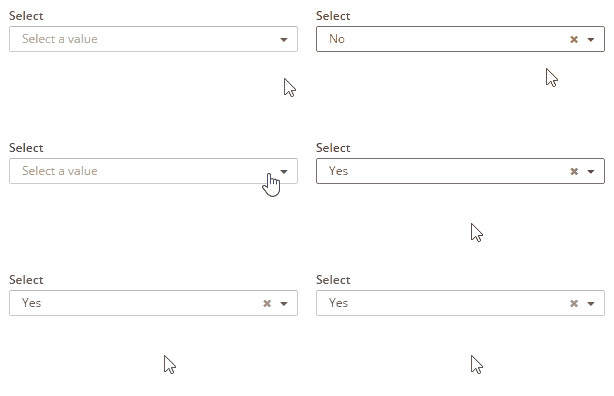
Select:
<criteria id="TextCrtSM" component="select" label="Select" initial-load="enum" target-action="demoEnum" optional="true" style="col-xs-12 col-sm-6 col-md-3 col-lg-2" />
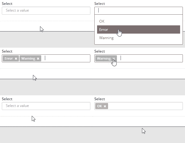
Multiple select:
<criteria id="TextCrtSM" component="select-multiple" label="Select" initial-load="enum" target-action="demoEnum" optional="true" style="col-xs-12 col-sm-6 col-md-3 col-lg-2" />
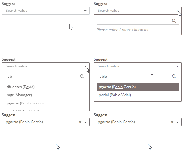
Suggest:
<criteria id="TextCrtSM" component="suggest" label="Select" target-action="getUsers" style="col-xs-12 col-sm-6 col-md-3 col-lg-2" />
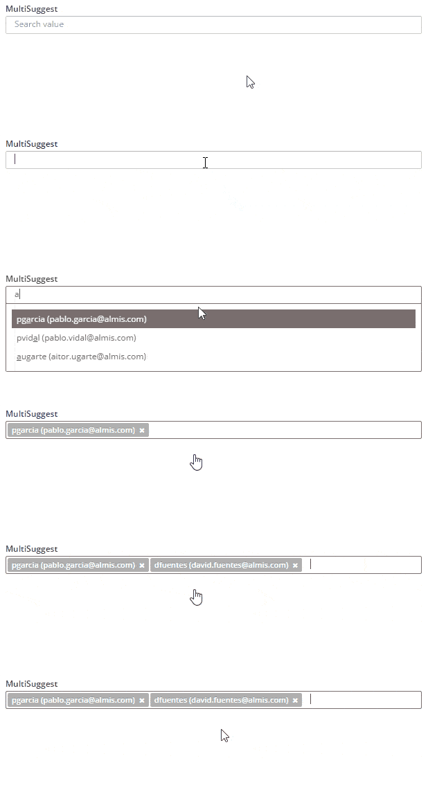
Multiple suggest:
<criteria id="TextCrtSM" component="suggest-multiple" label="Select" target-action="getUsers" style="col-xs-12 col-sm-6 col-md-3 col-lg-2" />
Checkbox group:
<criteria label="Checkbox 1" id="ChkBoxVa1" group="ChkBoxVa" variable="ChkBoxVa1" component="checkbox" style="col-xs-6 col-sm-4 col-lg-2 no-label"/>
<criteria label="Checkbox 2" id="ChkBoxVa2" group="ChkBoxVa" variable="ChkBoxVa2" component="checkbox" style="col-xs-6 col-sm-4 col-lg-2 no-label"/>
Radio group:
<criteria label="Radio 1" id="RadBox1" group="RadBoxGrp1" variable="RadBoxGrp1" component="radio" value="Radio1" style="col-xs-6 col-sm-4 col-lg-2 no-label" validation="required" />
<criteria label="Radio 2" id="RadBox2" group="RadBoxGrp1" variable="RadBoxGrp1" component="radio" value="Radio2" style="col-xs-6 col-sm-4 col-lg-2 no-label" readonly="true" />
Button checkbox:
<criteria label="Checkbox 1" id="ChkBoxVa21" group="ChkBoxVa2" variable="ChkBoxVa21" component="button-checkbox" style="col-xs-2"/>
Button radio:
<criteria label="Radio 1" id="RadBox21" group="RadBoxGrp2" variable="RadBoxGrp2" component="button-radio" value="Radio1" style="col-xs-2" validation="required" />
Special-purpose criteria
Color picker:
<criteria label="Color" id="Col" variable="Col" component="color" style="col-xs-6 col-sm-3 col-lg-2" />
Uploader:
<criteria label="File" id="Upl" variable="Upl" component="uploader" style="col-xs-12 col-sm-6 col-lg-4" />
These are useful, but they are rarely the first thing to add to a screen. Prefer introducing them after the basic form and data flow already work.
Step 2: Bind the screen to a grid
Grids are the main AWE component for result lists. They are typically fed by a query and controlled by criteria plus actions.
<grid id="[grid-identifier]" ...>
  <column ...></column>
  <group-header ...>
    <column ...></column>
  </group-header>
  <button ...> ... </button>
  <context-button ...> ... </context-button>
</grid>
Core structure:
<grid id="[grid-id]" style="[grid-style]" multiselect="[grid-is-multiselect]" checkbox-multiselect="[checkbox-multiselectable]" editable="[grid-is-editable]" send-operations="[grid-is-multioperation]" initial-load="[initial-load]" server-action="[server-action]" target-action="[target-action]" max="[elements-per-page]" pagination-disabled="[pagination-disabled]">
  ...
</grid>
<column label="[column-label]" name="[column-name]" sort-field="[sort-field]" align="[text-align]" charlength="[column-width-chars]" component="[column-component]" >
  <dependency ...> ... </dependency>
</column>
The most important starting attributes are:
idon the gridnameon the columnserver-actionandtarget-actionwhen the grid loads data from the server
See the full reference in the grids API.
Simple grid
<grid id="GrdSta" style="expand" initial-load="query" server-action="data" target-action="QryUniTstId" max="30">
  <column label="PARAMETER_TEXT" name="Als" sort-field="Als" align="left" charlength="20" style="separator" />
  <column label="PARAMETER_TEXT" name="Des" sort-field="Des" align="left" charlength="40" />
  <column label="PARAMETER_TEXT" name="Prg" sort-field="Prg" align="center" charlength="40" component="progress" value="40" server-action="data" target-action="QryChkPrg" printable="false" />
  <column label="PARAMETER_TEXT" name="DwnFil" sort-field="Des" align="left" charlength="50" component="text-view" icon="download" />
  <column label="PARAMETER_TEXT" name="TxtViw" sort-field="Des" align="right" charlength="10" component="text-view" printable="false"/>
  <column label="PARAMETER_TEXT" name="TxtSty" sort-field="Des" align="right" charlength="10" printable="false"/>
</grid>

This is the right first grid shape for most tutorials: query-backed, sortable, paginated, and read-only.
Header grouping
Use group-header when columns are easier to read as a visual block.
<group-header name="GrpHeaCol" label="PARAMETER_TEXT">
  <column label="PARAMETER_TEXT" name="Des" sort-field="Des" align="left" charlength="40" />
  <column label="PARAMETER_TEXT" name="Prg" sort-field="Prg" align="center" charlength="40" component="progress" value="40" server-action="data" target-action="QryChkPrg" printable="false" />
</group-header>
Multiselect, editable, and multioperation grids
Use these only when the user truly needs them:
multiselect="true"when the user acts on multiple rows at onceeditable="true"when inline editing is the best UXsend-operations="true"when one save must batch inserts, updates, and deletes
Examples:
<grid ... multiselect="true" ...>
  ...
</grid>
<grid ... editable="true" ...>
  <button label="BUTTON_NEW" icon="plus-circle" id="ButGrdEdiAdd">
    <button-action type="add-row" target="GrdEdi" silent="true" />
  </button>
  <button label="BUTTON_DELETE" icon="trash" id="ButGrdEdiDel">
    <button-action type="delete-row" target="GrdEdi" silent="true" />
    <dependency source-type="none" target-type="enable" initial="true">
      <dependency-element id="GrdEdi" attribute="selectedRows" condition="eq" value="1" />
    </dependency>
  </button>
</grid>
<grid ... editable="true" send-operations="true" ...>
  ...
</grid>
Important: if grid edits must persist, you still need a server action that calls a maintain.
Tree grids
Tree grids are for hierarchical data, not just for visual variety.
<grid ... treegrid="true" expand-column="TreGrd_Nam" tree-id="TreGrd_id" tree-parent="TreGrd_parent" initial-level="3" ...>
  <column label="PARAMETER_NAME" name="TreGrd_Nam" sort-field="TreGrd_Nam" align="left" sortable="false" charlength="40" />
</grid>
If the hierarchy must also be edited, combine treegrid="true" with editable="true".
Step 3: Add charts after the data path is stable
Charts are useful when the user needs trends, comparisons, or summaries. They are not a replacement for learning the query and grid flow first.
<chart id="[Chart Id]" label="[Chart title]" subtitle="[Chart subtitle]" type="[Type chart]" initial-load="[Initial load]" target-action="[Action]">
  <chart-legend layout="[Layout]" align="[Align]" verticalAlign="[Vertical align]" />
  <x-axis label="[Label X-Axis]" type="[Type axis]"/>
  <y-axis label="[Label Y-Axis]"/>
  <chart-tooltip suffix="[Suffix value]" number-decimals="[Decimal numbers]"/>
  <chart-serie id="[Serie ID]" x-value="[X-Values]" y-value="[Y-value]" label="[Serie label]" />
</chart>
Example:
<chart id="ChrLinTst" label="SCREEN_TEXT_CHART_TITLE_1" subtitle="Subtitulo grafico 1" type="mixed" initial-load="query" target-action="TstChrTwoSrc" zoom-type="xAxis" max="30" help-image="HELP_CHART_IMAGE_1">
  <chart-legend label="Leyenda" />
  <x-axis label="Fechas" type="datetime" />
  <y-axis label="Temperaturas (ºC)" formatter-function="formatCurrencyMagnitude"/>
  <y-axis opposite="true" label="Lluvias (mm)" />
  <chart-tooltip crosshairs="xAxis" suffix=" ºC" number-decimals="3" shared="true"/>
  <chart-serie id="serie-1" y-axis="0" x-value="dates" y-value="serie1" type="column" label="Serie 1" color="#A8E0A6" />
  <chart-serie id="serie-2" y-axis="1" x-value="dates" y-value="serie2" type="spline" label="Serie 2" />
  <context-button id="CtxLinTstRef" label="BUTTON_RELOAD" icon="refresh">
    <button-action type="server" server-action="data" target-action="TstChrTwoSrc" target="ChrLinTst" />
  </context-button>
</chart>
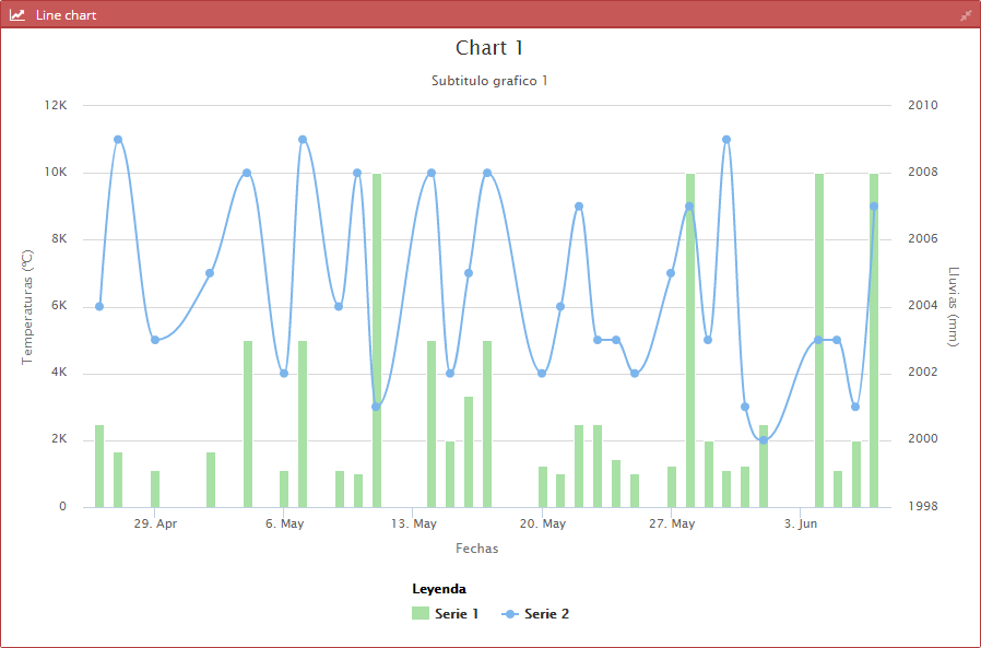
For the full chart model, use the chart API.