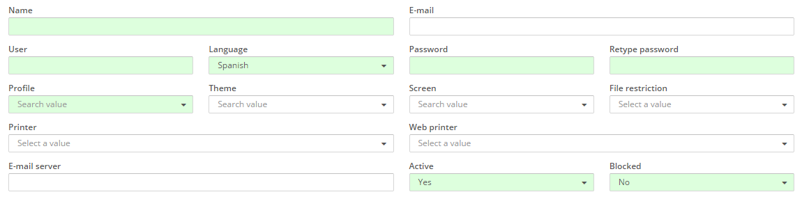
awe-103 Criteria, grids and charts
The criteria elements are screen components that can be used by a user to insert and select sets of data and send them to the server. They are also used to filter the data shown in the screen and to introduce or modify data.
Criteria
Criteria are defined in XML files that generate screens. In order to create a criteria,criteria tag is used:
<criteria ... />
In order to define and/or configure the criteria, we use several XML attributes. The structure to define it goes as follows:
<screen xmlns:xsi="http://www.w3.org/2001/XMLSchema-instance" xsi:noNamespaceSchemaLocation="https://aweframework.gitlab.io/awe/docs/schemas/screen.xsd" template="window" label="SCREEN_TITLE_USR" help="HELP_SCREEN_TITLE_USR" keep-criteria="true">
  <tag>
    <criteria id="[identifier]" component="[component]" label="[label]" placeholder="[placeholder]" style="[classes]"
              initial-load="[initial-load]" server-action="[server-action]" target-action="[target-action]"
              variable="[variable]" value="[value]" session="[session]" property="[property]"
              validation="[validation]" readonly="[read-only]" size="[size]" unit="[unit]" icon="[icon]"
              printable="[printable]" help="[help]" help-image="[help-image]"
              optional="[optional]" area-rows="[area-rows]" number-format="[number-format]" capitalize="[capitalize]"
              strict="[strict]" checked="[checked]" group="[group]" show-slider="[slider]" destination="[destination]">
      <dependency/>
    </criteria>
  </tag>
</screen>
Attributes id (internal reference) and component (criteria type) are mandatory. The rest are optional. In these links you can find all the general and specific attributes, as well as their meaning and use:
We can distinguish between two types of criteria:
Data insertion
Text criteria
They are text boxes for introducing information.
A basic text criteria example is shown below:
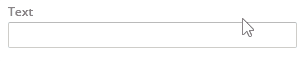
<criteria id="TextCrt" component="text" label="Text" style="col-xs-12 col-sm-6 col-md-3 col-lg-2" />
This example shows a text box with the locale "Text" on the upper part. In order to give CSS styles to the element, attribute "style" is used. When screen's values are sent to the server using buttons, dependencies, etc. (see buttons and Actions and dependencies), the value will be received in the text box in a variable with the same name as the attribute "id", in this case, "TextCrt".
The "label" attribute admits localization, meaning that locales can be defined in different languages and, depending on the one selected within the application, the corresponding one will be shown. Attributes "label", "placeholder", "unit" and "help" admit localization. For further information on this, see Locales.
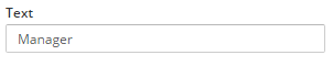
With the attribute "value" we can set a default value.
<criteria id="TextCrt" component="text" label="Text" value="Test text" style="col-xs-12 col-sm-6 col-md-3 col-lg-2" />

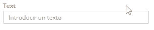
"value" attribute should not be mistaken with attribute "placeholder", because that is the text that appears inside of a text field before inserting anything.
<criteria id="TextCrt" component="text" label="Text" placeholder="Introduce a text" style="col-xs-12 col-sm-6 col-md-3 col-lg-2" />
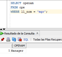
Load a default value with the value returned by a DB query
It is possible to load a default value with the value returned by a database query before the screen is loaded. For this, we should add the attribute "initial-load" with value "value" and in the attribute "target-action" we should say the name of the query we want to execute (it should be defined in "Queries.xml" file). The query should return two values in order to fulfill the text field, "label" and "value" (more information in DB queries). The value returned by the query will be loaded in the text box.
Pantalla
<criteria id="TextCrt" component="text" label="Text" initial-load="value" target-action="GetOpe" style="col-xs-12 col-sm-6 col-md-3 col-lg-2" />
Query
  <query id="GetOpe">
    <table id="ope" alias="ope" />
    <field id="openam" alias="label" />
    <field id="openam" alias="value" />
    <where>
      <and>
        <filter field="l1_nom" condition="=" variable="Usr" ignorecase="true" />
      </and>
    </where>
    <variable id="Usr" type="STRING" value="mgr" />
  </query>
Retrieving values from previous screen
When navigating between screens, sometime we would need to retrieve values from the previous screen. To achieve this, we should use the attribute "variable" with the name of the variable from the previous window that we want to retrieve.
Validations
It is possible to perform validations on the data introduced in the criteria. To do this, we should use the attribute "validation". There are many validation types: numeric, by date, minimun and maximum length of data, etc. To see all validation options, check here. When validation action is performed, from a button for instance, validation will be checked. In case is not valid, a message will appear on screen saying that that criteria does not meet with the conditions set.
Validation examples:
1. Required. If we want the criteria to be mandatory, we should use the following validation:
Criteria
<criteria id="TextCrt" component="text" label="Text" validation="required" style="col-xs-12 col-sm-6 col-md-3 col-lg-2" />
Button launching validation action
<button button-type="submit" label="BUTTON_SEARCH" icon="search" id="ButSch" help="HELP_SEARCH_BUTTON">
  <button-action type="validate" />
</button>
For further information on launching actions using a button, check Buttons
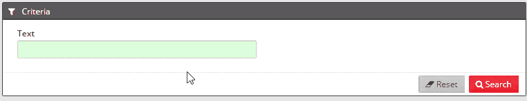 > Please note that required criteria have a green background.
2. Minimum length. If we want the data introduced in a criteria to have a minimum length (in the example below, 10 characters), we should do as follows:
Criteria
<criteria id="TextCrt" component="text" label="Text" validation="{minlength:10}" style="col-xs-12 col-sm-6 col-md-3 col-lg-2" />
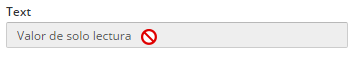
Readonly
To have a field with readonly information, we should use the attribute "readonly".
<criteria id="TextCrt" component="text" label="Text" readonly="true" style="col-xs-12 col-sm-6 col-md-3 col-lg-2" />
Size
It is possible to change the size of text inside of a criteria, as well as label's that comes along with it, via the attribute "size".
<criteria id="TextCrtSM" component="text" label="Text" size="sm" value="size sm" style="col-xs-12 col-sm-6 col-md-3 col-lg-2" />
<criteria id="TextCrtMD" component="text" label="Text" size="md" value="size md" style="col-xs-12 col-sm-6 col-md-3 col-lg-2" />
<criteria id="TextCrtLG" component="text" label="Text" size="lg" value="size lg" style="col-xs-12 col-sm-6 col-md-3 col-lg-2" />

Units
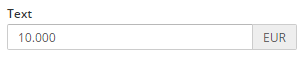
In order to show the units of criteria's value, we can use the attribute "unit".
<criteria id="TextCrt" component="text" label="Text" unit="EUR" value="10.000" style="col-xs-12 col-sm-6 col-md-3 col-lg-2" />
Icons
Representative icons may be shown next to the criteria using the attribute "icon". You can check all icons available in FontAwesome.
<criteria id="TextCrtSM" component="text" label="Text" icon="hand-o-right" value="Test text" style="col-xs-12 col-sm-6 col-md-3 col-lg-2" />
More info:
Links:
Password criteria
They are text boxes with hidden content, useful for passwords.

A simple way of creating a password criteria would be:
<criteria id="Identifier" label="Password" component="password" variable="password" style="col-xs-12 col-sm-6 col-md-3 col-lg-2" />
More info:
Textarea criteria
They are text boxes that allow multiple lines.
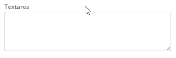
Example of textarea generation:
<criteria id="Identifier" label="Textarea" component="textarea" variable="Textarea" style="col-xs-12 col-sm-6 col-lg-6" />
More info:
Hidden criteria
They are hidden criteria, useful for sending static data to the server.
Example of a hidden criteria:
<criteria id="Identifier" variable="NumberHidden" component="hidden" value="4" />
More info:
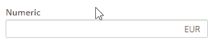
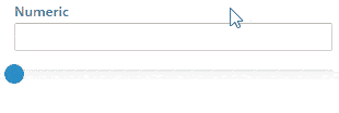
Numeric criteria
They are text boxes where only numbers are allowed. In order to control the accepted format, it is necessary to note the restrictions with the attribute "number-format" (check documentation on numeric criteria below).
It is possible to add a slider to the numeric component to help select the desired quantity.
A simple example of generating a numeric criteria:
<criteria id="Identifier" label="Numeric" component="numeric" show-slider="true" number-format="{min: 0, max: 100, step: 1, precision: 2, pSign:'s', aPad:true}" style="col-xs-12 col-sm-6 col-md-3 col-lg-2" />
More info:
Criterio de vista de texto
This criterion simply shows a text that may be recovered from a variable, parameter, query or even loaded with dependencies.
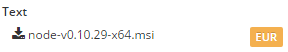
Ejemplo:
<criteria label="Text" id="TxtViw" variable="ButVal" component="text-view" style="col-xs-6 col-sm-3 col-lg-2" icon="download" />
More info:
Data selection
Criterio de fecha
It is a date criterion that shows a calendar so day, month and year can be selected.
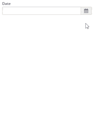
Ejemplo:
<criteria label="Date" id="Cal" variable="Cal" component="date" style="col-xs-6 col-sm-3 col-lg-2" validation="{dateLE:['CalReq']}" show-weekends="false" show-future-dates="false" />
More info:
Criterio de hora
A criterion that allows the selection of hours, minutes and seconds.
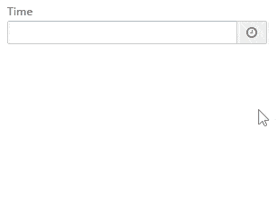
Ejemplo:
<criteria label="Time" id="Tim" variable="Tim" component="time" style="col-xs-6 col-sm-3 col-lg-2" />
More info:
Criterio de fecha filtrado
It is similar to the date criterion but certain dates can be filtered in order to avoid its selection.
Ejemplo:
<criteria label="PARAMETER_FILTERED_DATE" id="FilCal" variable="FilCal" component="filtered-calendar" initial-load="query" target-action="FilCalDat" style="col-xs-6 col-sm-3 col-lg-2" validation="{dateLE:['FilCalReq']}" />
More info:
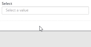
Seleccionar criterio
It is a select criterion with a list of values that may be selected.
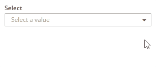
Ejemplo:
<criteria id="TextCrtSM" component="select" label="Select" initial-load="enum" target-action="demoEnum" optional="true" style="col-xs-12 col-sm-6 col-md-3 col-lg-2" />
In this example, the select takes its values from the enumerated "demoEnum".
There is the possibility to select several values with the "select-multiple" component.
<criteria id="TextCrtSM" component="select-multiple" label="Select" initial-load="enum" target-action="demoEnum" optional="true" style="col-xs-12 col-sm-6 col-md-3 col-lg-2" />
More info:
Criterios sugeridos
Allows the user to find a value writing some of the caracters of the value to be found.
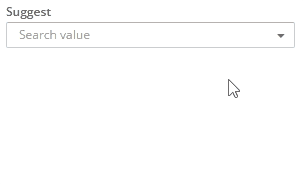
Ejemplo:
<criteria id="TextCrtSM" component="suggest" label="Select" target-action="getUsers" style="col-xs-12 col-sm-6 col-md-3 col-lg-2" />
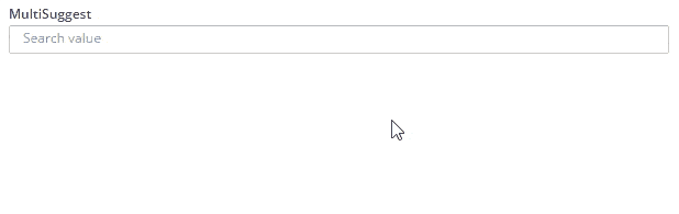
It is possible to select several values with the "suggest-multiple" component.
<criteria id="TextCrtSM" component="suggest-multiple" label="Select" target-action="getUsers" style="col-xs-12 col-sm-6 col-md-3 col-lg-2" />
More info:
Criterios de checkbox
Creates a checkbox component.
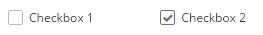
Ejemplo:
<criteria label="Checkbox 1" id="ChkBoxVa1" group="ChkBoxVa" variable="ChkBoxVa1" component="checkbox" style="col-xs-6 col-sm-4 col-lg-2 no-label"/>

<criteria label="Checkbox 2" id="ChkBoxVa2" group="ChkBoxVa" variable="ChkBoxVa2" component="checkbox" style="col-xs-6 col-sm-4 col-lg-2 no-label"/>
The "group" attribute is used to create a group of several criteria, with a binding among them.
More info:
Radio criterion
Shows a radio criterion. With this kind of component, only one of the group may be selected. If a new item is selected, the priously selected will be unselected.

Ejemplo:
<criteria label="Radio 1" id="RadBox1" group="RadBoxGrp1" variable="RadBoxGrp1" component="radio" value="Radio1" style="col-xs-6 col-sm-4 col-lg-2 no-label" validation="required" />

<criteria label="Radio 2" id="RadBox2" group="RadBoxGrp1" variable="RadBoxGrp1" component="radio" value="Radio2" style="col-xs-6 col-sm-4 col-lg-2 no-label" readonly="true" />

<criteria label="Radio 3" id="RadBox3" group="RadBoxGrp1" variable="RadBoxGrp1" component="radio" value="Radio3" style="col-xs-6 col-sm-4 col-lg-2 no-label"/>

<criteria label="Radio 4" id="RadBox4" group="RadBoxGrp1" variable="RadBoxGrp1" component="radio" value="Radio4" style="col-xs-6 col-sm-4 col-lg-2 no-label"/>

<criteria label="Radio 5" id="RadBox5" group="RadBoxGrp1" variable="RadBoxGrp1" component="radio" value="Radio5" style="col-xs-6 col-sm-4 col-lg-2 no-label" checked="true"/>
AS with the checkboxes, the "group" attribute is used to create a group of several criteria that will be bound among them.
More info:
Button checkbox criterion
It works as a checkbox but has the appearance of a button.

Ejemplo:
<criteria label="Checkbox 1" id="ChkBoxVa21" group="ChkBoxVa2" variable="ChkBoxVa21" component="button-checkbox" style="col-xs-2"/>

<criteria label="Checkbox 2" id="ChkBoxVa22" group="ChkBoxVa2" variable="ChkBoxVa22" component="button-checkbox" style="col-xs-2" checked="true"/>

<criteria label="Checkbox 3" id="ChkBoxVa23" group="ChkBoxVa2" variable="ChkBoxVa23" component="button-checkbox" style="col-xs-2" readonly="true" />

<criteria label="Checkbox" id="ChkBoxVa24" group="ChkBoxVa2" variable="ChkBoxVa24" component="button-checkbox" style="col-xs-2" checked="true"/>

<criteria label="Checkbox" id="ChkBoxVa25" group="ChkBoxVa2" variable="ChkBoxVa25" component="button-checkbox" style="col-xs-2"/>
More info:
Criterio del botón de radio
It works as a radio button but has the appearance of a normal button.

Ejemplo:
<criteria label="Radio 1" id="RadBox21" group="RadBoxGrp2" variable="RadBoxGrp2" component="button-radio" value="Radio1" style="col-xs-2" validation="required" />

<criteria label="Radio 2" id="RadBox22" group="RadBoxGrp2" variable="RadBoxGrp2" component="button-radio" value="Radio2" style="col-xs-2" readonly="true"/>

<criteria label="Radio 3" id="RadBox23" group="RadBoxGrp2" variable="RadBoxGrp2" component="button-radio" value="Radio3" style="col-xs-2"/>

<criteria label="Radio 1" id="RadBox24" group="RadBoxGrp2" variable="RadBoxGrp2" component="button-radio" value="Radio4" style="col-xs-2" checked="true"/>

<criteria label="Radio 1" id="RadBox25" group="RadBoxGrp2" variable="RadBoxGrp2" component="button-radio" value="Radio5" style="col-xs-2"/>
More info
Criterios de color
Obtains the hex value of a color using a color selection widget.
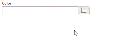
Ejemplo:
<criteria label="Color" id="Col" variable="Col" component="color" style="col-xs-6 col-sm-3 col-lg-2" />
More info:
Criterio del cargador
It is used to send files to the server. Once loaded, files may be managed by server tasks.
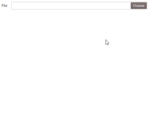
Ejemplo:
<criteria label="File" id="Upl" variable="Upl" component="uploader" style="col-xs-12 col-sm-6 col-lg-4" />
More info:
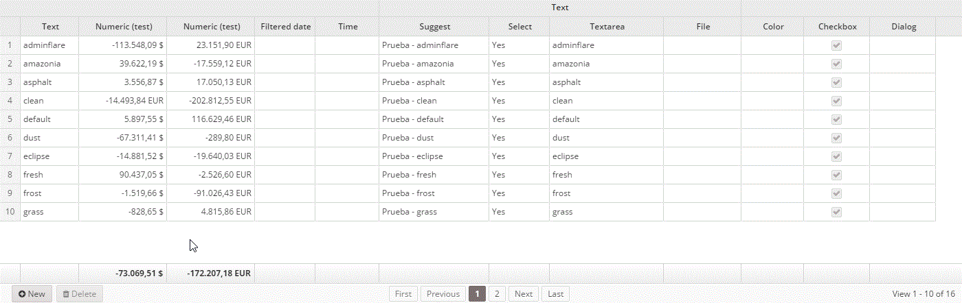
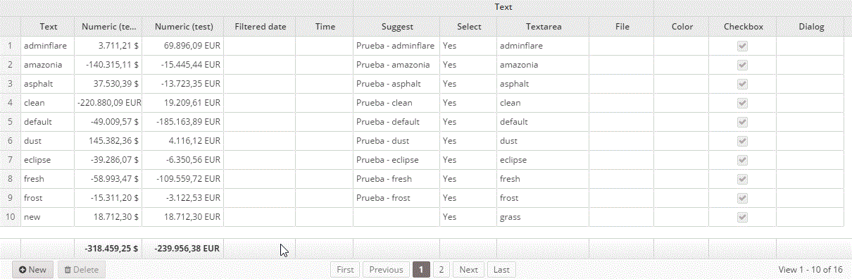
Tablas
Grid are AWE's main component for showing lists of data and they are paginated in order to help to the visualization of information. It is also possible to organize the information by pressing the column we want to use as sorting criteria.
Grids are defined in XML files that generate screens. To create a grid we use the "grid" tag:
<grid ... />
To define the behaviour and/or configuration of a grid, we should use the attributes defined by the XML item. The structure is as follows:
<grid id="[grid-identifier]" ...>
  <column ... ></column>
  ...
  <group-header ...>
    <column ...></column>
    ...
  </group-header>
  ...
  <button ... > ... </button>
  ...
  <context-button ...> ... </context-button>
  ...
</grid>
Grid tag structure:
<grid id="[grid-id]" style="[grid-style]" multiselect="[grid-is-multiselect]" checkbox-multiselect="[checkbox-multiselectable]" editable="[grid-is-editable]" send-operations="[grid-is-multioperation]" initial-load="[initial-load]" server-action="[server-action]" target-action="[target-action]" max="[elements-per-page]" pagination-disabled="[pagination-disabled]">
...
</grid>
The id attribute (internal reference) is mandatory. The rest of attributes are optional. In this link you can find all the existing attributes, as well as their meaning and use.
Structure of column tag:
<column label="[column-label]" name="[column-name]" sort-field="[sort-field]" align="[text-align]" charlength="[column-width-chars]" component="[column-component]" >
  <dependency ...> ... </dependency>
  ...
</column>
The name attribute (internal reference) is mandatory. The rest of attributes are optional. In this link you may find all existing attributes, as well as their meaning and use.
More info:
- Introduction to grid creation
- XML grid structure
- Grids, general attributes
- Columns, general attributes
- Components for columns
- Dependencies
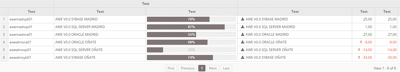
Simple
A simple grid only shows information, is not possible to modify, add or remove data.
Simple grid example:
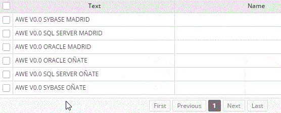
<grid id="GrdSta" style="expand" initial-load="query" server-action="data" target-action="QryUniTstId" max="30">
  <column label="PARAMETER_TEXT" name="Als" sort-field="Als" align="left" charlength="20" style="separator" />
  <column label="PARAMETER_TEXT" name="Des" sort-field="Des" align="left" charlength="40" />
  <column label="PARAMETER_TEXT" name="Prg" sort-field="Prg" align="center" charlength="40" component="progress" value="40" server-action="data" target-action="QryChkPrg" printable="false" />
  <column label="PARAMETER_TEXT" name="DwnFil" sort-field="Des" align="left" charlength="50" component="text-view" icon="download" />
  <column label="PARAMETER_TEXT" name="TxtViw" sort-field="Des" align="right" charlength="10" component="text-view" printable="false"/>
  <column label="PARAMETER_TEXT" name="TxtSty" sort-field="Des" align="right" charlength="10" printable="false"/>
</grid>
The "grid" tag has several attributes to configure grid's creation. Here you can find more details:
| Atributo | Value | What is used for? |
|---|---|---|
| style | expand | Applies the class "expand" to the HTML element generated. It is used to apply CSS styles. |
| carga-inicial | query | States how is the initial data load going to be. |
| server-action | data | States the type of server action that will be called to load grid's data. |
| target-action | QryUniTstId | References the element that will be called on server. In this case, because it is query type, the element "QryUniTstId" will be defined in Queries.xml file (click here for further information) |
| max | 30 | Max item number to recover per page (30). |
With "column" tags, we can see several attributes to configure the creation of grid columns:
| Atributo | What is used for? |
|---|---|
| label | Is the name that will appear in the column's header. i18n files may be used. |
| name | Is column's identifier and is used as a reference. |
| sort-field | Is the field that will be used as a sorting criteria when its header is clicked. Must point to a column's name but usually will point to itself. |
| align | Data's alignment. |
| charlength | Column's width measured in characters. |
| style | Used to apply CSS styles to the data shown in the column. |
| component | The type of component used in the column. For further information click here |
| value | In this case is usd to assign a default value to "progress" component if none is assigned when data is loaded. |
| server-action | Defines the server action that will be called to load the component, in this case "progress". |
| target-action | References the element that will be called by the server. In this case, because is query type, the element "QryUniTstId" will be defined in Queries.xml file (check here for more details. |
| imprimible | States whether if column should be shown when printed or not. In this case, because it is set to "false", it will not. |
| icon | Used to show Font Awesome icons in the column. |
Here only a few attributes were shown. For further details check:
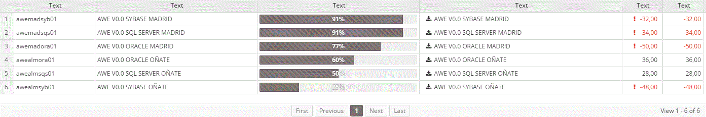
Header grouping
It is possible to group several headers into another one so information can be visually classified better. To achieve this, the "group-header" attribute is used, containing the columns that we desire to be grouped. If in the previous example we group the second and third columns, the grid will look like this:
<grid id="GrdSta" style="expand" initial-load="query" server-action="data" target-action="QryUniTstId" max="30">
  <column label="PARAMETER_TEXT" name="Als" sort-field="Als" align="left" charlength="20" style="separator" />
  <group-header name="GrpHeaCol" label="PARAMETER_TEXT">
    <column label="PARAMETER_TEXT" name="Des" sort-field="Des" align="left" charlength="40" />
    <column label="PARAMETER_TEXT" name="Prg" sort-field="Prg" align="center" charlength="40" component="progress" value="40" server-action="data" target-action="QryChkPrg" printable="false" />
  </group-header>
  <column label="PARAMETER_TEXT" name="DwnFil" sort-field="Des" align="left" charlength="50" component="text-view" icon="download" />
  <column label="PARAMETER_TEXT" name="TxtViw" sort-field="Des" align="right" charlength="10" component="text-view" printable="false"/>
  <column label="PARAMETER_TEXT" name="TxtSty" sort-field="Des" align="right" charlength="10" printable="false"/>
</grid>
For more details:
Multiselection
Multiselection grids are grid where several or even all of the rows may be selected. Generally, is used to perform actions on the selected rows, like deleting them, loop to get their information, etc.
If we want a grid to be multiselectable, we just neet to add the attribute "multiselect" with a "true" value.
<grid ...  multiselect="true" ...>
 ...
</grid>
For more information:
Editable
They are grids where data may be modified, which is done just in place.
For a grid to become editable we just need the "editable" attribute to be "true".
<grid ...  editable="true" ...>
 ...
</grid>
Botones de cuadrícula
To modify a row, it is only necessary to click it and modify the desired data. When done, we have to click the "Save row" button. However, to add or remove a row is necessary to add a button. Usually they are included inside of the grid tag and they will be shown at its footer:
<grid ...  editable="true" ...>
  ...
  <button label="BUTTON_NEW" icon="plus-circle" id="ButGrdEdiAdd">
    <button-action type="add-row" target="GrdEdi" silent="true" />
  </button>
  <button label="BUTTON_DELETE" icon="trash" id="ButGrdEdiDel">
    <button-action type="delete-row" target="GrdEdi" silent="true" />
    <dependency source-type="none" target-type="enable" initial="true">
      <dependency-element id="GrdEdi" attribute="selectedRows" condition="eq" value="1" />
    </dependency>
  </button>
</grid>
The delete button has a dependency, its purpose is to activate the button only when there is a row selected. The deleted row will be that one.
Add button's action is used to add an empty row in the grid, which may be used to add new values.
You can also add context buttons that will be shown when right clicking. To achieve this, instead of "button" tag, "context-button" should be used.
<grid ...  editable="true" ...>
  ...
  <context-button ... >
    ...
  </context-button>
</grid>
_==IMPORTANT:==* In order to store the changes in the database, a server action pointing to a maintain should be invoked.
For further info check:
Multioperation
Multioperation grid is an editable grid that can perform several operations at the same time over a dataset. To create it, the attribute "send-operations" should be set to "true".
<grid ...  editable="true" send-operations="true" ...>
  ...
</grid>
All operations will be sent to the server at the same time to be processed.
_==IMPORTANT:==* In order to store the changes in the database, a server action pointing to a maintain should be invoked.
Para más información ver:
Trees
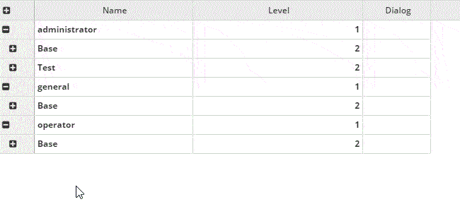
A tree grid is a special kind of grid that can be expanded as a tree. Different definitions of trees can be made, we can talk about standard trees, load trees, editable trees, multioption trees and combinations of them.
With this data structure, each row needs an identifier and its parent's (unless it's a root row, then parent's identifier is empty). The id should be defined in "tree-id" attribute and parent's in "tree-parent".
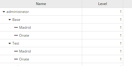
Treegrid example
A simple example of a tree grid would be the following one:

<grid ... treegrid="true" expand-column="TreGrd_Nam" tree-id="TreGrd_id" tree-parent="TreGrd_parent" initial-level="3" ...>
    <column label="PARAMETER_NAME" name="TreGrd_Nam" sort-field="TreGrd_Nam" align="left" sortable="false" charlength="40" />
</grid>
| Atributo | What is used for? |
|---|---|
| zambullir | Configures the grid as a treegrid |
| ampliar-columna | Name of column to be expanded. |
| arbol-id | Defines treegrid's identifier |
| árbol-padre | Defines treegrid's parent identifier |
| nivel inicial | Nivel inicial para expandir |
Editable treegrid
For a treegrid to be editable the attribute "editable" should be set to "true".
<grid ... treegrid="true" editable="true" ... >
    ...
</grid>
In order to add buttons to remove or add new rows, we should do the same as with normal grids. Check Grid buttons.
For more information:
Charts
AWE uses Highcharts library for chart render. This Javascript library allows to build many different kinds of dynamic charts in an easy, quick and flexible way. It is standalone and compatible with most of modern browsers with a high performance.
XML structure to generate a chart is as follows:
<chart id="[Chart Id]" label="[Chart title]" subtitle="[Chart subtitle]" type="[Type chart]" initial-load="[Initial load]" target-action="[Action]">
  <chart-legend layout="[Layout]" align="[Align]" verticalAlign="[Vertical align]" />
  <x-axis label="[Label X-Axis]" type="[Type axis]"/>
  <y-axis label="[Label Y-Axis]"/>
  <chart-tooltip suffix="[Suffix value]" number-decimals="[Decimal numbers]"/>
  <chart-serie id="[Serie ID]" x-value="[X-Values]" y-value="[Y-value]" label="[Serie label]" />
  <chart-parameter type="[Type parameter]" name="[Name parameter]">
    <chart-parameter type="[Type paramter]" name="[Name parameter]" value="[Parameter value]"/>
  </chart-parameter>
</chart>
Line chart example
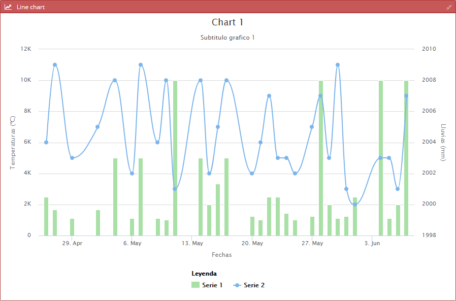
The following XML code generates the previous chart:
<chart id="ChrLinTst" label="SCREEN_TEXT_CHART_TITLE_1" subtitle="Subtitulo grafico 1" type="mixed" initial-load="query" target-action="TstChrTwoSrc" zoom-type="xAxis" max="30" help-image="HELP_CHART_IMAGE_1">
    <chart-legend label="Leyenda" />
    <x-axis label="Fechas" type="datetime" />
    <y-axis label="Temperaturas (ºC)" formatter-function="formatCurrencyMagnitude"/>
    <y-axis opposite="true" label="Lluvias (mm)" />
    <chart-tooltip crosshairs="xAxis" suffix=" ºC" number-decimals="3" shared="true"/>
    <chart-serie id="serie-1" y-axis="0" x-value="dates" y-value="serie1" type="column" label="Serie 1" color="#A8E0A6" />
    <chart-serie id="serie-2" y-axis="1" x-value="dates" y-value="serie2" type="spline" label="Serie 2" />
    <context-button id="CtxLinTstRef" label="BUTTON_RELOAD" icon="refresh">
        <button-action type="server" server-action="data" target-action="TstChrTwoSrc" target="ChrLinTst" />
    </context-button>
    <dependency source-type="formule" target-type="chart-options" formule="{zoom: {x: {min: [xMin],max: [xMax]}}}">
        <dependency-element id="ChrStockTst" attribute="xMin" alias="xMin" optional="true"/>
        <dependency-element id="ChrStockTst" attribute="xMax" alias="xMax" optional="true"/>
        <dependency-element id="ChrStockTst" event="zoom"/>
    </dependency>
</chart>
| Atributo | Label | What is used for? |
|---|---|---|
| subtitle | chart | Chart subtitle |
| type | chart | Chart type |
| zoom-type | chart | Decides in wich dimensions the user may zoom in |
| label | chart-legend | Legend's title |
| label | x-axis | Label over x-axis |
| type | x-axis | Axis type. May be "linear", "logarithmic", "datetime" or "category" |
| label | y-axis | Label over y-axis |
| formatter-function | y-axis | Javascript function to format axis' labels |
| opposite | y-axis | Shows the definition of that label on the right side |
| label | y-axis | Label over y-axis |
| crosshairs | chart-tooltip | Axis visualization to connect the points with their corresponding values in the axis |
| suffix | chart-tooltip | Suffix that is shown over chart's tooltip |
| number-decimals | chart-tooltip | Suffix that is shown over chart's tooltip related with decimal numbers |
| shared | chart-tooltip | Shared information for several charts |
| y-axis | chart-serie | When double or multiple y axis are used, this number specifies to which xAxis the series is connected to. It's the axis' identifier |
| x-value | chart-serie | Defines the value of the x axis point |
| y-value | chart-serie | Defines the value of the y axis point |
| type | chart-serie | Series type |
| label | chart-serie | Name of series. This value is shown in the legend |
| color | chart-serie | Series' color |
For more information check: