Custom widgets (React)
AWE lets you extend the UI it provides with your own JavaScript components — including third-party libraries and their styles — by embedding them in a screen through the <widget> element. On the React client, widgets are resolved by their type against a client-side widget registry, so you can plug in whatever you need at the application level without modifying the framework.
This guide walks through a complete, working example: an event calendar (built on the third-party FullCalendar library) added to a React AWE project.
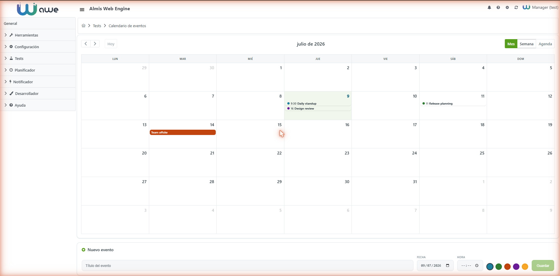
How it works
When you place a widget in a screen:
<widget type="event-calendar" id="eventCalendar" style="expand"/>
the React client looks up the widget type in its registry and renders the matching component:
- The
awe-react-clientpackage exposesregisterWidget(type, component)andgetWidget(type). The client resolves each<widget>node against the registry by itstype. - The built-in widgets (
file-manager,log-viewer,help-viewer,pdf-viewer,carousel) register through this same mechanism, so an application widget is not a special case. - All attributes of the widget node (
id,style, ...) are passed to your component as props. - If no component matches
type, the client renders a graceful placeholder (The widget <type> has not been created yet.) instead of failing.
To register your own component, import registerWidget from the client's main entry point and call it once at application startup.
Steps
1. Add the library dependency
Install the component library in your project (here, FullCalendar and its React adapter):
npm install --save @fullcalendar/core @fullcalendar/daygrid @fullcalendar/timegrid @fullcalendar/list @fullcalendar/interaction @fullcalendar/react
2. Write the widget component
Create the component under src/js/widgets/, for example src/js/widgets/EventCalendar.jsx. Key points:
- It is a plain React component. AWE passes the widget node attributes as props, so destructure
idandstylefrom them. - Render your third-party component (here,
<FullCalendar>) inside your own container. - Follow the AWE locale through
react-i18next:useTranslation()gives youtfor labels andi18n.languagefor the active AWE language code (e.g.en-GB,es-ES).
import React, { useState } from "react";
import PropTypes from "prop-types";
import { useTranslation } from "react-i18next";
import FullCalendar from "@fullcalendar/react";
import dayGridPlugin from "@fullcalendar/daygrid";
import timeGridPlugin from "@fullcalendar/timegrid";
import listPlugin from "@fullcalendar/list";
import interactionPlugin from "@fullcalendar/interaction";
import esLocale from "@fullcalendar/core/locales/es";
import enGbLocale from "@fullcalendar/core/locales/en-gb";

// AWE language codes mapped to FullCalendar locales
const CALENDAR_LOCALES = {
  "es-ES": esLocale,
  "en-GB": enGbLocale
};

// Receives the widget node attributes (id, style, ...) as props
function EventCalendar({ id, style = "" }) {
  const { t, i18n } = useTranslation();
  const [events, setEvents] = useState([/* ... in-memory demo events ... */]);

  return (
    <div id={id} className={`awe-ec ${style}`}>
      <div className="awe-ec-mount">
        <FullCalendar
          plugins={[dayGridPlugin, timeGridPlugin, listPlugin, interactionPlugin]}
          initialView="dayGridMonth"
          height="100%"
          locale={CALENDAR_LOCALES[i18n.language] ?? enGbLocale}
          events={events}
        />
      </div>
      {/* Composer to create/edit events (not a native <form> — see caution below) */}
    </div>
  );
}

EventCalendar.propTypes = {
  id: PropTypes.string.isRequired,
  style: PropTypes.string
};

export default EventCalendar;
Read the active language with react-i18next: const { t, i18n } = useTranslation(). Use i18n.language (codes like en-GB, es-ES) to pick the third-party library's locale, and t("KEY") for your own labels so they change with the AWE language. Do not rely on the browser language.
<form>, no native dialogsThe AWE screen already wraps its content in a <form>, and HTML forms cannot nest — so do not add another <form> inside your widget. Drive create/edit/delete with buttons and onClick handlers instead. Likewise, keep interactions inline rather than using alert() / confirm() / prompt(), and persist data through the widget server-action rather than in memory (the in-memory events above are only for the demo).
3. Register the component
Register the widget once at application startup in src/js/main.js, using registerWidget from the client main entry point:
const { registerWidget } = require('awe-react-client/js/main');
const { default: EventCalendar } = require('./widgets/EventCalendar');

// Custom widgets
registerWidget("event-calendar", EventCalendar);
The first argument ("event-calendar") is the type used in the screen XML; the second is your component.
4. Add the styles
Add your widget styles in src/css/main.css (imported by src/js/main.js). FullCalendar v6 injects its own base CSS at runtime, so you mainly override its CSS custom properties (scoped to your widget container) to blend with the active AWE theme:
.awe-ec {
  display: flex;
  flex-direction: column;
  height: 100%;
}

.awe-ec-mount {
  /* FullCalendar v6 custom properties */
  --fc-border-color: #e2e8ec;
  --fc-today-bg-color: rgba(86, 158, 27, 0.08);
  --fc-event-bg-color: #569e1b;
  --fc-event-border-color: #569e1b;
}
5. Add the screen
Create a screen that embeds the widget. The type matches the key you registered:
<screen xmlns:xsi="http://www.w3.org/2001/XMLSchema-instance"
        xsi:noNamespaceSchemaLocation="https://aweframework.gitlab.io/awe/docs/schemas/screen.xsd"
        template="window" label="MENU_TEST_EVENT_CALENDAR">
  <tag source="center" type="div" expandible="vertical" style="expand">
    <widget type="event-calendar" id="eventCalendar" style="expand"/>
  </tag>
</screen>
6. Add the menu option and locales
Register a menu option pointing to the screen and add the locale keys used by the screen/widget:
<!-- menu/private.xml -->
<option name="event-calendar-test" label="MENU_TEST_EVENT_CALENDAR" screen="event-calendar-test" icon="calendar"/>
<!-- locale/Locale-en-GB.xml -->
<locale name="MENU_TEST_EVENT_CALENDAR" value="Event calendar"/>
<locale name="SCR_EVENT_CALENDAR_NEW" value="New event"/>
<locale name="SCR_EVENT_CALENDAR_TITLE" value="Event title"/>
Notes
typeis the extension key — it is a free string, so you are not limited to a fixed set of components. Screen/profile restrictions remain the right place to control access.- Built-in and custom widgets share the same registry —
registerWidgetis exactly how the client registersfile-manager,log-viewerand the rest, so there is no framework change needed to add your own. - Pass configuration to the component with
<widget-parameter>; the widget node (including its parameters) reaches your component as props. - For the resolution model shared with the Angular client, see the Widgets API reference.