Validation
The validation action checks the conditions of each criterion with a value under the validation attribute. This action is related with a validate type button (see button actions).
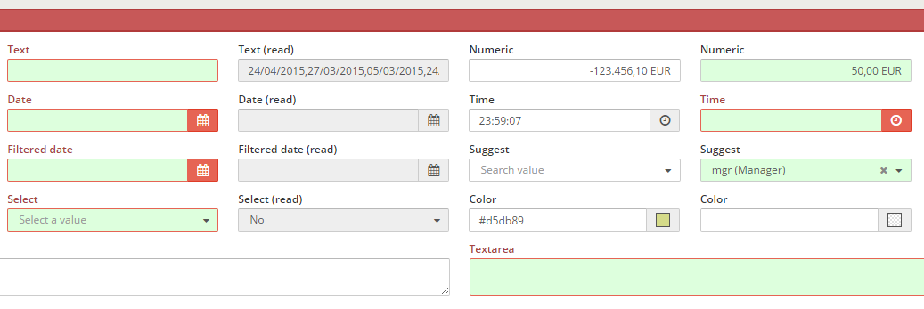
XML skeleton
<criteria [attributes] validation="[condition to validate]" />
Validation types
There are some kind of validation:
| Value of attribute | Component | Description | Examples |
|---|---|---|---|
| required | All except checkbox and radio | Check if the field has value | validation="{required:true}" |
| text | Text / Textarea / Password | Check if the value of the criteria is a text (Numbers and white spaces are not allowed) | validation="{text:true}" |
| textWithSpaces | Text / Textarea / Password | Check if the value of the criteria is a text (Numbers not allowed) | validation="{textWithSpaces:true}" |
| number | Text / Textarea / Password | Check if the value of the criteria is a number | validation="number" |
| integer | Text / Textarea / Password | Check if the value is a well-formed integer | validation="integer" |
| digits | Text / Textarea / Password | Check if the value is a number with only digits | validation="digits" |
| date | Text / Textarea / Password | Check if the value is a valid date | validation="date" |
| time | Text / Textarea / Password | Check if the value is a valid time (hour, minutes and seconds) | validation="time" |
Text / Textarea / Password | Check if the value is a valid string email | validation="email" | |
| gt | All except checkbox and radio | Check if the criterion value is greater than value | validation="{gt:value}" |
| ge | All except checkbox and radio | Check if the criterion value is greater or equal value | validation="{ge:value}" |
| lt | All except checkbox and radio | Check if the criterion value is lower than value | validation="{lt:value}" |
| le | All except checkbox and radio | Check if the criterion value is lower or equal than value | validation="{le:value}" |
| eq | All except checkbox and radio | Check if the criterion value is equal than value | validation="{eq:value}" |
| ne | All except checkbox and radio | Check if the criterion value is different than value | validation="{ne:value}" |
| mod | Numeric / Date / Time | Check if the criterion value is divisible by value | validation="{mod:value}" |
| range | Numeric / Date / Time | Check if the value is inside the range | validation="{range:{from:value, to:value}}" |
| equallength | Text / Textarea / Password | Check if the text length is equal to value | validation="{equallength:value}" |
| maxlength | Text / Textarea / Password | Check if the text length is less than value | validation="{maxlength:value}" |
| minlength | Text / Textarea / Password | Check if the text length is bigger than value | validation="{minlength:value}" |
| checkAtLeast | Checkbox / Button checkbox | Assure that there is at least value checked checkboxes in the group | validation="{checkAtLeast:value}" |
| maxRepeat | Grid columns | Check that the value of the cell is not repeated more than value times in its grid column (the cell counts as one). As in AngularJS: values are compared strictly (1 is not "1"), empty values are counted, and multiple (array) cells are never flagged. An empty value skips the rule and a non-numeric one flags every value. Only the edited cell is checked again: the other rows keep their state until they are edited or the form is validated | validation="{maxRepeat:value}" |
| pattern | Text / Textarea / Password | Check if the text is equal to the parameter | validation="{pattern:value}" |
Validation values
You can assign a simple static value to the validation comparator:
{eq:3}
... or you can take the value from a setting or a criterion:
{eq:{criterion:"CriterionId",type:"date"}}
These are the possible attributes on a value comparator:
| Value of attribute | Description | Examples |
|---|---|---|
| value | Constant value to compare with | value:5 |
| criterion | Retrieve the value from a criterion | criterion:"CriterionId" |
| setting | Retrieve the value from a setting | setting:"minlengthPassword" |
| message | Locale from message to retrieve if validation is not passed | message:"VALIDATION_MESSAGE_CUSTOM_ERROR" |
| type | Type of comparison | type:"type" |
Comparison types
You can define the type of the comparison, to check the values as a defined type:
| Type | Description |
|---|---|
| date | Compare as dates |
| integer | Compare as integer |
| float | Compare as floats |
| string | Compare as strings (default) |
Multiple validation
It is possible to have more than one validation actions under a single validation attribute. To do so, it is necessary to insert the validations in a json format:
{eq:{criterion:"Field1"},ne:{criterion:"Field2"}}
There is an exception with simple validation rules that have no parameters, such as required. In this case, it's not necessary to have the rule between {} brackets:
validation="required"
If you want to combine simple rules with complex rules, you need to define it as a complex rule as well:
{required:true, maxlength:{value:6, type:"integer"}}
Fields in hidden content
A criterion can sit in content the user does not see: a tab that is not the active one, a step of a wizard that is not the current one, or an accordion item that is collapsed. When a validate action fails, both clients (AngularJS and React) validate every criterion of the screen, hidden or not, and then bring the first invalid one into view:
- The tabs, wizard steps and accordion items that hide the field are opened, from the outer container to the inner one. A container that already shows the field is left as it is, and an accordion that allows several open items keeps the others open.
- The field is focused and scrolled into view.
- The tab header, the wizard step and the accordion item that hold invalid fields are marked with an error indicator (a red title with an exclamation mark, and a red number in a wizard step). The mark goes away when the fields are fixed.
The first invalid field is the first one in the order of the screen definition. Screens without hidden content keep working as they did: the error message is shown next to the field.
For automated tests, the marked tab, step or item carries the attribute data-invalid="true" (and "false" otherwise), next to data-active and data-completed. The test screen reveal-invalid of the test applications has a required field in a second tab, in a collapsed accordion item and in the second step of a wizard.
Examples
Standard criteria with validation action
<criteria label="PARAMETER_TEXT" id="TxtReq" variable="TxtReq" component="text" style="col-xs-6 col-sm-3 col-lg-2" validation="{required:true, maxlength:4}"/>
Check that the password is valid
<criteria label="PARAMETER_PASSWD" id="Pas" component="text"
validation="{required: true, pattern:{setting:'passwordPattern'}, ne:{criterion:'OldPas', message:'VALIDATOR_MESSAGE_REPEAT_OLD_PASSWORD'}, minlength:{setting:'minlengthPassword'}}"
style="col2" />
Check if a date is greater or equal than another
<criteria label="PARAMETER_FILTERED_DATE" id="FilCalReq" variable="FilCalReq" component="filtered-calendar" initial-load="query"
target-action="FilCalDat" style="col-xs-6 col-sm-3 col-lg-2" validation="{required:true,ge:{criterion:'FilCal',type:'date'}}" strict="false" />