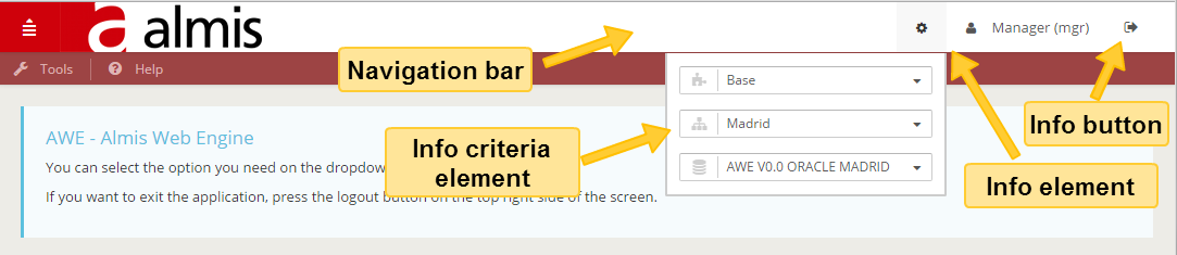
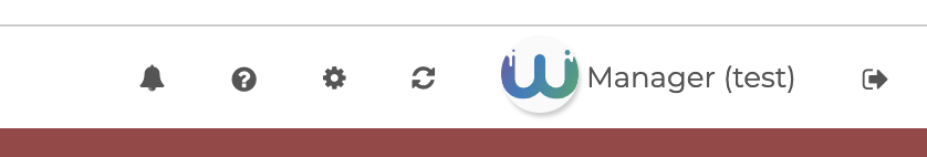
Navigation Bar
The navigation bar is used to add visual elements with logic functions in the top zone of application. This part is displayed in all application screens.
You can add info elements to show more info and info-button elements as buttons with actions. Also, you can put info-criteria elements inside info elements as criteria for show more info.
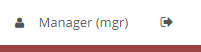
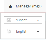
You also can user avatar component to show the user image, and of course use it as dropdown menu.
Estructura Xml
The xml structure of navigation bar component is the following:
<tag type="div" id="main-navbar-collapse" style="collapse navbar-collapse main-navbar-collapse">
  <tag type="div" style="right clearfix">
    <tag type="ul" style="nav navbar-nav pull-right right-navbar-nav">
      <info id="[id]" icon="[icon]" title="[info-title]">
      ... more info elements
      <info id="[id]" icon="[icon]" title="[info-title]">
      <info-criteria id="[id]" icon="[icon]" title="[info-criteria-title]" component="[component]" initial-load="[initial-load]"
        target-action="[target-action]" session="module" style="[style]" info-style="[info-style]">
        <dependency/>
      </info-criteria>
      ... more info criteria elements
    </info>
    <info-button id="[id]" icon="[icon]" title="[button-title]">
      <button-action type="[action-type]" />
      ... more button.action
    </info-button>
    ... more info-button
   </tag>
 </tag>
</tag>
Nabvar structure
| Elemento | Uso | Varias instancias | Descripción |
|---|---|---|---|
| info | Opcional | Si | Graphical element to show information |
| info-button | Opcional | Si | Navbar button for execute task. Same as button element in Awe |
| info-criteria | Opcional | Si | Navbar criteria to get input from the user and send it to the application server (business logic) . Same as criteria element in Awe |
| avatar | Opcional | Si | Navbar component which shows the user image. It can be used as button or as navbar dropdown menu |
info attributes
| Atributo | Uso | Tipo | Descripción | Valores |
|---|---|---|---|---|
id | Required | String | Info element identifier. Con fines de referencia | |
field | Opcional | String | Name of model attribute to get value of target-action | Ex.: field="label" Get label attribute of target-action data result |
title | Opcional | String | Info static text show when over | Note: You can use i18n files (locales) |
label | Opcional | String | Info text (outside the criterion) | Note: You can use i18n files (locales) |
style | Opcional | String | Info CSS classes | |
dropdown-style | Opcional | String | Info dropdown box CSS classes | |
icon | Opcional | String | Identificador de icono | Note: You can check all iconsets at icons screen |
unit | Opcional | String | Info unit. Use it with info icon to show a number as stacked style | |
session | Opcional | String | Session variable to load the criterion | Session variable identifier |
value | Opcional | String | Info default value | |
property | Opcional | String | Property variable to load the criterion | Property variable identifier |
server-action | Opcional | String | Llamada de acción del servidor | See server action list |
target-action | Opcional | String | Destino para llamar al servidor |
info-button attributes
| Atributo | Uso | Tipo | Descripción | Valores |
|---|---|---|---|---|
title | Opcional | String | Static text show when over button | Note: You can use i18n files (locales) |
info-style | Opcional | String | Css style of info-button container |
Note:
info-button element has other attributes asbuttonelement. You can see more info here.
info-criteria attributes
| Atributo | Uso | Tipo | Descripción | Valores |
|---|---|---|---|---|
title | Opcional | String | Static text show when over criteria | Note: You can use i18n files (locales) |
info-style | Opcional | String | Css style of info-criteria container | Ex.: info-style="form-group" |
Note:
info-criteriaelement has the same attributes ascriteriaelement. You can see more info here.
avatar attributes
| Atributo | Uso | Tipo | Descripción | Valores |
|---|---|---|---|---|
title | Opcional | String | Static text show when over element | Note: You can use i18n files (locales) |
show-label | Opcional | Boolean | Whether to show or not the label next to the user image | The default value is true |
image | Opcional | String | Relative or absolute of the image to use as avatar |
Note: avatar element has the same attributes as
buttonelement. You can see more info here.
Ejemplos
- Navigation bar with some info elements and info button
<tag type="div" id="main-navbar-collapse" style="collapse navbar-collapse main-navbar-collapse">
  <tag type="div" style="right clearfix">
   <tag type="ul" style="nav navbar-nav pull-right right-navbar-nav">
     <info id="ButUsrAct" icon="user" field="Val" server-action="data" target-action="ConUsr"/>
      <info-button id="ButLogOut" icon="sign-out" title="BUTTON_LOGOUT">
        <button-action type="logout" />
      </info-button>
    </tag>
  </tag>
</tag>
- Navigation bar with one info with info-criteria elements
<tag type="div" id="main-navbar-collapse" style="collapse navbar-collapse main-navbar-collapse">
  <tag type="div" style="right clearfix">
   <tag type="ul" style="nav navbar-nav pull-right right-navbar-nav">
     <info id="ButUsrAct" icon="user" field="Val" server-action="data" target-action="ConUsr">
       <info-criteria icon="image" title="PARAMETER_THEME" component="select" id="theme" initial-load="query"
           target-action="ThmSelVal" session="theme" style="col-xs-12 no-label" info-style="form-group">
         <dependency>
           <dependency-element id="theme" />
           <dependency-action type="server" server-action="maintain-silent" target-action="SesVarThm" silent="true" />
           <dependency-action type="change-theme" target="theme" />
         </dependency>
       </info-criteria>
       <info-criteria icon="language" title="PARAMETER_LANGUAGE" component="select" id="language" initial-load="enum"
          target-action="Lan" session="language" style="col-xs-12 no-label" info-style="form-group">
        <dependency>
          <dependency-element id="language" />
          <dependency-action type="server" server-action="maintain-silent" target-action="SesVarLan" silent="true" />
          <dependency-action type="change-language" target="language" />
        </dependency>
       </info-criteria>
      </info>
    </tag>
  </tag>
</tag>
- Info with unit and dependencies
<info id="Dab" icon="database" unit="3" style="nav-icon-btn-success">
  <dependency source-type="criteria-text" target-type="label" target-action="database" initial="true">
   <dependency-element id="database"/>
  </dependency>
</info>
- Avatar element with dropdown
<tag type="div" id="main-navbar-collapse" style="collapse navbar-collapse main-navbar-collapse">
  <tag type="div" style="right clearfix">
    <tag type="ul" style="nav navbar-nav pull-right right-navbar-nav">
      <avatar id="ButUsrAct" image="/images/logo/logo-awe-nuevo.svg" icon="user" field="Val" server-action="data" target-action="ConUsr"/>
      <info-button id="ButLogOut" icon="sign-out" title="BUTTON_LOGOUT">
        <button-action type="logout" />
      </info-button>
    </tag>
  </tag>
</tag>