Button
Try the button with live controls in the component catalog: the real AWE component and the XML that produces it.
A button is a graphical control element that provides the user a simple way to trigger an event, like searching for a query, or to interact with dialog boxes, like confirming an action.
Clicking on an AWE button launches the list of attached actions (button actions) which are called sequentially.

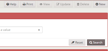
When the screen size is too small (mobile devices) the buttons defined on the buttons source of the screen are moved to the lower side:

XML skeleton
<button id="[button-identifier]" button-type="[button-type]" label="[button-label]" icon="[button-icon]"
        style="[button-style]" size="[button-size]">
  <button-action... />
  <dependency... />
</button>
Button structure
| Element | Use | Multiples instances | Description |
|---|---|---|---|
| button | Required | No | Global node of the button. Defines the button attributes |
| button-action | Optional | Yes | List of actions to be launched on button click |
| dependency | Optional | Yes | List of dependencies attached to the button |
Button attributes
| Attribute | Use | Type | Description | Values |
|---|---|---|---|---|
| id | Optional | String | Button identifier. For reference purposes | |
| label | Optional | String | Button text | Note: You can use i18n files (locales) |
| style | Optional | String | Button CSS classes. The btn-* classes give the look of the button and no-label makes it icon-only. See button styles | |
| icon | Optional | String | Icon identifier | Note: You can check all iconsets at icons screen |
| button-type | Optional | String | Button default behaviour | button (default), submit or reset. See button types |
| size | Optional | String | Criterion size | sm (default), md or lg. |
| value | Optional | String | For setting one string value for button | |
| help-text | Optional | String | Help text to show in button as help | Note: You can use i18n files (locales) |
| help-image | Optional | String | Url image to show in button as help | Note: You can use i18n files (locales) |
| permission | Optional | String | Permissions the user needs to see the button. It replaces what is derived from the targets of its actions. See screen elements | Permission identifiers separated by spaces, all required. Ex. users.create |
| show-loading | Optional | Boolean | Busy state of the button. When the action it launched is still running after a short time (about 400 ms), the button shows a spinner instead of its icon (before its label when it has none) and stays disabled until the action ends. Quick actions show nothing | true (default) or false |
| loading-label | Optional | String | Localisation key of the label shown instead of the label while the busy state is on, in both engines | Absent keeps the label |
| busy-threshold | Optional | Integer | Milliseconds the actions must still be running before the busy state shows, so a quick action shows nothing | Absent keeps the engine threshold (400); 0 shows it on every click |
Button styles
The style attribute takes CSS classes. A few of them change the look of the button in both client engines (AngularJS
and React), with the AWE 5 design system:
| Style | Look |
|---|---|
| (none) | Outlined button (a submit button is the filled primary one, a reset button the secondary one) |
btn-primary | Filled primary button: the main action of the screen, the card or the dialog. One per area |
btn-default | Filled secondary button (the Bootstrap default button). Not the same as a button without a style, which is outlined and restyled with the --awe-button-default-* tokens |
btn-danger | Filled danger button (destructive actions) |
btn-success | Filled success button |
btn-warning | Filled warning button |
btn-dark | Filled contrast button |
btn-ghost | Ghost button: no background nor border until the pointer is over it, muted text. For toolbar and row actions |
btn-tonal | Tonal button: the soft primary tint, with the primary text. For an action that has to stand out next to the outlined ones without being the primary action of the area |
no-label | Icon-only button (see below). It can be combined with any of the others |
When a style has several btn-* classes the first one is used. Any other class is added to the button as it is.
Icon-only buttons
no-label draws only the icon of the button, as a square of the size of the control. The label is still required:
it becomes the tooltip of the button and its accessible name (aria-label), so screen readers announce it.
- A
title, when the button has one, is the tooltip instead of the label. - A button with a
helpkeeps its help as the tooltip (the label is still its accessible name).
<button label="BUTTON_SCREEN_HELP" icon="question-circle" id="ButHlp" style="btn-ghost no-label">
  <button-action type="dialog" target="HlpOpt" />
</button>
Button types
| Type | Description | Image |
|---|---|---|
button | Standard button. Does nothing if there are no button actions attached |  |
submit | Submit button. Is called when a user presses INTRO inside a criterion |  |
reset | Reset button. If clicked launches a reset action |  |
Button events
| Event | Description |
|---|---|
click | Launched when an user clicks the button |
Button actions
Inside a button, you can define a list of button actions, which are actions that will be launched when the user pushes the button. The order of the button actions are defined is the same as they will be launched.
See the actions section for more details about actions.
Examples
Standard button with actions and dependencies (delete row in grid)
Button is disabled until at least one element is selected on the grid.
<button label="BUTTON_DELETE" icon="trash" id="ButDel">
<button-action type="check-some-selected" target="Grd..."/>
<button-action type="confirm" target="DelMsg" />
<button-action type="server" server-action="maintain" target-action="...Del"/>
<button-action type="filter" target="Grd..."/>
<dependency target-type="disable" initial="true">
<dependency-element id="Grd..." condition="<" value="1"/>
</dependency>
</button>
Button launched on click event
Same case as before, but activated with a dependency (and maybe with other element conditions)
<button label="BUTTON_DELETE" icon="trash" id="ButDel">
<dependency target-type="disable" initial="true">
<dependency-element id="Grd..." condition="<" value="1"/>
</dependency>
<dependency initial="true">
<dependency-element id="ButDel" event="click"/>
<dependency-element .../>
<dependency-action type="check-some-selected" target="Grd..."/>
<dependency-action type="confirm" target="DelMsg" />
<dependency-action type="server" server-action="maintain" target-action="...Del"/>
<dependency-action type="filter" target="Grd..."/>
</dependency>
</button>