Criteria
Try the criteria with live controls in the component catalog: the real AWE inputs and the XML that produces them. Each family has its own playground: text inputs, numbers and dates, selects and suggests, checkbox and radio and file upload.
Criteria elements are window components which can get input from the user and send it to the application server (business logic).
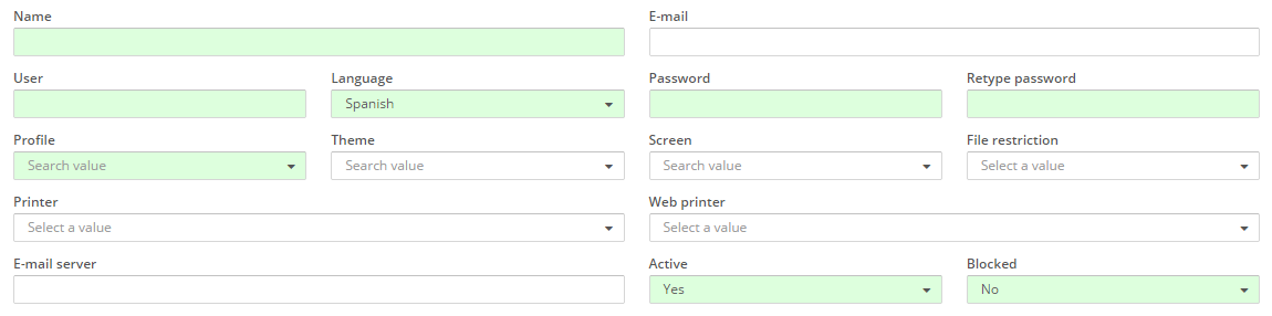
How does it work
Internally, a criterion has 2 basic attributes to manage the information to send to the server and the information to show to the user:
- selected: The selected values of the criterion. These values will be sent to the server.
- values: The available values of the criterion. These values will not be sent to the server. It's a list of values and labels that will be shown to the user to choose from.
Priorities
The selected values can be fulfilled in several ways. Here is a priority list with those ways:
- variable - These are the values sent from another screen
- screen target - The values returned by the screen target are the most priority of the list
initial-load="value"- The query-retrieved values follow the screen target values- session - Session-stored values
- property - Property-stored values
- value - Static values defined on value attribute
XML skeleton
<criteria id="[identifier]" component="[component]" label="[label]" placeholder="[placeholder]" style="[classes]"
          initial-load="[initial-load]" server-action="[server-action]" target-action="[target-action]"
          variable="[variable]" value="[value]" session="[session]" property="[property]"
          validation="[validation]" readonly="[read-only]" size="[size]" unit="[unit]" icon="[icon]"
          printable="[printable]" help="[help]" help-image="[help-image]"
          optional="[optional]" area-rows="[area-rows]" number-format="[number-format]" capitalize="[capitalize]"
          strict="[strict]" checked="[checked]" group="[group]" show-slider="[slider]" destination="[destination]">
  <dependency... />
</criteria>
Criteria structure
| Element | Use | Multiples instances | Description |
|---|---|---|---|
| criteria | Required | No | Global node of criteria. Defines the criterion attributes |
| dependency | Optional | Yes | List of dependencies attached to the criterion |
General attributes
| Attribute | Use | Type | Description | Values |
|---|---|---|---|---|
| id | Required | String | Criterion identifier. For reference purposes | |
| component | Required | String | Criterion type | See components |
| label | Optional | String | Criterion text (outside the criterion) | Note: You can use i18n files (locales) |
| placeholder | Optional | String | Criterion text (inside the criterion) | Note: You can use i18n files (locales) |
| style | Optional | String | Criterion CSS classes | See Bootstrap positioning for criteria sizing |
| initial-load | Optional | String | Server action call to load the criterion data (launched at window generation) | enum (for enumerated), query (for query call loading the values part of the criterion) or value (for query call loading the selected part of the criterion) |
| server-action | Optional | String | Server action call | See server action list |
| target-action | Optional | String | Target to call on the server | |
| max | Optional | Integer | Max number of values | Note: Default value is set in property var.def.rpp in file base.properties |
| autoload | Optional | Boolean | Launch target-action when the screen has been initialized | Note: Default value is false |
| autorefresh | Optional | Integer | Launch the target-action every X seconds | Note: The value is in seconds |
| variable | Optional | String | Parameter to fill the criterion value | Identifier of a criterion in the previous screen |
| value | Optional | String | Criterion default value | |
| session | Optional | String | Session variable to load the criterion | Session variable identifier |
| property | Optional | String | Property variable to load the criterion | Property variable identifier |
| validation | Optional | String | Validation rules | See validation |
| readonly | Optional | Boolean | Set criterion as readonly | Default value is false |
| size | Optional | String | Criterion size | sm (default), md or lg. |
| unit | Optional | String | Criterion unit text | Note: You can use i18n files (locales) |
| icon | Optional | String | Icon identifier | Note: You can check all iconsets at icons screen |
| printable | Optional | String | Check if criterion is printable | true (default) or false. Note: excel only has effect on grid columns |
| help | Optional | String | Help text for the criterion | Note: You can use i18n files (locales) |
| help-image | Optional | String | Help image for the criterion | This must be a image path |
| left-label | Optional | Integer | Put the label on the left and give it a size in chars | Default value is empty (label is on top instead of left). If defined, the value must be a number of chars for the label. The label is shown on the left from the sm breakpoint (576 px) and on top below it. Its width is the number of chars by the pixels per char of the criterion size (7 px for sm, 8 px for md and 10 px for lg) in both engines |
The help and help-image attributes show a tooltip when the user stays on the label of the criterion (a help icon is
shown next to it). Both engines show it in every criterion, including checkboxes, radio buttons, button checkboxes and
button radios, and also in buttons and in the headers of the grid columns.
To keep the less frequent criteria of a search at hand, place them in the <advanced> block of their window: see
advanced search.
Specific attributes
| Attribute | Criterion | Type | Description | Values |
|---|---|---|---|---|
| optional | Select | Boolean | Allow selecting a empty value | Default value is false |
| area-rows | Textarea | Integer | Number of rows of the textarea | Default value is 3 |
| number-format | Numeric | String | Format of the number | See autonumeric plugin |
| capitalize | Select, Suggest | Boolean | Put the first letter of the options in uppercase and the others in lowercase | Default value is false |
| strict | Suggest | Boolean | Allow the user only to select the list values | Default value is true |
| check-target | Suggest | String | Target action to be launched if label is not defined at suggest initialization | Default value is the defined at target-action |
| checked | Checkbox, Radio | Boolean | Mark the criterion as checked initially | Default value is false |
| group | Checkbox, Radio | String | Group of the criterion (for validation and management purposes) | |
| show-slider | Numeric | Boolean | Used to show the graphic component slider | Note: Only apply in numeric criteria |
| destination | Uploader | String | Destination relative folder to upload the file | |
| drop-zone | Uploader | Boolean | Shows a drop area to drag and drop the file, and a preview of images | Default value is false |
| capture | Uploader | String | Adds a button to take a photo with the device camera | user (front camera) or environment (rear camera) |
| show-weekends | Date | Boolean | For enable or disable the weekend days | Default value is true |
| show-future-dates | Date | Boolean | For enable or disable the future days after date value selected | Default value is true |
| date-format | Date | String | To set the format of the date you want to show | Default value is dd/MM/yyyy. Note: See the format in the following link |
| date-show-today-button | Date | Boolean | To show or not the button to select today date | Default value is true |
| date-view-mode | Date | String | Select 'days', 'months' or 'years' to set the minimum magnitude to be shown | Default value is days |
| time-format | Time | String | Format of the time you want to show | HH:mm, HH:mm:ss, hh:mm a or hh:mm:ss a. Default value is HH:mm:ss. React engine only |
| presets | Date range | String | Quick presets shown under the range, separated by commas or spaces | TODAY, YTD, ALL or a period back from today (7D, 2W, 1M, 3M, 12M, 3Y...). By default no preset is shown |
Components
Text criterion
Basic text input.

Password criterion
Basic text input, but the written characters are not shown to the user.

While the caps lock is on, both engines mark the field with a warning color and an arrow icon. The state comes from the last key pressed on the page, so the warning shows even if the caps lock was switched on before the user reached the field.
In both engines the field has a show / hide button at its right end (an eye icon, "Show password" / "Hide password"), reachable with the keyboard and disabled while the criterion is read-only. It only changes how the field is drawn: the value, the validation and the parameter sent stay the same. A field too narrow to hold the button without covering the text (under 6rem, as a password with a long left label in a narrow column) hides it. The sign-in page keeps its own button, and a password column of a grid has no button.
Textarea criterion
Criterion which allows the user to insert a large text and newlines.

Hidden criterion
Hidden criterion. It is useful to send static values to a query or as a formula element.
Numeric criterion
Criterion which allows to insert formatted numbers.

Numeric criterion with slider enabled
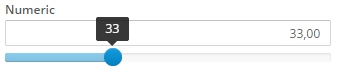
Number format attribute
This attribute is used to format the numeric criterion and the slider. It is specified in json object format.
| Attribute | Use | Type | Description | Values |
|---|---|---|---|---|
| min | Optional | Number | The minimum possible value | Ex: {min: 5} |
| max | Optional | Number | The maximum possible value | Ex: {max: 5} |
| aSign | Optional | String | Desired currency symbol | Ex: {aSign: ' €'} |
| pSign | Optional | String | Controls the placement of the currency symbol | pSign: 'p' to prefix or pSign: 's' to suffix (default) |
| aPad | Optional | Boolean | Controls padding of the decimal places | true always pads the decimal with zeros or false (default) to no padding |
| precision | Optional | Number | Number of decimals | Note: The thousand & decimal separators can not be the same |
| step | Optional | Number | Slider increment step | Ex: {step: 5} |
| ticks | Optional | Array | Used to define the values of ticks in slider. Tick marks are indicators to denote special values in the range. This option overwrites min and max options | Ex: {ticks: [-1000, -500, 0, 500, 1000]} |
| ticks_labels | Optional | Array | Defines the labels below the tick marks. Accepts HTML input | Ex: {ticks_labels: ['-$1000', '-$500', '$0', '$500', '$1000']} |
Note: You can view all autonumeric attributes here and the slider attributes here
Number format examples
number-format="{min: 0, max: 100, step: 0.01, precision: 2, aSign:' £', pSign:'s', aPad:true}"
---
number-format="{min: -1000, max: 1000, step: 10, precision: 2, aSign:' $', pSign:'s', aPad:true,
ticks: [-1000, -500, 0, 500, 1000], ticks_labels: ['-$1000', '-$500', '$0', '$500', '$1000']}"
Date criterion
Allows to select a date with a calendar.
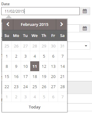
The AngularJS and the React engines apply the same options to the date criterion and to the date columns of a grid:
date-formatsets the format of the date shown and of the value that the client sends to the server and expects from it. The default isdd/mm/yyyy. The tokens are the ones of the bootstrap-datepicker plugin (d,dd,m,mm,M,MM,yy,yyyy...), soyyyy-mm-ddsends2024-03-15.date-view-modeset tomonthsoryearsmakes the calendar select a month or a year. Use it with a format that has no day (mm/yyyyoryyyy).show-weekends="false"disables the Saturdays and the Sundays.show-future-dates="false"disables the dates after the date that the criterion has when the screen starts.date-show-today-button="false"hides the button that selects today.
Time criterion
Allows to select a time with a time picker.
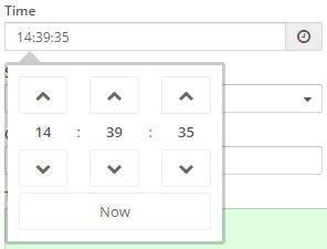
The time-format attribute (React engine only) sets how the time is shown:
| Format | Shows | Value sent to the server |
|---|---|---|
HH:mm | 14:30 | 14:30 |
HH:mm:ss | 14:30:15 (default) | 14:30:15 |
hh:mm a | 02:30 PM (12-hour clock) | 14:30 |
hh:mm:ss a | 02:30:15 PM (12-hour clock) | 14:30:15 |
The value that the client sends is always a 24-hour time, and it has seconds only when the format has them.
<criteria label="PARAMETER_TIME" id="Time" component="time" time-format="HH:mm"/>
Date range criterion
Allows to select a period (a start date and an end date) in one criterion. The end date cannot be before the start date
(an open end is allowed unless the criterion is required, which needs both dates). The user can type the dates, pick
them in the calendar or click one of the quick presets.
<criteria id="Period" component="date-range" label="PERIOD" presets="1M,3M,YTD,12M,3Y,ALL"/>
The criterion sends two parameters to the server, named after the criterion identifier with the suffixes .from
and .to. Both are dates in dd/MM/yyyy format (a null when the date is empty), so a criterion with identifier
Period sends Period.from and Period.to, and a query reads them as any other parameter:
<query id="OrdersByPeriod">
  <table id="Orders"/>
  <field id="OrderDate"/>
  <where>
    <and>
      <filter left-field="OrderDate" condition="ge" right-variable="PeriodFrom"/>
      <filter left-field="OrderDate" condition="le" right-variable="PeriodTo"/>
    </and>
  </where>
  <variable id="PeriodFrom" type="DATE" name="Period.from"/>
  <variable id="PeriodTo" type="DATE" name="Period.to"/>
</query>
The value attribute is a list of the two default dates separated by a comma
(value="01/01/2026,31/01/2026"); an empty first date (value=",31/01/2026") leaves the start open. It also accepts
one of the preset codes below (value="YTD"): the server resolves it into its two dates from the server date, and the
criterion opens with that preset shown as active. Reset and restore go back to that range.
A value initial load (initial-load="value") fills the range from the value column of the first two rows of its
target: the first row is the start date and the second one the end date.
The presets attribute defines the quick presets. Each code is shown as a button which fills both dates from the current date, and the active preset is cleared as soon as one of the dates is edited:
| Preset | Range |
|---|---|
TODAY | Today |
YTD | From January 1st of the current year to today |
ALL | Clears both dates (no period filter) |
<n>D, <n>W | The last n days or weeks until today |
<n>M, <n>Y | The last n months or years until today (1M, 3M, 12M, 3Y...) |
The label of a preset is the locale DATE_RANGE_PRESET_ followed by its code
(DATE_RANGE_PRESET_YTD), which AWE provides for TODAY, 1W, 1M, 3M, 6M, YTD, 12M, 3Y and ALL; any
other code shows the code itself unless you define its locale. The DATE_RANGE_FROM and DATE_RANGE_TO locales are
the placeholders of the two inputs, and VALIDATOR_MESSAGE_DATE_RANGE the validation message.
Note: The dates are always
dd/MM/yyyy: thedate-format,show-weekends,show-future-datesanddate-view-modeattributes of the date criterion do not apply to the date range.
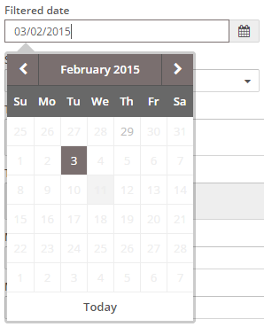
Filtered date criterion
Allows to select a date with a calendar from a list of filtered dates.
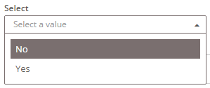
Select criterion
Shows a list and allows the user to select one element.
Suggest criterion
Allows the user to search a value by typing some characters of the seek value.
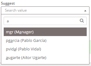
Note: The typed text is sent to the server as
suggestparameter, but only when the query is used to fill in the options. Otherwise, suggest's id should be used as usual.Important:
initial-load="query"orinitial-load="enum"attributes must not be used with this component, as it search for the values when typing. If you want to set an initial value on the suggest component, you should use thetargetattribute on screen or thevariableattribute on the criterion.The
check-targetattribute will make to launch a query when criterion is initialized only if the criterion data hasvaluefield but nolabelfield (i.e. if suggest component has been loaded) with atargetquery on screen load but only with a field instead of a compound field withvalueandlabelfields).
The options of a suggest can be grouped: when the rows of its query carry a group field (a locale key, translated by
the client), the list shows one header per group, in the order of the first option of each group, and the options of
the group under it. A header cannot be chosen and the arrow keys skip it; the chosen option shows its own label. The
options of a query without group are shown as always. For example, a service that searches profiles and users at once
answers:
[
  {"value": "profile:1", "label": "ADM - Administrator", "group": "PARAMETER_PROFILE"},
  {"value": "user:1", "label": "test - Manager", "group": "PARAMETER_USER"}
]
Select VS Suggest
| Select | Suggest |
|---|---|
| The list of values is "fixed" | The list can change every time you interact with the component |
| The list is loaded when you enter into the window | The list is loaded when you interact with the component |
| Filtered in the client | Can be filtered in client and server |
| You have to use it when the list of values is small and with fixed number of values. | It can be used with both small and large lists |
| Use attribute "max"=0 | Use attribute "max" to limit the data returned by the server. |
| You must use the variable "suggest" to filter. | |
| Not used when there are interrelationships between criteria | Mandatory use when there are interrelationships with other criteria. |
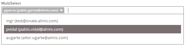
Multiple select criterion
Shows a list and allows the user to select some elements.
Multiple suggest criterion
Allows the user to search some values by typing some characters of the seek values.
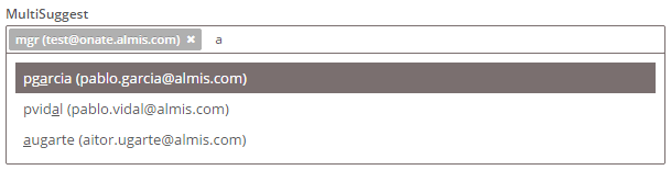
Note: The typed text is sent to the server as
suggestparameter.
Picklist criterion
It works in a similar way of a multiselect criterion, but is more intuitive

To fill the picklist the component uses the following columns in a query:
| Attribute | Use | Type | Description | Values |
|---|---|---|---|---|
| value | Required | String | Element identifier | Element value (value sent to server) |
| label | Required | String | Element title | Element title Note: You can use i18n files (locales) |
| description | Optional | String | Element description | Element description Note: You can use i18n files (locales) |
| unit | Optional | String | Element unit text | Text shown on the right of the element Note: You can use i18n files (locales) |
| icon | Optional | String | Element icon | Icon shown on the left of the description Note: You can check all iconsets at icons screen |
| image | Optional | String | Element image | URL to image shown on the left of the element |
Note: Picklist is only available in the new
AWE Reactengine
Checkbox criterion
Shows a checkbox. It sends a 1 (or the value defined in the value attribute) if it's checked or 0 if it is unchecked.

With style="switch" (it can be combined with the column classes, e.g. style="col-xs-12 col-sm-6 switch") both
engines draw the checkbox as a switch: a track with a handle and the label beside it. It sends the same values (1, or
the value attribute, when on and 0 when off), the Space key toggles it, it is announced as a switch
(role="switch") with its state, and it is disabled while the criterion is read-only.
<criteria label="PARAMETER_ACTIVE" id="Sta" component="checkbox" value="1" style="col-xs-12 col-sm-6 switch" />
Radio button criterion
Shows a radio button. It is mono-selection. It sends the value attribute of the selected element between all the radio buttons with the same group attribute.

Note: If we want a radio button group to be required, all the radio buttons that are inside the group must have validation="required"
Button checkbox criterion (line)
Similar to a checkbox but it has a button appearance. It sends a 1 (or the value defined in the value attribute) if it's checked or 0 if it is unchecked.

Radio button criterion (line)
Similar to a radio button but it has a button appearance. It is mono-selection. It sends the value attribute of the selected element between all the radio buttons with the same group attribute.

With options of its own (an initial-load of an enumerated or a query), one button radio criterion is one joined group
of buttons, one per option, in both engines: it sends the value of the chosen option, and the option of its value
starts chosen when it has checked="true":
<criteria id="subject-type" label="SCREEN_TEXT_ACCESS_SUBJECT_TYPE" component="button-radio"
          initial-load="enum" target-action="access-subject-types" value="user" checked="true"/>
Its label is shown above the buttons, as the label of any other criterion, so it lines up with the criteria of its
row. Without options, each button radio criterion is one button of its own value, and the criteria with the same group
make the group, as the radio buttons above (this is how the AngularJS engine draws them).
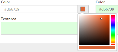
Color criterion
Color criterion. It is useful to get color hexadecimal value with a color picker widget.

Uploader criterion
Criterion useful to send files to the server. Once uploaded, the files can be managed by the server processes

The uploader has two optional attributes, available in both the AngularJS and the React clients:
drop-zone="true"shows a dashed drop area with a hint. The user can drop a file on it (the file dialog keeps working, and the Choose button stays reachable with the keyboard). When the file is a raster image (PNG, JPEG, GIF, WebP, BMP or AVIF) a preview is shown. Other files, SVG images included, are uploaded without preview.capture="user|environment"adds a Take photo button that opens the device camera on mobile browsers (userfor the front camera,environmentfor the rear one) and previews the photo. Browsers without a camera fall back to the regular file dialog.
Both options send the file through the same upload request as the Choose button, so the server keeps validating the
file type and size (uploadMaxSize). The preview is generated in the browser from the selected file and is released
when the file is cleared or replaced, or the screen is closed. The attributes are ignored in a read-only uploader.
Text view criterion
This criterion simply shows a text, which can be retrieved from a variable, a parameter, a query or even loaded with dependencies.

Examples
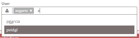
Multiple suggest with icon
<criteria label="PARAMETER_USER" component="suggest-multiple" id="..." icon="user" initial-load="query" target-action="..."
          style="col-xs-12 col-sm-6 col-lg-3"/>
Radio button group
<criteria component="radio" label="PARAMETER_RADIO_1" id="RadBox1" group="RadBox" variable="RadBox"
          value="Radio1" style="col-xs-6 col-sm-2 col-lg-1 no-label" validation="required" checked="true"/>
<criteria component="radio" label="PARAMETER_RADIO_2" id="RadBox2" group="RadBox" variable="RadBox"
          value="Radio2" style="col-xs-6 col-sm-2 col-lg-1 no-label" readonly="true"/>
<criteria component="radio" label="PARAMETER_RADIO_3" id="RadBox3" group="RadBox" variable="RadBox"
          value="Radio3" style="col-xs-6 col-sm-2 col-lg-1 no-label"/>
Required text without label, with placeholder and with icon
<criteria placeholder="SCREEN_TEXT_USER" component="text" icon="user" id="user" validation="required"
          style="col-xs-6 col-sm-4 col-md-2"/>

Select multiple with two preselected values
<criteria component="select-multiple" id="user" label="PARAMETER_USER" icon="user" initial-load="query"
          target-action="..." style="col-xs-12 col-sm-6 col-lg-3" value="1, 2" validation="required"/>

By default the field of a multiple select is one control high, in both clients. It shows the chips of the chosen values
that fit, in the order of the options (a label that does not fit ends with an ellipsis and shows in full as a tooltip),
and a +3 counter when some do not. The counter is a button: it opens a popover with every chosen value and a button to
remove each one, and Escape, a click outside, a scroll or a resize close it. Optional criteria also have a clear icon;
the chips have no remove icon of their own.
The display attribute chooses how a select-multiple or a suggest-multiple shows its values:
| Value | Shows | Default of |
|---|---|---|
summary | One line: the chips that fit and the +N counter described above | select-multiple |
chip | Every value as a chip with its own remove icon; the field grows with the values | suggest-multiple |
<!-- Every chosen value in sight, even if the field grows -->
<criteria component="select-multiple" id="user" display="chip" .../>
<!-- A suggest that keeps one line, for a filter bar -->
<criteria component="suggest-multiple" id="portfolio" display="summary" .../>
Color criterion sample
<criteria label="PARAMETER_COLOR" id="Col" variable="Col" component="color"
          style="col-xs-6 col-sm-3 col-lg-2" value="#d5db89" />
Uploader criterion sample
<criteria label="PARAMETER_UPLOADER" id="Upl" component="uploader" validation="required"
          style="col-xs-12 col-sm-6 col-lg-4" destination="testModule">

Uploader with drop zone and camera capture
<criteria label="PARAMETER_UPLOADER" id="Photo" component="uploader" destination="photos"
          style="col-xs-12 col-sm-6 col-lg-4" drop-zone="true" capture="environment"/>