Side panel
Try the side panel with live controls in the component catalog: the real AWE component and the XML that produces it.
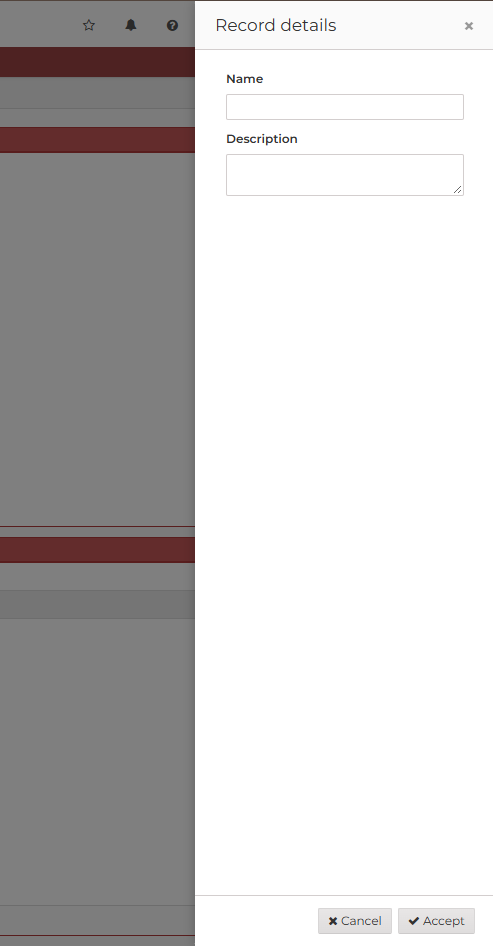
A side panel is a dialog anchored to the left or to the right edge of the screen, with a header, a body that
scrolls and an optional footer. Use it for content that the user consults or edits next to the screen (filters, details,
settings) without leaving it. It is opened and closed exactly like a dialog: with a button-action of type dialog (see
button actions), and with the close and close-cancel actions. Both web engines (AngularJS
and React) support it.
XML skeleton
<side-panel id="[panel-identifier]" label="[panel-label]" icon="[panel-icon]" style="[panel-style]"
            position="[left|right]" max-width="[css-length]" on-close="[on-close]" deferred="[deferred]">
  [define the content of the side panel]
  <tag type="div" style="modal-footer">
    [footer buttons]
  </tag>
</side-panel>
Side panel structure
| Element | Use | Multiples instances | Description |
|---|---|---|---|
| side-panel | Required | No | Global node of the side panel. Defines the side panel attributes |
| header-tag | Optional | Yes | Tag of the identity header (with header-grid) |
Side panel attributes
| Attribute | Use | Type | Description | Values |
|---|---|---|---|---|
| id | Optional | String | Side panel identifier. The dialog, close and close-cancel actions target it | |
| label | Optional | String | Title of the header | Note: You can use i18n files (locales) |
| icon | Optional | String | Icon of the header (AngularJS engine) | Note: You can check all iconsets at icons screen |
| style | Optional | String | Style of the side panel (css classes) | CSS classes separated by space (' ') |
| position | Optional | String | Edge of the screen the side panel is anchored to | right (default), left |
| max-width | Optional | String | Maximum width of the side panel. It takes the whole width of the screen when the screen is narrower | A CSS length, for instance 30rem, 480px or 50vw. Default 40rem |
| on-close | Optional | String | Behaviour of the stack after closing the side panel with its close button, Esc or a click outside | accept (default), reject- Reject cancels the stack, accept continues executing stack actions |
| deferred | Optional | Boolean | Load the data of the components of the side panel the first time it is opened, not with the screen. See deferred loading | true, false (default) |
| header-grid | Optional | String | Grid of the screen whose selected row the header shows. See identity header | A grid id |
| header-title-field | Optional | String | Field of the selected row with the title of the identity header | A field of the grid |
| header-subtitle-field | Optional | String | Field of the selected row with the subtitle (muted, under the title). Not shown when empty | A field of the grid |
| header-avatar-field | Optional | String | Field of the selected row the initials of the avatar are taken from (as the avatar-field of a grid column). No avatar when empty | A field of the grid |
| header-avatar-tone-field | Optional | String | Field of the selected row with the tone of the avatar | primary, info, success, warning, danger, neutral (default, any other value) |
| header-avatar-icon-field | Optional | String | Identity header: field of the selected row with an icon drawn in the avatar instead of the initials, on the tone of header-avatar-tone-field. A row without icon falls back to the initials | Field id |
| header-swatch-field | Optional | String | Field of the selected row with a colour drawn as a large circle in the place of the avatar (as the swatch-field of a grid column). No circle for any other value | An AWE 5 palette name or a #RGB / #RRGGBB hex |
Opening and closing
The side panel opens with a dialog action whose target is the side panel, as a dialog does:
<button id="ButPnlRight" label="BUTTON_SIDE_PANEL_RIGHT" icon="arrow-left">
  <button-action type="dialog" target="PnlRight"/>
</button>
It closes:
- with a
closeaction (the actions after thedialogaction go on) or aclose-cancelaction (they are cancelled), usually in the buttons of its footer; - with the close button of its header, with Esc or with a click outside it. These follow the
on-closeattribute:accept(default) behaves asclose,rejectasclose-cancel.
A dialog action with an edit-permission the user does not have opens the side panel in view mode: its criteria are
read-only. See screen elements.
Identity header
With header-grid the header of the side panel shows the selected row of that grid when exactly one row is selected
(for instance, the side panel that edits the user of the selected row): a large avatar with the initials of
header-avatar-field, the title of header-title-field, the subtitle of header-subtitle-field and a header-tag for
each field to show as a tag, in the order of the XML. With no row or several rows selected (for instance, the same side
panel opened to create a new record) the header shows its label and its icon. The header follows the selected row while
the side panel is open.
Attribute of header-tag | Use | Description |
|---|---|---|
| field | Required | Field of the selected row with the text of the tag. A tag whose value is empty is not shown |
| tone-field | Optional | Field with the tone of the tag: success, warning, danger, info or neutral (default) |
| icon-field | Optional | Field with the icon of the tag. With it the tag is plain: the icon takes the place of the dot |
The avatar and the tags look like the avatar and the status tags of the grid cells. The avatar is decorative;
the title is the accessible name of the side panel. With header-swatch-field a circle of the colour of the selected row
(an AWE 5 palette name or a hex, as the swatch of a grid column) takes the place of the avatar, as the
themes screen does with the primary colour of the theme; with an empty or unknown colour the header shows the avatar of
header-avatar-field, if any. All the header-* attributes are optional; without header-grid the
header does not change. Both engines support it. The header-grid can be a tree grid: the header
shows its selected row, as the Why? panel of the access screen does.
<side-panel id="PnlUsr" label="SCREEN_TITLE_USER_PANEL" icon="user"
            header-grid="GrdUsrAdm" header-title-field="FulNam" header-subtitle-field="UsrPro"
            header-avatar-field="Ini" header-avatar-tone-field="IniTon">
  <header-tag field="StaTxt" tone-field="StaTon"/>
  <header-tag field="2faHdr" tone-field="2faTon" icon-field="2faIcn"/>
  [define the content of the side panel]
</side-panel>
Footer
Put the buttons of the side panel in a child tag with the modal-footer style. The header and the footer stay in view
and the body scrolls between them when its content is longer than the screen.
Focus
While the side panel is open, the keyboard focus stays inside it: Tab from its last control goes back to the first one (the close button of its header) and Shift+Tab from the first one goes to the last one. When the side panel closes, the focus goes back to the control that opened it.
Example
A side panel on the right edge, 30rem wide, with a footer, and a deferred side panel on the left edge, 20rem wide, which rejects the stack when it is dismissed:
<tag source="buttons">
  <button id="ButPnlRight" label="BUTTON_SIDE_PANEL_RIGHT" icon="arrow-left">
    <button-action type="dialog" target="PnlRight"/>
  </button>
  <button id="ButPnlLeft" label="BUTTON_SIDE_PANEL_LEFT" icon="arrow-right">
    <button-action type="dialog" target="PnlLeft"/>
  </button>
</tag>
<tag source="center">
  <window style="expand" label="SCREEN_TITLE_SIDE_PANEL" expandible="vertical">
    <tag type="div" style="panel-body">
      <criteria id="CrtPnlResult" label="PARAMETER_SIDE_PANEL_RESULT" component="text" readonly="true"
                style="col-xs-12 col-sm-6"/>
    </tag>
  </window>

  <side-panel id="PnlRight" label="SIDE_PANEL_TITLE_RIGHT" max-width="30rem">
    <tag type="div" style="panel-body">
      <criteria id="CrtPnlName" label="PARAMETER_NAME" component="text" style="col-xs-12"/>
      <criteria id="CrtPnlNotes" label="PARAMETER_DESCRIPTION" component="textarea" style="col-xs-12"/>
    </tag>
    <tag type="div" style="modal-footer">
      <button id="ButPnlRightCancel" label="BUTTON_CANCEL" icon="times">
        <button-action type="close-cancel" target="PnlRight"/>
      </button>
      <button id="ButPnlRightAccept" label="BUTTON_ACCEPT" icon="check">
        <button-action type="close" target="PnlRight"/>
        <button-action type="value" target="CrtPnlResult" value="accepted"/>
      </button>
    </tag>
  </side-panel>

  <side-panel id="PnlLeft" label="SIDE_PANEL_TITLE_LEFT" position="left" max-width="20rem" on-close="reject"
              deferred="true">
    <tag type="div" style="panel-body">
      <criteria id="CrtPnlLeftName" label="PARAMETER_NAME" component="text" style="col-xs-12"/>
    </tag>
    <tag type="div" style="modal-footer">
      <button id="ButPnlLeftClose" label="BUTTON_CLOSE" icon="times">
        <button-action type="close" target="PnlLeft"/>
      </button>
    </tag>
  </side-panel>
</tag>
With the builder module, SidePanelBuilder builds a <side-panel>:
new SidePanelBuilder()
  .setPosition(SidePanelPosition.LEFT)
  .setMaxWidth("20rem")
  .setOnClose(OnClose.REJECT)
  .setDeferred(true)
  .setId("PnlLeft")
  .setLabel("SIDE_PANEL_TITLE_LEFT");