Tab and tabcontainer
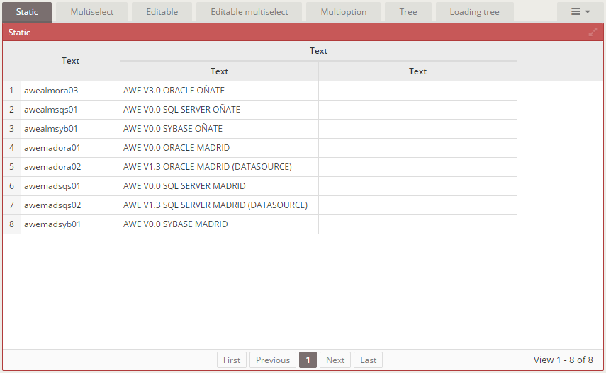
A tab is a very useful screen component to separate the screen components in tabs:
XML skeleton
<tab id="[tab-identifier]" initial-load="[initial-load]" target-action="[target-action]" maximize="[maximize-tab]">
  <tabcontainer id="[tabcontainer-identifier-1]">
  ...
  <tabcontainer id="[tabcontainer-identifier-n]">
  <dependency...></dependency>
  <context-menu...></context-menu>
</tab>
The tab list is filled with the value and label fields of the query/enum launched with [target-action].
Tab structure
<tab id="[tab-identifier]" initial-load="[initial-load]" target-action="[target-action]">
   ...
</tab>
| Element | Use | Multiples instances | Description |
|---|---|---|---|
| tab | Required | No | Global node of tab. Defines the tab attributes |
| tabcontainer | Required | Yes | List of tabcontainers to show |
| dependency | Optional | Yes | List of dependencies attached to the tab |
| context-menu | Optional | No | Context menu attached to the tab |
Tab attributes
| Attribute | Use | Type | Description | Values |
|---|---|---|---|---|
| id | Required | String | Tab identifier. Needs to be the same as target-action values | |
| initial-load | Required | String | Server action call to load the criterion data (launched at window generation) | enum (for enumerated) or query (for query call) |
| target-action | Required | String | Target to call on the server | |
| style | Optional | String | Tab CSS classes | Note: Here you can use expand class to set the tab as expandible |
| maximize | Optional | Boolean | Whether to show the maximize icon or not | Note: Works in both engines like a window: the tab list and its content fill the content area (menu and top bar stay visible) and the Restore button brings them back; there is no Escape key shortcut |
| orientation | Optional | String | Wizard steps orientation | Default value is vertical |
Tabcontainer structure
A tabcontainer is a window opened when a tab is selected. Note that [tabcontainer-identifier] must match the value
of the query/enumerated list set at Tab element.
<tabcontainer id="[tabcontainer-identifier]" type="[type]" label="[label]" style="[style]" expandible="[expandible]" deferred="[deferred]">
  ...
</tabcontainer>
Tabcontainer attributes
| Attribute | Use | Type | Description | Values |
|---|---|---|---|---|
| id | Required | String | Tabcontainer identifier. Needs to be the same as target-action values | |
| label | Optional | String | Tabcontainer title | Note: You can use i18n files (locales) |
| style | Optional | String | Tabcontainer CSS classes | Note: Here you can use expand class to set the window as expandible |
| type | Optional | String | Tabcontainer HTML tag type | div, span, p, ... |
| expandible | Optional | String | How to expand the tabcontainer children | vertical, horizontal |
| deferred | Optional | Boolean | Load the data of the tabcontainer components the first time the tab is selected, not with the screen. See deferred loading | true, false (default) |
Deferred loading
By default the server runs the initial-load queries of the components of every tabcontainer when it generates the screen,
including the tabs which are not shown. With deferred="true" in a tabcontainer, the data of its components is loaded
the first time the tab is selected, so a screen with many or heavy tabs loads faster. Without the attribute nothing changes.
The AngularJS and the React clients behave the same way.
<tab id="Customer" initial-load="enum" target-action="CustomerTabs">
  <tabcontainer id="Summary">
    ...
  </tabcontainer>
  <tabcontainer id="Orders" deferred="true">
    <grid id="OrderGrid" initial-load="query" target-action="OrderList" max="20">
      ...
    </grid>
  </tabcontainer>
</tab>
The rules are the ones of the deferred dialogs, applied to the tab: the components of the
tabcontainer are on the screen but empty until the tab is selected for the first time; then one silent deferred-data
server action loads them (with the values the screen has at that moment) and the tab is not loaded again, unless a query failed: the error is
shown and the next selection loads the tab again. Some details of the tabs:
- The tab which is selected when the screen is shown also loads on its own (right after the screen), because it is shown at once. Defer the pages the user does not see first.
- A tabcontainer which is the first one gets no advantage from the attribute; use it in the other pages.
- A deferred tabcontainer inside another deferred container waits for its own selection.
- A deferred tabcontainer never selected is not validated: its criteria are ignored by every validation rule, also in targeted validations. See validation of deferred containers.
- The
initial-loadof thetabitself (the list of pages) is never deferred.