Charts
A chart shows the result of a query as a graphic: lines, columns, areas, pies, scatter plots... You describe it in the
screen XML with a chart element, its axes, its series and, optionally, a legend, a tooltip and extra parameters. The
chart loads its data from a query, like any other AWE component.
Two engines draw the charts, and the chart XML is the same in both:
| Engine | Library | Notes |
|---|---|---|
| React | Apache ECharts 6.1.0 | Default client of AWE 5. Charts are drawn as SVG |
| AngularJS | Highcharts | Keeps drawing the charts with Highcharts until the AngularJS engine moves to ECharts (issue #775) |
The server does the translation. For every chart it builds the Highcharts chartModel (used by the AngularJS engine)
and, next to it, an echartsModel (used by the React engine). The echartsModel is an ECharts option without data and
without functions: the client adds the values of the query, and interprets the formats and the other
hints that the server sends. The options that you set with chart-parameter are translated too;
the ones that have no ECharts counterpart are ignored and reported in the log of the server.
Note: Apache ECharts is open source (Apache License 2.0). Highcharts is open source for non commercial applications. For commercial purposes, you must purchase a license to use it in the AngularJS engine.
The pages about charts are:
- Charts (this page): XML structure, examples of every chart type, actions, differences between the engines.
- Chart formats: the format language of labels, tooltips and axes.
- Chart parameters: the Highcharts options that you can set, and how each one is translated.
Chart concepts
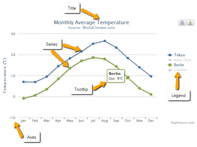
To get to grasp with how a chart works it is important to understand the various parts or concepts of a chart. Below is an image and a description of the main concepts in a chart. The image was drawn with Highcharts but the parts are the same in both engines.
-
Title: Is the text that will be presented at the top of a chart. Also you can put a subtitle element to describe in more detail the graphic. See chart for more information in XML structure.
-
Series: Is one or more series of data presented on a chart. See series for more information in XML structure.
-
Tooltip: When hovering over a series or a point on the chart you can get a tooltip that describes the values on that particular part of the chart. See tooltip for more information in XML structure.
-
Legend: The legend shows the data series in the graph and allows for enabling and disabling one or more series. See legend for more information in XML structure.
-
Axis: The x and y-axis of the chart, can also use multiple axes for different data series. Most chart types, like the typical cartesian types line and column, have axes. See axis for more information in XML structure.
Time series with zoom (stock charts)
A chart with stock-chart="true" is meant to show the evolution of a lot of data over time. In the React engine it has
a slider under the plot (the navigator) and the x axis can be zoomed with the mouse wheel. The AngularJS engine
draws it with Highstock, which adds a range selector, a scrollbar and a navigator.
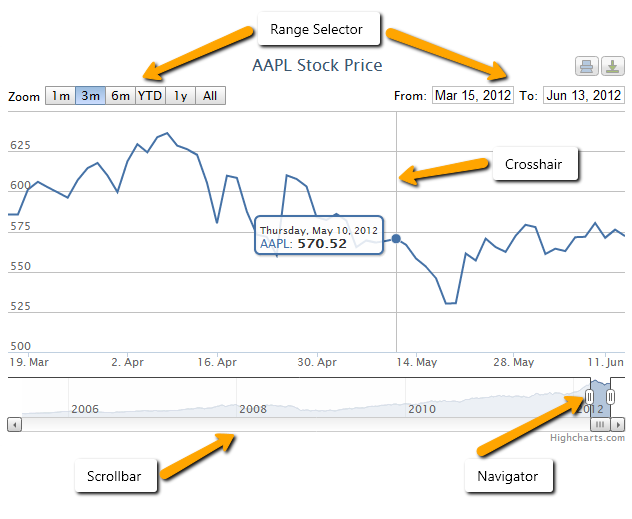
- Navigator: Allows you to fine tune the range of the chart which is displayed.
- Range selector: Allows you to quickly select a range to be shown on the chart or specify the exact interval to be shown. Only in the AngularJS engine.
- Scrollbar: Allows scrolling on the chart. Only in the AngularJS engine.
- Crosshair: Shows a line following the tooltip of a chart to better read results of the x-axis. This functionality can be found in the tooltip options, and it can be used in any chart (it is not enabled by default).
The image above shows Highstock. See the stock chart example for the React engine.
XML skeleton
The basic chart structure is the next one:
<chart id="[Chart Id]" label="[Chart title]" subtitle="[Chart subtitle]" type="[Type chart]"
       initial-load="[Initial load]" target-action="[Action]">
  <chart-legend layout="[Layout]" align="[Align]" verticalAlign="[Vertical align]" />
  <x-axis label="[Label X-Axis]" type="[Type axis]"/>
  <y-axis label="[Label Y-Axis]"/>
  <chart-tooltip suffix="[Suffix value]" number-decimals="[Decimal numbers]"/>
  <chart-serie id="[Serie ID]" x-value="[X-Values]" y-value="[Y-value]" label="[Serie label]" />
  <chart-parameter type="[Type parameter]" name="[Name parameter]">
    <chart-parameter type="[Type parameter]" name="[Name parameter]" value="[Parameter value]"/>
  </chart-parameter>
</chart>
Global chart structure
For easier development of graphics, not all labels are required.
| Element | Use | Multiples instances | Description |
|---|---|---|---|
| chart | Required | No | Global node of chart. Generically describes the graph. Title, type, what query generates it, ... |
| chart-legend | Optional | No | Describes the legend of chart |
| chart-tooltip | Optional | No | The tooltip appears when hovering over a point in a series. By default the tooltip shows the values of the point and the name of the series |
| x-axis | Required | Yes | Describes the X-axis of chart |
| y-axis | Required | Yes | Describes the Y-axis of chart. It is possible to have multiple axes and linking them with different data series |
| chart-serie | Required | Yes | A series is a set of data. It's represented as list of arrays with two values, [[x1,y1], [x2,y2]]. Each array is a point in the serie represented by axis |
| chart-parameter | Optional | Yes | Extra parameters to overwrite the chart structure. See chart parameters |
The chart element can also hold dependency, context-button and context-separator elements, like the other
components. A pie chart has no axes: the axes that the XML declares are not drawn.
Chart element
Chart element has the following attributes:
| Attribute | Use | Type | Description | Values |
|---|---|---|---|---|
| id | Required | String | Chart identifier | |
| label | Optional | String | Is the title of chart | Note: You can use i18n files (locales) |
| subtitle | Optional | String | Is the subtitle of chart | Note: You can use i18n files (locales) |
| type | Required | String | Type of chart | line, spline, column, column_3d, area, areaspline, arearange, areasplinerange, pie, pie_3d, donut, donut_3d, semicircle, mixed, bubble, scatter. See chart types |
| stock-chart | Optional | Boolean | Flag to indicate a stock type chart | true or false |
| theme | Optional | String | Is the name of the Highcharts theme | AngularJS engine only. See Highcharts themes |
| inverted | Optional | Boolean | Whether to invert the axes so that the x axis is vertical and y axis is horizontal. When true, the x axis is reversed by default. | true or false |
| stacking | Optional | String | Whether to stack the values of each series on top of each other | normal or percent |
| enable-data-labels | Optional | Boolean | Whether to show the data labels of the points | Defaults to false |
| format-data-labels | Optional | String | Format string for the data labels. See chart formats | Ex. Point y with 3 decimals format-data-labels="{y:.3f}" |
| zoom-type | Optional | String | Decides in what dimensions the user can zoom | xAxis, yAxis or all |
| initial-load | Required | String | For load the chart when the screen is generated | Note: Only can have the 'query' value |
| target-action | Required | String | Is the name of query to load chart | |
| server-action | Optional | String | Type of server action that loads the chart | |
| max | Optional | Number | Number of points to be shown | Note: 0 stands for all elements |
| autorefresh | Optional | Number | Interval of the automatic reload of the chart | |
| autoload | Optional | Boolean | Whether the chart loads its data automatically | |
| style | Optional | String | CSS classes of the chart | |
| visible | Optional | Boolean | Whether the chart is visible | |
| help | Optional | String | Help text of the chart | Note: You can use i18n files (locales) |
| help-image | Optional | String | Image shown in the help of the chart | |
| icon-loading | Optional | String | Set the loading icon | spinner (default), square, circles, carpet, dots, folding, squarebar, circlebar, cubes, icon, custom, none |
Chart types
| Type | Drawn as (React engine) |
|---|---|
line, spline | Lines. spline smooths them |
area, areaspline | Filled lines. areaspline smooths them |
arearange, areasplinerange | Approximated by a filled line (the server logs a warning) |
column | Vertical bars |
column_3d | Vertical bars, flat (3D is not drawn) |
pie | Pie |
pie_3d | Pie, flat |
donut, donut_3d | Pie with an inner radius (50% by default), flat |
semicircle | Donut that only draws its upper half |
scatter, bubble | Points. bubble uses the z-value of the series as the size |
mixed | The type of each series decides (type of chart-serie). A series without type is a line |
Axis element
Axis element has the following attributes:
| Attribute | Use | Type | Description | Values |
|---|---|---|---|---|
| label | Optional | String | Is the name of axis | Note: You can use i18n files (locales) |
| label-format | Optional | String | A format string for the axis label. See chart formats | Defaults to {value}. Ex.: Add unit to axis label-format = "{value} ºC" |
| formatter-function | Optional | String | Named function to format axis labels | formatCurrencyMagnitude. See named formatters |
| label-rotation | Optional | Number | Rotation of the labels in degrees | Defaults to 0 |
| type | Optional | String | The type of axis. | linear, logarithmic, datetime or category. Defaults to linear |
| tick-interval | Optional | Number | The interval of the tick marks in axis units | In a datetime axis the unit is the millisecond, so an interval of one day is 24 * 3600 * 1000 = 86400000. In a category axis, one label is shown every n categories |
| allow-decimal | Optional | Boolean | Whether to allow decimals in the ticks of the axis. When counting integers, like persons or hits on a web page, decimals must be avoided in the axis tick labels | Defaults to false, so the ticks are integers unless you set true |
| opposite | Optional | Boolean | Whether to display the axis on the opposite side of the normal. The normal is on the left side for vertical axes and bottom for horizontal, so the opposite sides will be right and top respectively | Defaults to false |
An x-axis or y-axis element can hold chart-parameter elements, with the options of the
axis scope.
Legend element
Legend element has the following attributes:
| Attribute | Use | Type | Description | Values |
|---|---|---|---|---|
| label | Optional | String | Is the title of legend | Note: You can use i18n files (locales) |
| enabled | Optional | Boolean | For enabled or disabled the legend in the chart | Defaults to false when the chart-legend element is present. Without the element, the legend is shown in charts with axes and hidden in pies and stock charts |
| border-width | Optional | Number | The width of the drawn border around the legend | Default to 0 |
| layout | Optional | String | The layout of the legend items | horizontal or vertical. Defaults to horizontal |
| align | Optional | String | The horizontal alignment of the legend box within the chart area | left, center or right. Defaults to center |
| verticalAlign | Optional | String | The vertical alignment of the legend box | top, middle or bottom. Defaults to bottom |
| floating | Optional | Boolean | When the legend is floating, the plot area ignores it and is allowed to be placed below it | true or false. Defaults to false |
In a pie chart the legend lists the slices. In the other charts it lists the series and clicking an entry hides and shows the series.
Tooltip element
Tooltip element has the following attributes:
| Attribute | Use | Type | Description | Values |
|---|---|---|---|---|
| enabled | Optional | Boolean | For enabled or disabled the tooltip in the chart | Defaults to true |
| crosshairs | Optional | String | Display crosshairs to connect the points with their corresponding axis values | xAxis, yAxis or all |
| number-decimals | Optional | Number | Format tooltip value setting the number of decimals | |
| suffix | Optional | String | Format tooltip value adding a suffix string | Ex.: suffix = " ºC" |
| prefix | Optional | String | Format tooltip value adding a prefix string | Ex.: prefix = "Temp. " |
| point-format | Optional | String | The format of the point's line in the tooltip. See chart formats | Ex.: point-format = '{series.name}: <b>{point.y}</b><br/>' |
| date-format | Optional | String | For series on a datetime axes, the date pattern of the header of the tooltip | Ex.: date-format = "%Y-%m-%d" |
| shared | Optional | Boolean | Shared tooltip for multiple series of chart | Defaults to false |
The header and the footer of the tooltip, and the HTML mode, are set with parameters of the tooltip. See HTML tooltips.
Serie element
Serie element has the following attributes:
| Attribute | Use | Type | Description | Values |
|---|---|---|---|---|
| id | Required | String | Serie identifier | |
| label | Optional | String | Is the name of serie. This value is shown in legend | Note: You can use i18n files (locales) |
| type | Optional | String | Type of serie | line, spline, column, bar, pie, area, areaspline, arearange, areasplinerange or scatter. Note: If there are several series of different type, you should set the type attribute of chart element to mixed. A bar series is a horizontal column: it inverts the whole chart |
| color | Optional | String | Is used to set a color for serie | Note: You can use name of colors or hexadecimal code. Ex.: color = "red" or color = "#BF0B23" |
| x-value | Required | String | Defines the value of the point on the x axis. It corresponds to the alias attribute of the field in the query | |
| y-value | Required | String | Defines the value of the point on the y axis. It corresponds to the alias attribute of the field in the query | |
| z-value | Optional | String | Defines the value of the point on the z axis (the size of a bubble). It corresponds to the alias attribute of the field in the query | |
| x-axis | Optional | Number | When using dual or multiple x axes, this number defines which xAxis the particular series is connected to. It refers to the position of the axis | Default value is 0 |
| y-axis | Optional | Number | When using dual or multiple y axes, this number defines which yAxis the particular series is connected to. It refers to the position of the axis | Default value is 0 |
| drilldown-serie | Optional | String | Is the serie Id of drilldown serie | Note: View this example |
| drilldown | Optional | Boolean | Flag to indicate if the serie is used in a subchart | true or false |
A chart-serie can hold chart-parameter elements, with the options of the
series scope.
Chart parameter element
It is used for overwrite values in chart elements. It has the following attributes:
| Attribute | Use | Type | Description | Values |
|---|---|---|---|---|
| type | Required | String | Type of chart parameter | Can be one of string, integer, long, float, double, boolean, array, object or null. |
| name | Required | String | Name of chart parameter | |
| value | Optional | String | Value of chart parameter |
The chart element, the axes, the legend, the tooltip and the series accept chart-parameter children. See
chart parameters for the options that each engine applies.
Series and queries concepts
In this section, it explains how works the integration between series of graphics and query engine of AWE. A series is
a list of points, and a point has an x value and a y value (and a z value in a bubble chart). Each point is a row
of the query.
Therefore, you must set the values of x and y for point in a serie. For this, exist the serie attributes x-value and
y-value.
This attributes corresponds to the alias attribute of the field in the query. Let's see the following example:
- XML code of chart element
<chart id="ChrBarTst" label="CHART_2" type="column_3d" initial-load="query" target-action="TstChrThrDatSrc">
  <x-axis label="SCREEN_TEXT_CHART_AXIS_DATES" type="datetime"/>
  <y-axis label="Temperaturas (ºC)"/>
  <chart-serie id="serie2-1" x-value="dates" y-value="serie1" type="column" label="SCREEN_TEXT_CHART_SERIE_1" />
  <chart-serie id="serie2-2" x-value="dates" y-value="serie2" type="column" label="SCREEN_TEXT_CHART_SERIE_2" />
  <chart-serie id="serie2-3" x-value="dates" y-value="serie3" type="column" label="SCREEN_TEXT_CHART_SERIE_3" />
</chart>
- Query code to load chart
  <!-- GET THREE DATA SERIES WITH DATES -->
  <query id="TstChrThrDatSrc" distinct="true">
    <table id="HISAweDbs"/>
    <field id="HISdat" transform="DATE_MS" function="TRUNCDATE" alias="dates"/>
    <computed format="(1/(parseInt(Math.random()*10,10)+1))*10" eval="true" alias="serie1" transform="NUMBER"/>
    <computed format="(parseInt(Math.random()*10,10)+1)+2" eval="true" alias="serie2" transform="NUMBER"/>
    <computed format="((parseInt(Math.random()*10,10)+1)*2)-4" eval="true" alias="serie3" transform="NUMBER"/>
    <order-by field="dates" type="ASC"/>
  </query>
In this example, you can see the attribute x-value = "dates" of chart serie is equal to attribute alias in field
element and the attribute y-value = "serie1" is equal to alias in the query.
Note: If the axis type is datetime, the chart expects a date as a long value: a JavaScript date timestamp (milliseconds since Jan 1st 1970). AWE provides transform = "DATE_MS".
The series of a chart can also be defined at runtime, without chart-serie elements, with the
chart actions.
Note: The values of the points are drawn as the query gives them. The chart does not round them: use
number-decimalsin the tooltip or a format to show a given number of decimals.
Examples
The examples show trimmed screens of the React test application, drawn with ECharts. The values of the series of the test queries are random, so a chart of your application will not look exactly the same. The test screens use Spanish and English texts for their titles and labels.
Every example uses the same query structure: one field with the x value (DATE_MS for dates) and one computed or
selected field for each series, as described in Series and queries concepts.
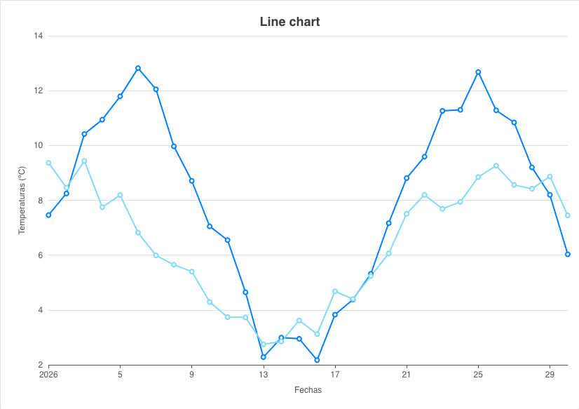
Line chart
Type line: the series are drawn as lines with a marker on each point. The color attribute of a series sets its
color and zoom-type="xAxis" lets the user zoom the x axis.
<chart id="ChrLinTst" label="SCREEN_TEXT_LINE_CHART" type="line" initial-load="query"
       target-action="TstChrTwoSrc" zoom-type="xAxis" max="25">
  <chart-legend label="Leyenda" verticalAlign="middle" align="right" border-width="1" />
  <x-axis label="Fechas" type="datetime" />
  <y-axis label="Temperaturas (ºC)" />
  <chart-tooltip crosshairs="xAxis" suffix=" ºC" number-decimals="1" />
  <chart-serie id="serie-1" x-value="dates" y-value="serie1" label="Serie 1" color="#0080FF" />
  <chart-serie id="serie-2" x-value="dates" y-value="serie2" label="Serie 2" color="#81DAF5" />
</chart>
Note: A
chart-legendelement is disabled unless you setenabled="true", so the legend of this chart is not drawn.
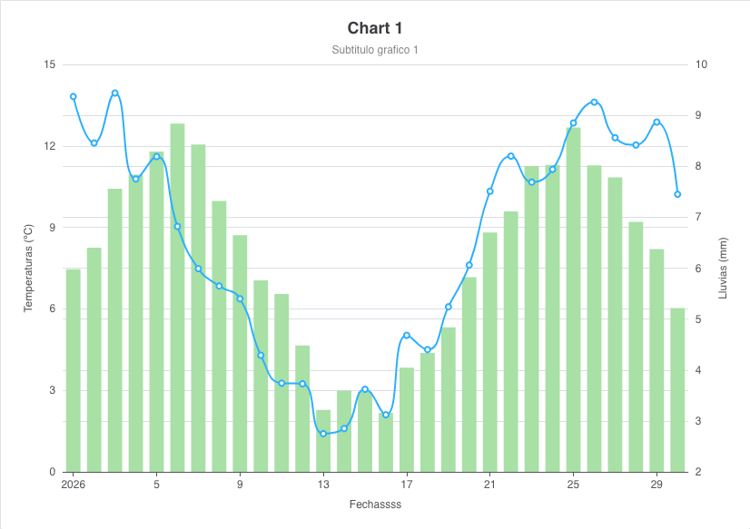
Mixed chart: column, spline and two y axes
Type mixed: each series sets its own type. This chart draws a column series and a spline series, each one on its
own y axis (y-axis="0" and y-axis="1"; the second axis is opposite).
<chart id="ChrLinTst" label="SCREEN_TEXT_CHART_TITLE_1" subtitle="Subtitulo grafico 1" type="mixed"
       initial-load="query" target-action="TstChrTwoSrc" zoom-type="xAxis" max="30">
  <chart-legend label="Leyenda" />
  <x-axis label="Fechas" type="datetime" />
  <y-axis label="Temperaturas (ºC)" formatter-function="formatCurrencyMagnitude"/>
  <y-axis opposite="true" label="Lluvias (mm)" />
  <chart-tooltip crosshairs="xAxis" suffix=" ºC" number-decimals="3" shared="true"/>
  <chart-serie id="serie-1" y-axis="0" x-value="dates" y-value="serie1" type="column" label="Serie 1" color="#A8E0A6" />
  <chart-serie id="serie-2" y-axis="1" x-value="dates" y-value="serie2" type="spline" label="Serie 2" />
</chart>
The tooltip of this chart is shared: it shows the values of all the series at the same x value, with a crosshair. See the tooltip example.
Area chart
Types area and areaspline fill the area under the line. This example uses areaspline and changes the date
pattern of the labels of the axis with a chart-parameter.
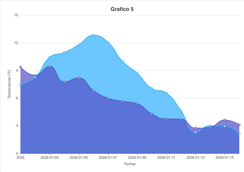
<chart id="ChrAreTst" label="Grafico 5" type="areaspline" initial-load="query" target-action="TstChrTwoSrcLab" max="16">
  <chart-legend align="right" verticalAlign="top" floating="true" />
  <x-axis label="Fechas" type="datetime">
    <chart-parameter type="object" name="dateTimeLabelFormats">
      <chart-parameter type="string" name="day" value="%Y-%m-%d" />
    </chart-parameter>
  </x-axis>
  <y-axis label="Temperaturas (ºC)" />
  <chart-tooltip suffix=" ºC" number-decimals="3" />
  <chart-serie id="serie1" x-value="dates" y-value="serie1" label="Serie 1" />
  <chart-serie id="serie2" x-value="dates" y-value="serie2" label="Serie 2" />
</chart>
Area with a gradient fill
The fill of an area is a linear gradient set in the series (fillColor). The gradient goes from the top to the bottom
of the plot. The threshold of -Infinity fills the area from the bottom of the axis, and the markers are styled with
plotOptions.area.marker.
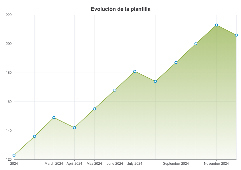
<chart id="ChrAdvArea" label="Evolución de la plantilla" type="area" zoom-type="xAxis"
       initial-load="query" target-action="ChrAdvAreaSrc">
  <chart-legend enabled="false" />
  <chart-tooltip number-decimals="0" date-format="%B %Y" crosshairs="xAxis" suffix=" personas" />
  <x-axis type="datetime">
    <chart-parameter type="object" name="dateTimeLabelFormats">
      <chart-parameter type="string" name="month" value="%B %Y" />
    </chart-parameter>
    <chart-parameter type="string" name="gridLineWidth" value="0.5" />
  </x-axis>
  <y-axis>
    <chart-parameter type="string" name="gridLineWidth" value="0.5" />
  </y-axis>
  <chart-serie id="staff" x-value="month" y-value="staff" label="Plantilla" color="#8cac41">
    <chart-parameter type="object" name="fillColor">
      <chart-parameter type="object" name="linearGradient">
        <chart-parameter type="integer" name="x1" value="0" />
        <chart-parameter type="integer" name="y1" value="0" />
        <chart-parameter type="integer" name="x2" value="0" />
        <chart-parameter type="integer" name="y2" value="1" />
      </chart-parameter>
      <chart-parameter type="array" name="stops">
        <chart-parameter type="array" name="">
          <chart-parameter type="integer" name="" value="0" />
          <chart-parameter type="string" name="" value="rgba(140,172,65,0.7)" />
        </chart-parameter>
        <chart-parameter type="array" name="">
          <chart-parameter type="integer" name="" value="1" />
          <chart-parameter type="string" name="" value="rgba(140,172,65,0.05)" />
        </chart-parameter>
      </chart-parameter>
    </chart-parameter>
  </chart-serie>
  <chart-parameter type="object" name="plotOptions">
    <chart-parameter type="object" name="area">
      <chart-parameter type="integer" name="lineWidth" value="2" />
      <chart-parameter type="string" name="threshold" value="-Infinity" />
      <chart-parameter type="object" name="marker">
        <chart-parameter type="string" name="fillColor" value="#FFFFFF" />
        <chart-parameter type="integer" name="lineWidth" value="2" />
        <chart-parameter type="string" name="lineColor" value="#0088CC" />
        <chart-parameter type="integer" name="radius" value="4" />
      </chart-parameter>
    </chart-parameter>
  </chart-parameter>
</chart>
Column chart
Type column. With the stacking attribute (normal or percent) the series are stacked. The type column_3d is
accepted in the XML, but the React engine draws it flat, like this stacked chart:
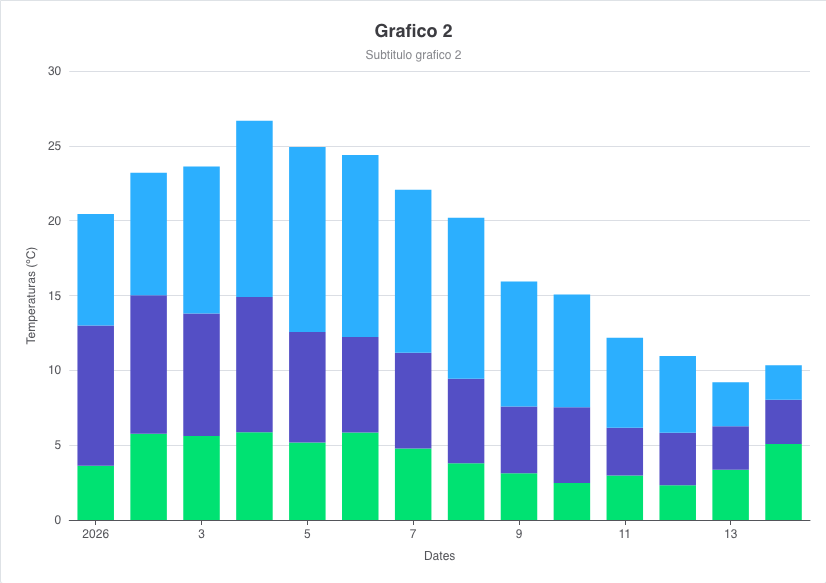
<chart id="ChrBarTst" label="Grafico 2" subtitle="Subtitulo grafico 2" type="column_3d" stacking="normal"
       initial-load="query" target-action="TstChrThrDatSrc" max="21">
  <chart-legend layout="vertical" align="right" verticalAlign="middle" />
  <x-axis label="SCREEN_TEXT_CHART_AXIS_DATES" type="datetime" />
  <y-axis label="Temperaturas (ºC)" />
  <chart-tooltip crosshairs="xAxis" suffix=" ºC" number-decimals="3" />
  <chart-serie id="serie2-1" x-value="dates" y-value="serie1" type="column" label="SCREEN_TEXT_CHART_SERIE_1" />
  <chart-serie id="serie2-2" x-value="dates" y-value="serie2" type="column" label="SCREEN_TEXT_CHART_SERIE_2" />
  <chart-serie id="serie2-3" x-value="dates" y-value="serie3" type="column" label="SCREEN_TEXT_CHART_SERIE_3" />
</chart>
The series of a stack are the ones with the same stack parameter (the default stack is shared by all the series).
Stacked columns with rounded corners
The borderRadius of a series (pixels or percentage) rounds the end of the bar that is away from zero, and only in the
outermost series of a stack. The padding between columns is set with pointPadding and groupPadding, and the order
of the entries of the legend with legendIndex. The y axis uses the formatCurrencyMagnitude formatter.
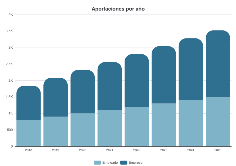
<chart id="ChrAdvColumns" label="Aportaciones por año" type="column" stacking="normal"
       initial-load="query" target-action="ChrAdvColumnsSrc">
  <chart-legend enabled="true" />
  <chart-tooltip number-decimals="2" suffix=" €" shared="true" />
  <x-axis type="category" tick-interval="1" />
  <y-axis formatter-function="formatCurrencyMagnitude" tick-interval="500" />
  <chart-serie id="company" type="column" x-value="year" y-value="company" label="Empresa" color="#2f6f8f">
    <chart-parameter type="string" name="borderRadius" value="30%" />
    <chart-parameter type="integer" name="legendIndex" value="2" />
  </chart-serie>
  <chart-serie id="employee" type="column" x-value="year" y-value="employee" label="Empleado" color="#7fb3c8">
    <chart-parameter type="string" name="borderRadius" value="30%" />
    <chart-parameter type="integer" name="legendIndex" value="1" />
  </chart-serie>
  <chart-parameter type="object" name="plotOptions">
    <chart-parameter type="object" name="column">
      <chart-parameter type="float" name="pointPadding" value="0.05" />
      <chart-parameter type="float" name="groupPadding" value="0.05" />
    </chart-parameter>
  </chart-parameter>
</chart>
Bar chart and pyramid
A bar chart is a column chart turned on its side. There are two ways to get it: a series of type bar, or
inverted="true" in the chart. In both cases the x axis is vertical, and the y axis is horizontal (the first category or
the oldest date is at the top).
The pyramid is a bar chart with two series that share a stack, a second x axis on the opposite side, and negative
and positive values formatted with a condition. Two helper series (dummyMax and
dummyMin, of type scatter) are hidden from the legend and from the mouse: they only extend the range of the axis.
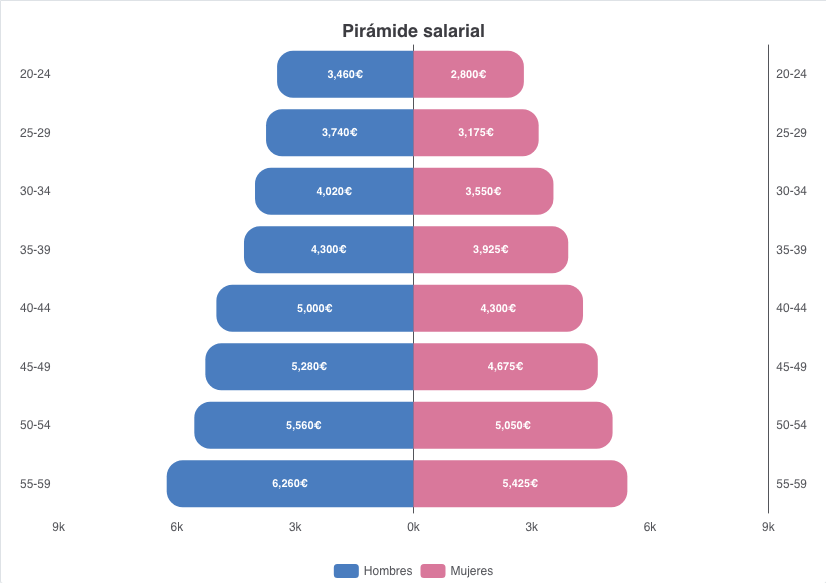
<chart id="ChrAdvPyramid" label="Pirámide salarial" type="column" inverted="true"
       initial-load="query" target-action="ChrAdvPyramidSrc">
  <chart-legend enabled="true" />
  <chart-tooltip shared="false">
    <!-- html tooltip: see Chart formats -->
  </chart-tooltip>
  <x-axis type="category" />
  <x-axis type="category" opposite="true" />
  <y-axis>
    <chart-parameter type="object" name="labels">
      <chart-parameter type="string" name="format"
                       value="{#if (gt value 0)}{multiply value 0.001}k{else}{multiply value -0.001}k{/if}" />
    </chart-parameter>
    <chart-parameter type="string" name="gridLineWidth" value="0" />
  </y-axis>
  <chart-serie id="men" type="column" x-value="age" y-value="men" label="Hombres" color="#4a7dbf">
    <chart-parameter type="string" name="stack" value="salary" />
    <chart-parameter type="float" name="pointPadding" value="0" />
    <chart-parameter type="float" name="groupPadding" value="0.1" />
    <chart-parameter type="integer" name="borderRadius" value="20" />
    <chart-parameter type="object" name="dataLabels">
      <chart-parameter type="boolean" name="enabled" value="true" />
      <chart-parameter type="string" name="format"
                       value="{#if (gt y 0)}{y:,.0f}€{else}{(multiply y -1):,.0f}€{/if}" />
    </chart-parameter>
  </chart-serie>
  <chart-serie id="women" type="column" x-value="age" y-value="women" label="Mujeres" color="#d9789b" x-axis="1">
    <chart-parameter type="string" name="stack" value="salary" />
    <!-- same parameters as the men series -->
  </chart-serie>
  <chart-serie id="dummyMax" type="scatter" x-value="age" y-value="dummyMax" label="max" color="transparent">
    <chart-parameter type="boolean" name="showInLegend" value="false" />
    <chart-parameter type="boolean" name="enableMouseTracking" value="false" />
    <chart-parameter type="object" name="marker">
      <chart-parameter type="boolean" name="enabled" value="false" />
    </chart-parameter>
  </chart-serie>
  <chart-serie id="dummyMin" type="scatter" x-value="age" y-value="dummyMin" label="min" color="transparent">
    <chart-parameter type="string" name="linkedTo" value=":previous" />
    <!-- same parameters as dummyMax -->
  </chart-serie>
</chart>
Pie chart
Type pie. The legend lists the slices. enable-data-labels shows the label of each slice, and its text is set with
format-data-labels (see chart formats). A pie has no axes, so the axes
that the XML declares are not drawn.
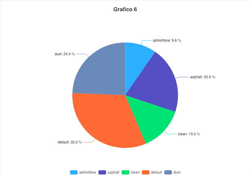
<chart id="ChrPieTst" label="Grafico 6" type="pie" initial-load="query" enable-data-labels="true"
format-data-labels="<b>{point.name}</b>: {point.percentage:.1f} %"
target-action="TstChrPieDrillSrc" max="5">
<chart-legend enabled="true" />
<x-axis label="Themes" />
<y-axis label="Percent (%)" />
<chart-tooltip suffix=" %" number-decimals="2" />
<chart-serie id="serie1" x-value="names" y-value="serie1" label="Themes" />
<chart-parameter type="object" name="plotOptions">
<chart-parameter type="object" name="pie">
<chart-parameter type="string" name="size" value="75%" />
</chart-parameter>
</chart-parameter>
</chart>
Pie with its own colors
The colors parameter sets the palette of the chart. With colorByPoint every slice takes a color, and
allowPointSelect lets the user select a slice with a click. This chart has the type pie_3d, which is drawn flat.
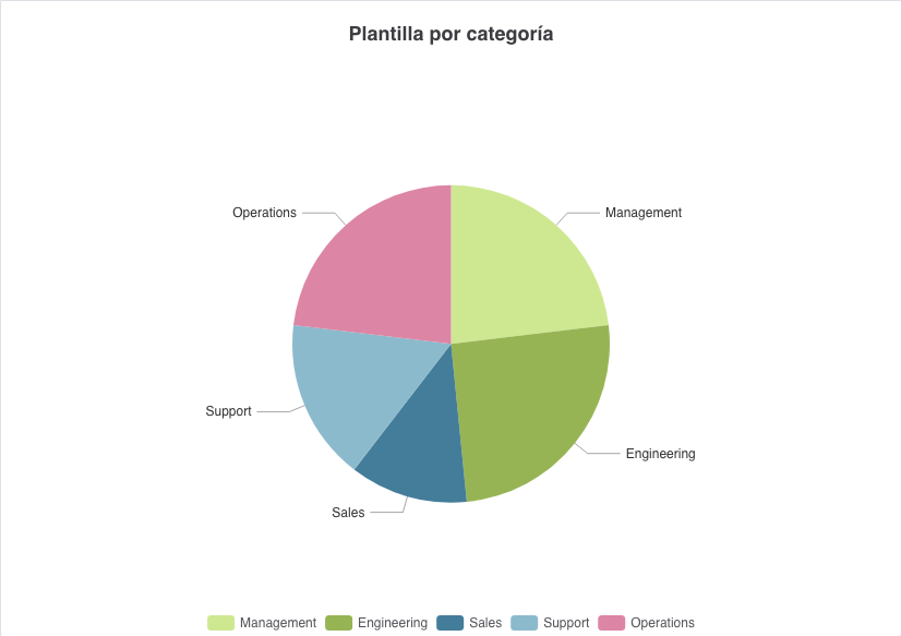
<chart id="ChrAdvPie3d" label="Plantilla por categoría" type="pie_3d" enable-data-labels="true"
       initial-load="query" target-action="ChrAdvPieSrc">
  <chart-legend enabled="true" />
  <chart-tooltip number-decimals="0" suffix=" personas" />
  <chart-serie id="cat" x-value="category" y-value="people" label="Personas" />
  <chart-parameter type="array" name="colors">
    <chart-parameter type="string" name="" value="rgba(201,229,134,0.9)" />
    <chart-parameter type="string" name="" value="rgba(140,172,65,0.9)" />
    <!-- ... -->
  </chart-parameter>
  <chart-parameter type="object" name="plotOptions">
    <chart-parameter type="object" name="series">
      <chart-parameter type="boolean" name="colorByPoint" value="true" />
      <chart-parameter type="boolean" name="allowPointSelect" value="true" />
    </chart-parameter>
    <chart-parameter type="object" name="pie">
      <chart-parameter type="object" name="dataLabels">
        <chart-parameter type="string" name="connectorColor" value="rgba(128,128,128,0.7)" />
      </chart-parameter>
    </chart-parameter>
  </chart-parameter>
</chart>
Donut chart
Types donut and donut_3d draw a pie with an inner radius (50% by default). plotOptions.pie.size is the outer
radius and plotOptions.pie.innerSize the inner radius, relative to size. The 3D type is drawn flat.
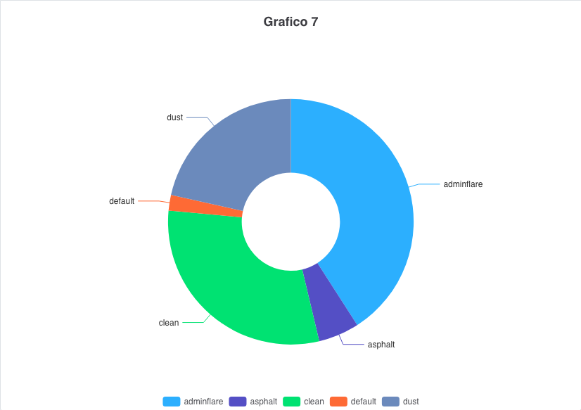
<chart id="ChrDonutTst" label="Grafico 7" type="donut_3d" initial-load="query" target-action="TstChrPieSrc" max="5">
  <chart-legend enabled="true" />
  <x-axis label="Themes" />
  <y-axis label="Percent (%)" />
  <chart-tooltip suffix=" %" number-decimals="2" />
  <chart-serie id="serie1" x-value="names" y-value="serie1" label="Themes" />
  <chart-parameter type="object" name="plotOptions">
    <chart-parameter type="object" name="pie">
      <chart-parameter type="string" name="size" value="75%" />
      <chart-parameter type="string" name="innerSize" value="40%" />
    </chart-parameter>
  </chart-parameter>
</chart>
Semicircle chart
Type semicircle draws only the upper half of a donut. The labels are written inside the slices (a negative
dataLabels.distance), and the title is moved to the middle of the chart with the title parameters. Like in
Highcharts, the center and the size of the semicircle are measured in the plot area, which leaves out the legend, so
the title sits in the hole.
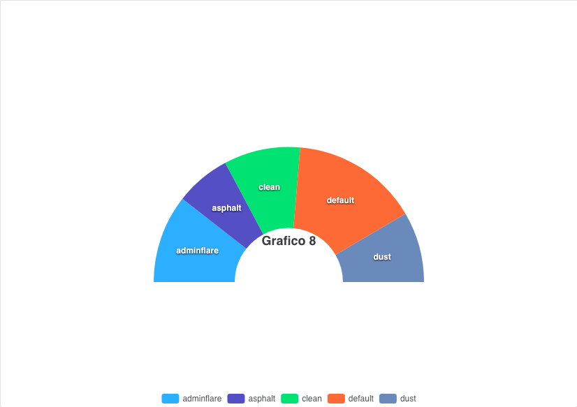
<chart id="ChrSemiCircleTst" label="Grafico 8" type="semicircle" enable-data-labels="true"
       initial-load="query" target-action="TstChrPieSrc" max="5">
  <chart-legend enabled="true" />
  <x-axis label="Themes" />
  <y-axis label="Percent (%)" />
  <chart-tooltip suffix=" %" number-decimals="2" />
  <chart-serie id="serie1" x-value="names" y-value="serie1" label="Themes" />
  <chart-parameter type="object" name="title">
    <chart-parameter type="string" name="align" value="center" />
    <chart-parameter type="string" name="verticalAlign" value="middle" />
    <chart-parameter type="integer" name="y" value="50" />
  </chart-parameter>
  <chart-parameter type="object" name="plotOptions">
    <chart-parameter type="object" name="pie">
      <chart-parameter type="string" name="size" value="75%" />
      <chart-parameter type="string" name="innerSize" value="40%" />
      <chart-parameter type="object" name="dataLabels">
        <chart-parameter type="boolean" name="enabled" value="true" />
        <chart-parameter type="integer" name="distance" value="-20" />
        <chart-parameter type="object" name="style">
          <chart-parameter type="string" name="fontWeight" value="bold" />
          <chart-parameter type="string" name="color" value="white" />
          <chart-parameter type="string" name="textShadow" value="0px 1px 2px black" />
        </chart-parameter>
      </chart-parameter>
    </chart-parameter>
  </chart-parameter>
</chart>
Drilldown
A series with drilldown-serie opens another series when the user clicks one of its points. The target series sets
drilldown="true" and is not drawn until it is opened. A Back to Themes link (the name of the first series) at the top left of the
chart returns to the first level (the text comes from the drillUpText of the chart text files). The keys parameter of the
first series binds the values of each point to the name, the y value and the drilldown target.
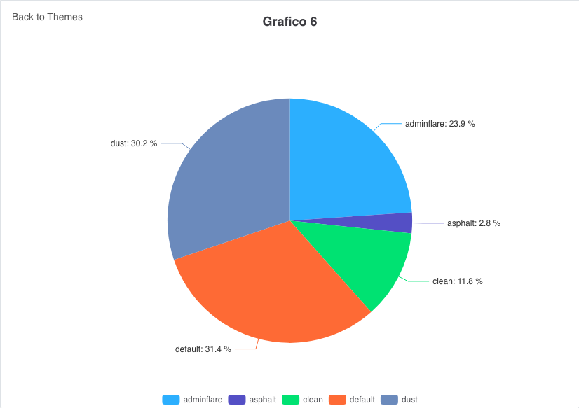
<chart id="ChrPieTst" label="Grafico 6" type="pie" initial-load="query" enable-data-labels="true"
format-data-labels="<b>{point.name}</b>: {point.percentage:.1f} %"
target-action="TstChrPieDrillSrc" max="5">
<chart-legend enabled="true" />
<x-axis label="Themes" />
<y-axis label="Percent (%)" />
<chart-tooltip suffix=" %" number-decimals="2" />
<chart-serie id="serie1" x-value="names" y-value="serie1" label="Themes" drilldown-serie="serie1_1">
<chart-parameter type="array" name="keys">
<chart-parameter type="string" value="name" name=""/>
<chart-parameter type="string" value="y" name=""/>
<chart-parameter type="string" value="drilldown" name=""/>
</chart-parameter>
</chart-serie>
<chart-serie id="serie1_1" drilldown="true" x-value="names" y-value="subserie1" label="SubThemes" />
</chart>
The query returns the values of both levels in the same row:
<query id="TstChrPieDrillSrc" distinct="true">
  <table id="AweThm"/>
  <field id="Nam" alias="names"/>
  <computed format="parseInt(Math.random()*100,10)" eval="true" alias="serie1" transform="NUMBER"/>
  <computed format="(parseInt(Math.random()*100,10))+2" eval="true" alias="subserie1" transform="NUMBER"/>
</query>
Scatter chart
Type scatter: one point for each row, with no line. The x and y values are numbers or dates.
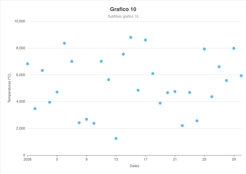
<chart id="ChrScaTst" label="Grafico 10" subtitle="Subtitulo grafico 10" type="scatter" initial-load="query"
       target-action="TstChrOneSrcThrAxs" max="21">
  <chart-legend layout="vertical" align="right" verticalAlign="middle" />
  <x-axis label="SCREEN_TEXT_CHART_AXIS_DATES" type="datetime" />
  <y-axis label="Temperaturas (ºC)" />
  <chart-tooltip suffix=" ºC" number-decimals="3" />
  <chart-serie id="serie2-1" x-value="Ord" y-value="serie1_1" z-value="serie1_2" label="SCREEN_TEXT_CHART_SERIE_1" />
</chart>
Bubble chart
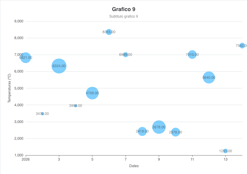
Type bubble: a scatter chart where the z-value of the series gives the size of each bubble. The range of the sizes
is set with minSize and maxSize, and the data labels can show the z value with {point.z}.
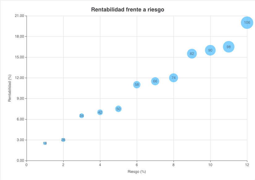
<chart id="ChrAdvBubble" label="Rentabilidad frente a riesgo" type="bubble" initial-load="query"
       target-action="ChrAdvBubbleSrc">
  <chart-legend enabled="false" />
  <x-axis label="Riesgo (%)" />
  <y-axis label="Rentabilidad (%)" label-format="{value:.2f}" />
  <chart-serie id="funds" x-value="risk" y-value="return" z-value="weight" label="Fondos" />
  <chart-parameter type="object" name="plotOptions">
    <chart-parameter type="object" name="series">
      <chart-parameter type="object" name="dataLabels">
        <chart-parameter type="boolean" name="enabled" value="true" />
        <chart-parameter type="string" name="format" value="{point.z}" />
      </chart-parameter>
    </chart-parameter>
    <chart-parameter type="object" name="bubble">
      <chart-parameter type="integer" name="minSize" value="10" />
      <chart-parameter type="integer" name="maxSize" value="40" />
    </chart-parameter>
  </chart-parameter>
</chart>
Without minSize and maxSize the sizes go from 10 to 50 pixels:
Stock chart with zoom
With stock-chart="true" the chart is meant for long time series. The React engine adds a slider (the navigator) under
the plot, a zoom of the x axis with the mouse wheel, and shows no legend by default.
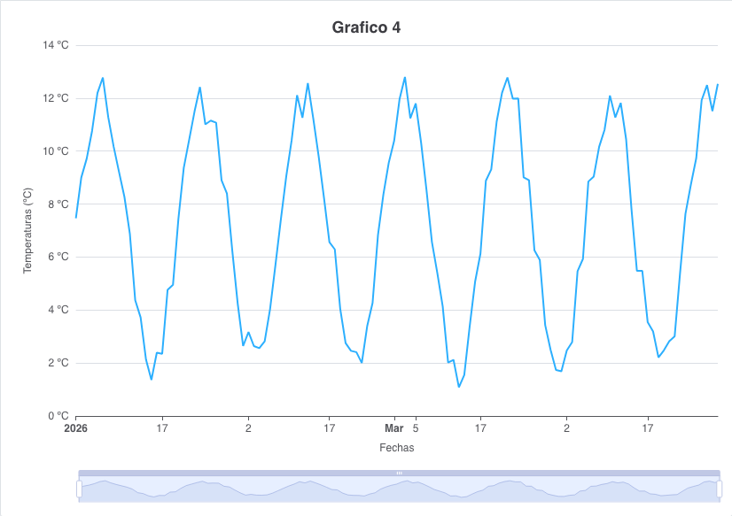
<chart style="expand-3x" id="ChrStockTst" label="Grafico 4" stock-chart="true" zoom-type="xAxis" type="line"
       initial-load="query" target-action="TstChrThrDatSrcHor" max="30">
  <x-axis label="Fechas" type="datetime" />
  <y-axis label="Temperaturas (ºC)" label-format="{value} ºC"/>
  <chart-tooltip suffix=" ºC" number-decimals="2" />
  <chart-serie id="serie1" x-value="dates" y-value="serie1" label="Serie 1" />
</chart>
zoom-type (xAxis, yAxis or all) adds the zoom of the axes to any chart, not only to the stock ones.
Chart actions
The server can change a chart from a service, with client actions. The actions are built with the classes of
com.almis.awe.builder.client.chart and are listed in the actions page:
| Action | Builder | Effect |
|---|---|---|
add-chart-series | AddChartSeriesActionBuilder | Adds series (a series with the same id is replaced) |
remove-chart-series | RemoveChartSeriesActionBuilder | Removes the series with the given ids |
replace-chart-series | ReplaceChartSeriesActionBuilder | Replaces all the series |
add-points | AddPointsActionBuilder | Adds the rows of a DataList to the values of the chart |
The series that the actions carry are ChartSerie objects, with the id, the name, the x-value and y-value names and the
points. The server translates each one to ECharts, as it does with the chart-serie elements of the XML, and sends
the translation with the action. The chart does not need to declare series in its XML: the screen of the example has no
chart-serie elements.
public ServiceData replaceSeriesChart(List<String> userList) {
  List<ChartSerie> series = new ArrayList<>();
  for (String user : userList) {
    ChartSerie serie = new ChartSerie();
    serie.setId(user);
    serie.setName(user);
    serie.setXValue("month");
    serie.setYValue(user + "-y");
    serie.setData(months.stream()
      .map(month -> new ChartSeriePoint(factory.textNode(month), factory.numberNode(random.nextInt(11))))
      .toList());
    series.add(serie);
  }
  return new ServiceData().addClientAction(new ReplaceChartSeriesActionBuilder("ChrLinTst", series).build());
}
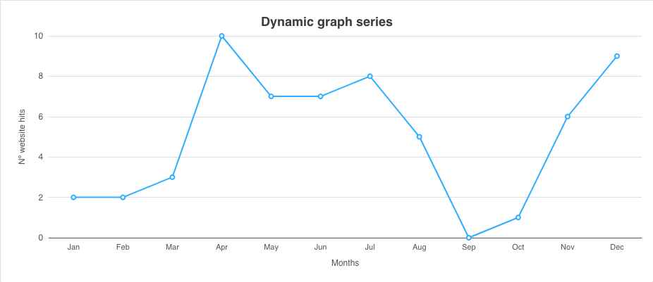
The ChrTstDynamicSeries screen of the test application has three buttons that call services like this one (add,
remove and replace series).
Dependencies
A dependency with target-type="chart-options" changes the options of a chart at runtime. For example, to synchronize
the zoom of two charts:
<dependency source-type="formule" target-type="chart-options" formule="{zoom: {x: {min: [xMin],max: [xMax]}}}">
  <dependency-element id="ChrStockTst" attribute="xMin" alias="xMin" optional="true"/>
  <dependency-element id="ChrStockTst" attribute="xMax" alias="xMax" optional="true"/>
  <dependency-element id="ChrStockTst" event="zoom"/>
</dependency>
The result of the formula is a Highcharts options object, so it is applied only by the AngularJS engine. The React
engine does not apply it: the client logs a warning in the browser console
(The 'chart-options' dependency is not applied to charts drawn with ECharts) and leaves the chart as it is. The
other dependencies of a chart (visibility, attributes, reload...) work in both engines. See
dependencies.
Differences between the engines
| Feature | React (ECharts) | AngularJS (Highcharts) |
|---|---|---|
3D types (column_3d, pie_3d, donut_3d) | Drawn flat | Drawn in 3D |
chart-parameter options | Only the translated options; the rest are ignored and logged | Any option of the Highcharts API |
chart-options dependency | Not applied (warning in the console) | Applied |
theme attribute (Highcharts themes) | Ignored. The look comes from the theme of the application | Applied |
| Default palette | The Highcharts 11 palette, for the series without color | The Highcharts palette, or the one of the theme |
| Dark mode | The charts follow the theme of the application (see below) | Highcharts themes (theme attribute) |
| Stock charts | Slider and zoom with the mouse wheel | Highstock: navigator, range selector, scrollbar |
| Printing | Image drawn by the SVG renderer of ECharts | Highcharts export |
| Chart texts | Files src/i18n/charts/charts-<language>.json | Texts of the AngularJS client |
Known limits of the React engine
- 3D charts are flat. The 3D types are accepted, so existing screens keep working, but the depth is not drawn.
- Colors. When the XML gives no colors, the series take the colors of the Highcharts 11 default palette
(
#2caffe,#544fc5,#00e272,#fe6a35,#6b8abc,#d568fb,#2ee0ca,#fa4b42,#feb56a,#91e8e1). Set thecolorof the series, or thecolorsparameter of the chart, to use your own. - Dark theme. The chart reads the theme of the application when it is created, and draws itself with light or dark colors. If the user changes the theme while the screen is open, the chart picks the new theme when it is created again (for example when the screen is opened again or the language changes).
- Drilldown and printing. Printing a chart that is drilled down prints the top level.
- Raw values. The values are drawn as the query gives them: nothing is rounded unless a format or
number-decimalssays so. - Highcharts options. Options without an ECharts counterpart are ignored. Check the log of the server, which reports each one once (see chart parameters).
- Highcharts themes. The
themeattribute applies only to the AngularJS engine. - Range types.
arearangeandareasplinerangeare approximated by a filled line.
Highcharts themes (AngularJS engine)
Note: This section applies only to the AngularJS engine. The React engine ignores the
themeattribute.
The AngularJS engine and the Highcharts library allow to change the style easily. There are some themes by default. Just
set the attribute theme of the chart element with the name of the theme.
The available theme list is:
- dark-unica
- dark-green
- dark-blue
- gray
- grid
Creating your own theme
Here is a simple example to show the process:
/**
 * Theme for Highcharts JS
 */

Highcharts.theme["your-theme"] = {
colors: ['#058DC7', '#50B432', '#ED561B', '#DDDF00', '#24CBE5', '#64E572',
             '#FF9655', '#FFF263', '#6AF9C4'],
    chart: {
        backgroundColor: {
            linearGradient: [0, 0, 500, 500],
            stops: [
                [0, 'rgb(255, 255, 255)'],
                [1, 'rgb(240, 240, 255)']
            ]
        },
    },
    title: {
        style: {
            color: '#000',
            font: 'bold 16px "Trebuchet MS", Verdana, sans-serif'
        }
    },
    subtitle: {
        style: {
            color: '#666666',
            font: 'bold 12px "Trebuchet MS", Verdana, sans-serif'
        }
    },

    legend: {
        itemStyle: {
            font: '9pt Trebuchet MS, Verdana, sans-serif',
            color: 'black'
        },
        itemHoverStyle:{
            color: 'gray'
        }
    }
};
Note: You must add the new file name into scripts.xml file on your project.
Printing and server rendering
Printing in the React engine. When the user prints a screen with a chart, the client draws an image of the chart apart from the screen, with the SVG renderer of ECharts, in light colors and with the size of the page. The image is drawn from the top level of the chart, even when the user has drilled down.
Rendering on the server. The ChartService described below is independent of the engine of the browser: it builds
the Highcharts model of the chart and sends it to a Highcharts export server, which returns an SVG image. It still needs
the export server (highcharts.server.url).
Chart render service
Highcharts has an export server which allows you to generate high quality charts on the server side:
https://www.highcharts.com/docs/export-module/setting-up-the-server
We have developed a new render service which allows you to generate charts in SVG format using this export server and
AWE charts.
Defining charts
Defining a chart to be generated on server is similar to defining a chart to be shown on a browser.
You define a screen and inside the chart, as shown before. This screen can be or not in the application, it doesn't matter.
The charts defined for server generation doesn't need server-action and target-action attributes, as
data sources are going to be passed as parameters.
Usage
There is a new service designed to generate charts in server side, called ChartService.
This service has two methods which allows the developer to generate charts using a single datasource or multiple datasources:
Render a chart with a single DataList
Render chart method (with a single DataList) generates a chart using only one
DataList as datasource.
public String renderChart(String screenName, String chartName, DataList data) throws AWException
screenNameis the name of the screen file where chart ischartNameis theidof the chart to be generateddatais the sourceDataList
This method will return a chart in SVG+XML format (or AWException if there is an error).
Render a chart with multiple DataList
Render chart method (with a map of DataList) generates a chart using multiples datalists.
public String renderChart(String screenName, String chartName, Map<String, DataList> datasources) throws AWException
screenNameis the name of the screen file where chart ischartNameis theidof the chart to be generateddatasourcesis a map of String and DataList which will contain all data sources.
This method will return a chart in SVG+XML format (or AWException if there is an error).
One of the data must be called main, and will be the default one, the rest will match a parameter datasource defined
on the serie which should pick the data. For example, this serie would pick the DataList inside the detail map key:
<chart-serie id="data" x-value="name" y-value="value"/>
<chart-serie id="detail" x-value="name" y-value="value">
  <chart-parameter type="string" name="datasource" value="detail"/>
</chart-serie>
the corresponding map for this serie should be:
Map<String, DataList> datasources = new HashMap<>();
datasources.put("main", mainDataList);
datasources.put("detail", detailDataList);
The first serie (data) will pick the data defined on main key
and the second serie (detail) will pick the data defined on detail key
Render server
You can configure the render server on application.properties file updating the highcharts.server.url property:
################################################
# Chart properties
################################################
highcharts.server.url=http://export.highcharts.com
The default export server is pointing to Highcharts export server: http://export.highcharts.com
Upgrading to AWE 5
In AWE 5 the React engine draws the charts with Apache ECharts 6.1.0 instead of Highcharts. The AngularJS engine keeps drawing them with Highcharts until it moves to ECharts (issue #775).
The chart XML does not change. The server translates the chart, its axes, series and chart-parameter elements into
an ECharts model, and logs a warning (once per option) for every option it cannot translate. Check these points when
you upgrade an application that uses the React engine:
- Review the log of the server. Open every screen with a chart and look for warnings that start with
Highcharts chart-parameter. Each one is an option that the React engine ignores. See chart parameters for the options that are translated. - Custom code that imports Highcharts. The React client no longer depends on
highchartsnor onhighcharts-react-official. A custom component of your application that imports them has to declare them in its ownpackage.json(check the Highcharts licence) or move to ECharts, which the client already provides. .highcharts-*CSS rules. The charts are no longer drawn by Highcharts, so these rules do not match anything in the React engine. Colors, fonts and borders come from the XML (chart-parameter) and from the theme. The dark mode of the application is applied to the charts automatically, when the chart is created.- Palette. The series without a color of their own keep the Highcharts 11 default palette. Set
colorin the series or thecolorsparameter in the chart to change it. - Highcharts themes. The
themeattribute is ignored by the React engine. If a theme gave colors or fonts to your charts, set them in the XML. - 3D charts (
column_3d,pie_3d,donut_3d) are drawn flat. chart-optionsdependency. Its result is a Highcharts options object. It is not applied to the charts drawn with ECharts and the client logs a warning in the browser console.- Formats. The format strings of Highcharts 11 (
{point.y:.2f},{#if ...}, the date patterns of%Y-%m-%d...) work as before, see chart formats. Number specifications other than.Nfand,.Nfare written as the raw value, and the values are never rounded unless a format asks for it. - Printing. The charts are printed from an image drawn by ECharts. A drilled-down chart prints its top level.
- Chart texts. The language files of the chart texts are
src/i18n/charts/charts-<language>.jsonin the React client, and they only hold the texts that the charts use:noData,drillUpText,decimalPoint,thousandsSep,months,shortMonthsandweekdays. Copy your customizations to those files. - Server rendering.
ChartServicestill uses the Highcharts export server and the Highcharts model of the chart, sohighcharts.server.urlis still needed for it.