Context menu
Awe engine allows define context menu inside a grid, tree grid, chart, button, criterion, tab or wizard. With these menus, you can add functionality to your window.
Opening the menu
The menu opens with a right click on the component that declares it: grids, tree grids, charts, buttons, criteria, tabs and wizards.
- When none of the options is visible (for example, because of their dependencies), the menu does not open and the browser menu is shown instead. Grids and tree grids are the exception: the options of a grid usually depend on the selected row, and those dependencies are resolved after the click selects the row, so a grid opens its menu whenever it declares options.
- When a component sits inside another one that also declares a context menu (a criterion inside a tab), the menu of the inner component wins over the menu of its container.
Opening the menu from a button
A button opens a context menu with the show-context-menu client action. It is the way to give each row of a grid a button that opens the context menu of the grid with a left click:
<column name="Actions" label="" component="button" icon="ellipsis-v" charlength="12">
  <button-action type="show-context-menu"/>
</column>
- The button of a grid row selects its row, as a right click on the row does, and opens the context menu of the grid just under the button.
- Any other button opens its own context menu (the
context-buttonelements declared inside the button), just under itself. - When there is nothing to open the action only finishes and the following actions go on. For a button outside a grid that means it declares no options or none of them is visible. A grid opens its menu whenever it declares options, even if none of them is visible at that moment, because their dependencies resolve after the row is selected; only a grid that declares no options has nothing to open (and then the row is not selected either).
- The action works in both client engines (AngularJS and React) and it is allowed on any button. Do not set a
target: the action always works on the button that launches it.
Xml structure
The xml structure of context menus is the following:
<context-button id="[Id]" label="[label]" icon=[icon]">
  <context-button id="[Id]"  label="[label]" icon=[icon]>
    <button-action type="[action-type]" target="[target]" silent="[silent]" />
  </context-button>
    <context-button id="[Id]"  label="[label]" icon=[icon]>
      <button-action type="[action-type]" target="[target]" silent="[silent]" />
    </context-button>
    <context-separator/>
    <context-button id="[Id]"  label="[label]" icon=[icon]>
      <button-action type="[action-type]" target="[target]" silent="[silent]" />
      ... more button actions
    </context-button>
    <dependencies/>
    .. more context-button
    .. more context-separator
  </context-button>
  .. more context-button
  .. more context-separator
</context-button>
Context menu elements
| Element | Use | Multiples instances | Description |
|---|---|---|---|
| context-button | Required | Yes | Context button element of the menu. Defines one element of the context menu |
| button-action | Required | Yes | Action of the context button. You can define a list of button actions |
| context-separator | Optional | Yes | Separator line of context button list |
| dependency | Optional | Yes | List of dependencies attached to the button |
Context button attributes
| Name | Type | Use | Description | Values |
|---|---|---|---|---|
id | String | Required | Context button identifier | |
label | String | Required | Label of the context button. | Note: You can use i18n files (locales) |
icon | String | Optional | Icon name of the context button | Note: You can check all iconsets at icons screen |
Note: The context button has the same attributes as button element. You can see more info here
Button action attributes
Note: You can see all attributes of
button-actionhere
Context separator attributes
| Name | Type | Use | Description | Values |
|---|---|---|---|---|
name | String | Optional | Context separator identifier |
Examples
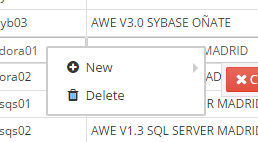
- Context menu inside a grid
<grid id="GrdSta" style="expand" initial-load="query" server-action="data" target-action="QryUniTst" max="30">
  <column label="PARAMETER_TEXT" name="Als" sort-field="Als" align="left" charlength="20" style="separator" />
  <group-header name="GrpHeaCol" label="PARAMETER_TEXT">
    <column label="PARAMETER_TEXT" name="Des" sort-field="Des" align="left" charlength="40" />
    <column label="PARAMETER_TEXT" name="Prg" sort-field="Prg" align="center" charlength="40"
            component="progress" value="50" server-action="data" target-action="QryChkPrg" />
  </group-header>
  <context-button id="CtxGrdStaAdd" label="BUTTON_NEW" icon="plus-circle" >
    <button-action type="screen" target="matrix_test" />
    <dependency target-type="show" initial="true">
      <dependency-element id="GrdSta" column="Als" attribute="selectedRowValue" condition="!=" value="awemadora02" />
      <dependency-element id="GrdSta" event="select-row" />
    </dependency>
  </context-button>
  <context-button id="CtxGrdStaDel" label="BUTTON_DELETE" icon="trash">
    <button-action type="screen" target="matrix_test" />
    <dependency target-type="show" initial="true">
      <dependency-element id="GrdSta" column="Als" attribute="selectedRowValue" condition="==" value="awemadora02" />
      <dependency-element id="GrdSta" event="select-row" />
    </dependency>
  </context-button>
</grid>